What is an Accordion Block?
The Accordion Block is a combination of a containing parent block with a bar layout, and a child slideout block that allows you to build out layouts inside. Like the instrument it’s named after, the content can expand and contract to improve the reading experience.
How it Works
Not to be confused with the Slideout Block (though they are similar!), this block with its nested containers allows you to build layouts inside the slideout section. These are activated when a user clicks to expand them. The key practical use is for full-width content that can be viewed if desired but is otherwise hidden, usually under a heading. The most practical case is to hide text-heavy details that would overwhelm a user and create too much scroll on mobile if viewed all at once – think FAQs, product specs, or policies.
The Accordion Block allows you to include everything a customer or client might need to know on the page, without hurting the user experience with visual overwhelm and painfully long scrolling. And don’t worry, search engines can read all nested content.
The Accordion Block is also a parent block. You can control how many Accordion Item Blocks appear within your Accordion Block using the settings, with the exception of advanced settings for the Accordion Items (Pro users only).
Block Settings
You can customize the Accordion Block using Style, Layout, and Settings options, giving you great flexibility in how you tailor elements to your design.

Styles Tab
Typography Settings
These settings are govern the text within all Accordion Items.
Typography Settings
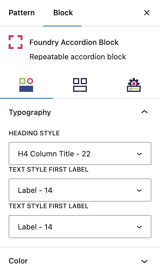
Heading Style
This dropdown allows you to select a heading style for the accordion label. In the use case of a job listing, this would be the job title. This is based off settings under Global Styles > Typography.
Text Style First Label
This dropdown allows you to select one of text styles for the text in the first field after the title. In the use case of a job listing, it could be full-time or remote. This is based off of settings under Global Styles > Typography.
Text Style Second Label
This dropdown allows you to select one of text styles for the text in the second field after the title. In the use case of a job listing, this could be location. This is based off of settings under Global Styles > Typography.
More about
Global StylesColor Settings
These settings are govern the colors for all Accordion Items.
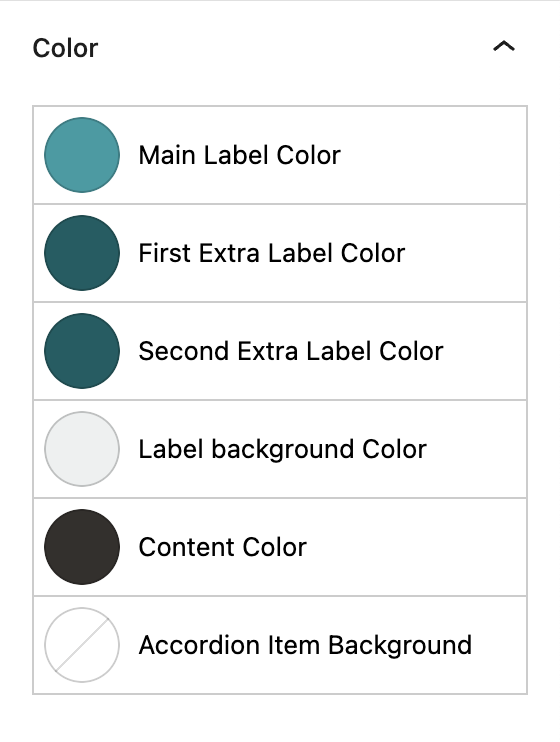
Color
This setting allows you to customize the color of the fonts for all of the individual elements in your accordion content. The options will be colors from your palette(s), as configured under Global Styles > Colors.
Main Label Color allows you to customize the text for your accordion labels. In the use case of a job listing, this would be the job title.
First Extra Label Color allows you to customize the text in the second fields, usually a high-level descriptor. In the use case of a job listing, it could be full-time or remote. It comes with a divider to separate it from the main label.
Second Extra Label Color allows you to customize any additional labels you add to the visible part of the accordion item. In the use case of a job listing, this could be location.
Label Background Color allows you to customize the color of the box containing your accordion labels, ie. the headings.
Content Color allows you to customize the main paragraph text for all items in your Accordion Block.
Accordion Item Background
This setting allows you to customize the background color of all of the boxes containing your accordion content, ie. the Accordion Items.
More about
Global Styles
Layout Tab
Accordion Spacing Settings
These settings govern the spacing within your Accordion Block and Accordion Items.
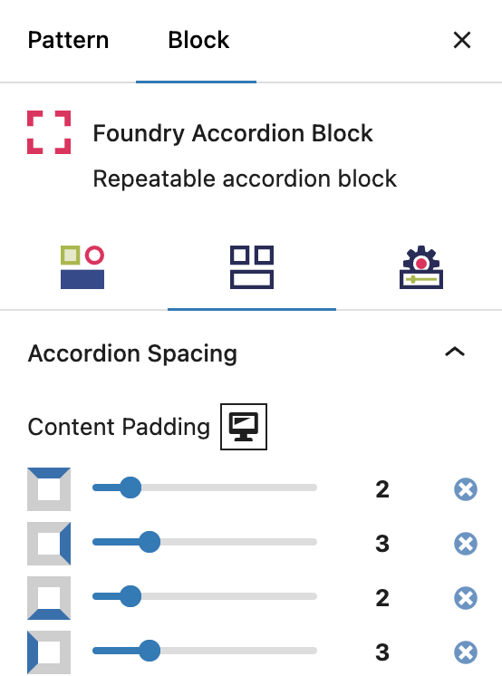
Content Padding
The setting allows you to add or reduce spacing around the outsides of all sections in the Accordion Item, relative to the label (see next section for more on labels). In plain terms, this is the padding around the part of the accordion that expands and collapses, the hidden content. There is one toggle each for adjusting padding on top, to the right, on the bottom, and on the left of your accordion sections.
More about
Spacing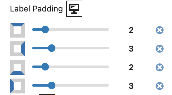
Label Padding
This setting allows you to add or reduce spacing around the outsides of the label, relative to the slideout content. The label is the visible copy that sits atop the accordion content area. In FAQs, for example, the label would be the question, and a person would click to expand the answer. There is one toggle each for adjusting padding on top, to the right, on the bottom, and on the left of your accordion label.
More about
Padding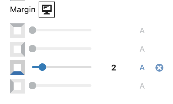
Margin
This setting allows you to add or reduce spacing around the outsides of your complete Accordion Items (the label and content combo). This is the space around each section, relative to the next section or boundary of the accordion block. There is one toggle each for adjusting padding on top, to the right, on the bottom, and on the left of your accordion.
More about
SpacingAccordion Layout Settings
These settings govern the responsiveness of all content within your accordion.
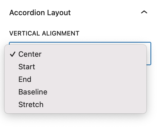
Vertical Alignment
This setting lets you control the alignment of the Accordion Items within the parent Accordion Block, when the screen becomes different sizes.
Center, Start, and End are flex options that dictate which way the flex should function.
Baseline will align the content (ie. the heading, labels, and icon) for each Accordion Item along the bottom.
Stretch will stretch the Accordion Items to fill fill the space evenly.
More about
Display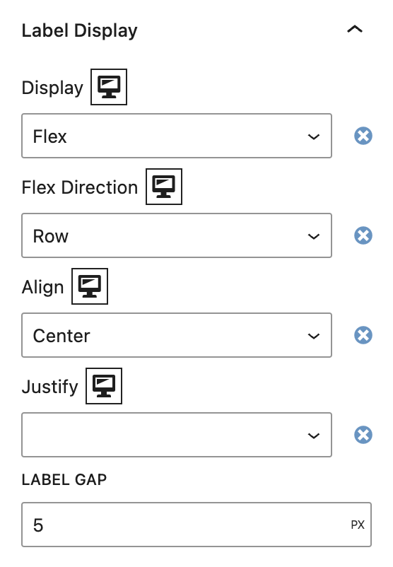
Label Display
This controls how the label container is displayed, and governs the alignment and order of the labels within.
The element behaves like a block element and lays out its content according to the flexbox model. Options include Flex Direction (Column, Row, Column Reverse, Row Reverse), Flex Align (Start/Top, Center, End/Bottom), Flex Justify (Start/Left, Center, End/Right, Space Between).
The Label Gap option determines the number of pixels between each label if no Flex Justify option is selected.
More about
Display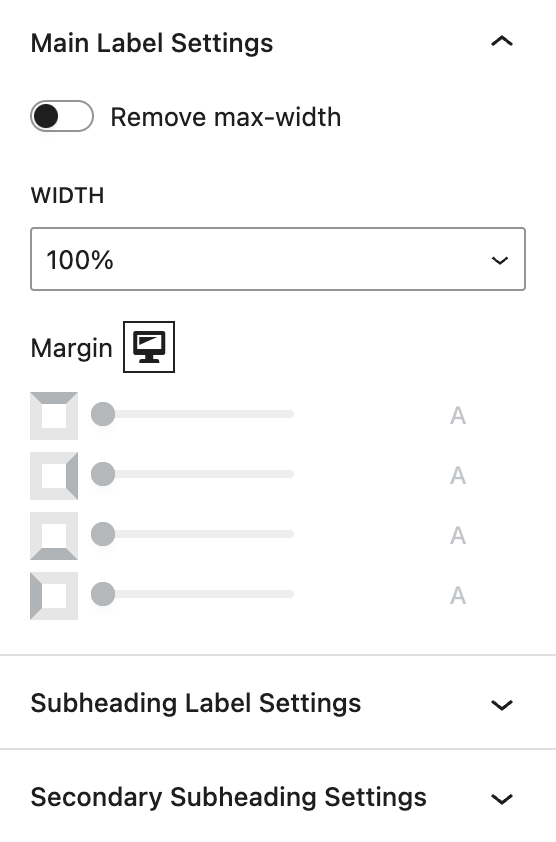
Label Settings
Individual label settings let you precisely control the width and margins for the main, subheading, and secondary subheading.
Width settings include an on/off toggle that allows the container to either stretch to the full width of the browser or to sit within the max-width setting (which is set by default to 1200px).
Margin settings allow you to add or reduce spacing around the outsides of your complete Accordion Items (the label and content combo). This is the space around each section, relative to the next section or boundary of the accordion block. There is one toggle each for adjusting padding on the top, to the right, on the bottom, and on the left of your accordion.
More about
Spacing
Settings Tab
General Settings
These are general settings for the functionality of your Accordion Block.
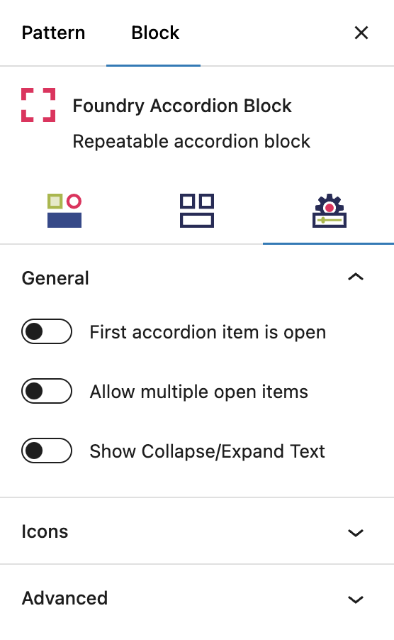
Functional Toggles
First accordion item is open
This toggle controls whether the first accordion item is already open when a user loads the page. When enabled, the item is open/expanded. When disabled, all accordion items are closed. You might choose to set the first item open if you want to give the user a clear indication that this section of the page has nested content.
Allow multiple open items:
By enabling this option, more than one accordion item can remain open at the same time. This changes the default behavior, where opening a new accordion automatically closes the previously open one. It’s ideal for pages where users may want to reference multiple sections simultaneously without losing previous content.
Show Collapse/Expand text:
This feature appends text next to the accordion icon to improve user clarity. When an accordion is open, it shows “Collapse” alongside the icon, and when closed, it displays “Expand.” This provides a clear visual cue to users, making navigation more intuitive.
More about
ParallaxIcons
These are settings for the icon used to show a user where to expand/collapse the accordion.
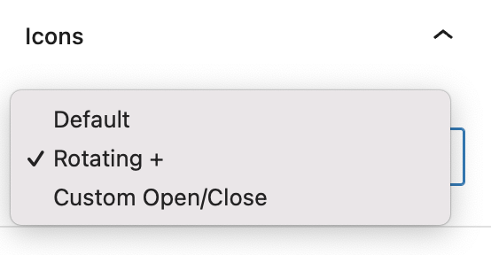
Use Custom Icons
Default clickable icons for an accordion are an upward arrow (accordion content open) and downward arrow (accordion content closed).
Rotating + will give you a + symbol when the accordion is closed, and it rotates to look like an ‘x’ when the accordion is open
Custom Open/Close will give you additional fields open to enter Font Awesome icon shortcode.
More about
Font Awesome ShortcodesAdvanced Settings
These settings are only accessible to Pro users (with the exception of HTML anchors), and also only accessible to site admins.
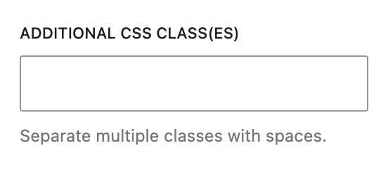
Additional CSS Class(es)
On the Accordion Block and child Accordion Item, this allows you to enter a unique Class identifier, to facilitate custom CSS targeting within the theme for custom development.
It also enables the use of Refoundry utility classes.
More about
Theme Customizations