What is a Slideout Block?
The Slideout Block is a combination of a grid-based parent layout, and a child section that effectively slides out to reveal hidden content.
How it Works
Not to be confused with the Accordion Block (though they are similar!), this unique block with its nested containers allows you to build layouts inside the slideout section. These are activated when a user clicks to expand them. The key practical use is for team member bios and contact details. You could also use it for something like logos with slideout content about partners or funders. The Slideout Block keeps the page neat and tidy, with ample room to store content. And don’t worry, search engines can read all nested content.
The Slideout Block is also a parent block. You can control how many Slideout Item Blocks appear in your Slideout Block using the settings. Each child Slideout Item Block supports all other Refoundry blocks, meaning you can create any layout you want within each section that slides out. This allows you to build responsive layouts within each item to support a variety of needs for nested content.
Block Settings
You can customize the Slideout Block using Style, Layout, and Settings options, giving you great flexibility in how you tailor elements to your design.
Styles Tab
Text Settings
Text settings govern the text within the Slideout Block.
Text
Heading Style
This setting allows you to style the headings for all items in the slideout grid, using the heading styles set in Global Styles > Typography.
Subheading Style
This setting allows you to style the subheadings for all items in the slideout grid, using the heading styles set in Global Styles > Typography. Of course, you would choose a smaller size for the subheading than the main heading.
More about
Global StylesColor Settings
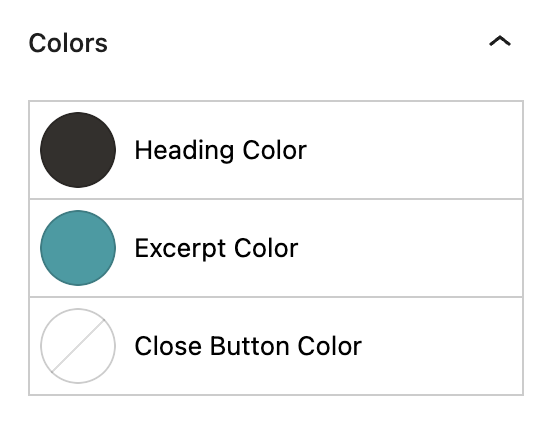
Color settings govern the color of the text and buttons within the Slideout Block.
Color
Heading Color
This setting allows you to pick the color for the headings for all items in the slideout grid, using the colors set in Global Styles > Colors.
Excerpt Color
This setting allows you to pick the color for the excerpt text for all items in the slideout grid, using the colors set in Global Styles > Colors.
Close Button Color
This setting allows you to designate the color for the close button (“x” symbol) in the child slideout section, using the colors set in Global Styles > Colors.
More about
ColorsBorder Settings
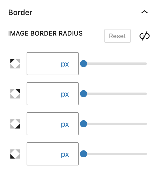
Border settings govern the borders around the images within the Slideout Block.
Image Border Radius
This value rounds the corners of the image’s outer border edge, for all images within your Slideout Blocks. When enabled, you can control how much each corner of the Container Block is rounded. Use ‘Reset’ to bring everything back to zero.
More about
Borders & RadiusLayout Tab
Grid Settings
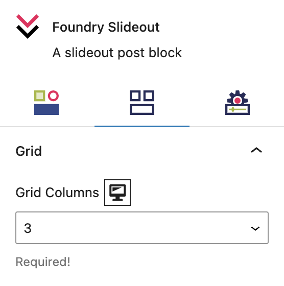
These settings let you choose how many Slideout Block Items will appear left to right in the parent grid. This setting is required for the Slideout Block to work properly.
Grid Columns
This is how many Slideout Item Blocks will appear left to right on the page, so if you choose 3 you will have three blocks across the page.
More about
WidthsSettings Tab
Options
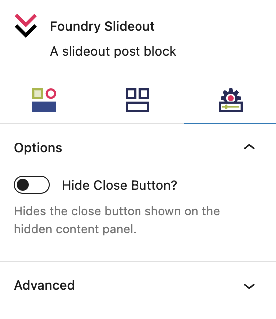
These settings are for the functionality of all Slideout Items in the Slideout Block.
Hide Close Button
This setting allows you to hide the close button (“x” symbol) in the child Slideout Item sections.
More about
ParallaxAdvanced Settings
These settings are only accessible to Pro users (with the exception of HTML anchors), and also only accessible to site admins.
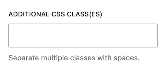
Additional CSS Class(es)
This allows you to enter a unique Class identifier, to facilitate custom CSS targeting within the theme for custom development.
It also enables the use of Refoundry utility classes.
More about
Theme Customizations
