What is a Tabs Block?
The Tabs Block allows you to present a variety of content in a tabbed style, giving the user the ability to control which content they view.
How it Works
The Tabs Block a similar design choice to a Slider Block or Accordion Block in that you’re nesting content to keep the page tidier and easier on the eyes. Just like those other two blocks, the Tabs Block is a parent block that comes with Tab Items to manage individual content (ie. each tab) within the main Tabs Block. And don’t worry about the SEO implications – tabbed content is still visible to search engines within the page code.
The Tabs Block is also a parent block. Each tab in the Tabs Block supports all other Refoundry blocks, meaning you can create any layout you want within each tab. This allows you to build responsive layouts within each item to support a variety of needs for nested content. Popular uses are courses or curriculums and product specs.
Block Settings
You can customize the Tabs Block using Style, Layout, and Settings options, giving you great flexibility in how you tailor elements to your design.
Styles Tab
Text Settings
These settings govern all text within the Tabs Block.
Text
Heading Style
This setting allows you to style the child Tab Item Block’s label text, using styles set under Global Styles > Typography.
Text Style
This setting allows you to style all paragraph text within the child Tab Item Block using the styles you’ve set in Global Styles > Typography.
More about
Global StylesLayout Tab
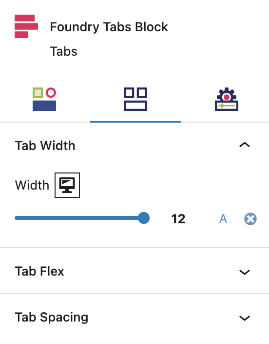
Tab Width Settings
These settings govern all widths within the Tabs Block.
Tab Flex Settings
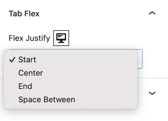
These settings govern all flex within the Tabs Block.
Flex Options
Flex Justify controls the left-to-right position of the group of Tab Items within the Tabs Block.
More about
Global StylesTab Spacing Settings
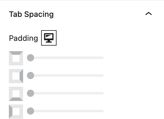
These settings govern all spacing within the Tabs Block.
Padding
These top, right, bottom, and left sliders, with a range from 0 to 12, control the amount of interior space there is between the edges of the Tabs Block and its contents.
More about
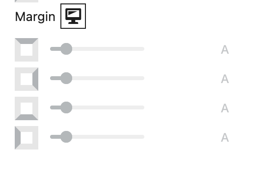
SpacingMargin
These sliders, with a range from 0 to 12, control the amount of exterior space there is around the Tabs Block and adjacent objects. Each one controls the margins around the top, bottom, left, and right of the container.
More about
SpacingSettings Tab
Label Settings
These settings govern the labels that are used to mark each tab, so a user knows what’s inside them and wants to click.
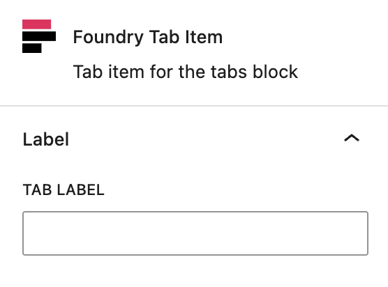
Tab Label
This setting allows you to enter text for each Tab Item Block to be displayed in the tab navigation.
More about
SpacingAdvanced Settings
These settings are only accessible to Pro users (with the exception of HTML anchors), and also only accessible to site admins.
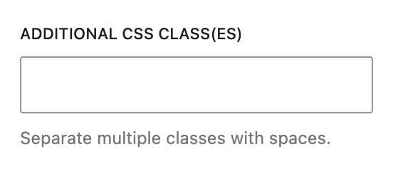
Additional CSS Class(es)
This allows you to enter a unique Class identifier, to facilitate custom CSS targeting within the theme for custom development.
It also enables the use of Refoundry utility classes.
More about
Theme Customizations
