What is a Slider Block?
The Slider Block is a combination of a containing parent block and a child section, which effectively allows you to build layouts inside two or more sliding Container Blocks. It’s a carousel of content that a user can slide through.
How it Works
The slider is activated when a user clicks on the navigation (usually a button), or swipes on a touch device. This action slides the content along to reveal the next container of content in the Slider Block. Content nested in a slider carousel is still visible to search engines.
The Slider Block is also a parent block. You can control how many Slider Items using the Slide Count settings. Each child Slider Item supports all other Refoundry blocks, meaning you can create any layout you want within each section that slides. This allows you to build responsive layouts within each item to support a variety of needs for your carousel content.
Block Settings
You can customize the Slider Block using Layout, and Settings options, giving you great flexibility in how you tailor elements to your design.
Layout Tab
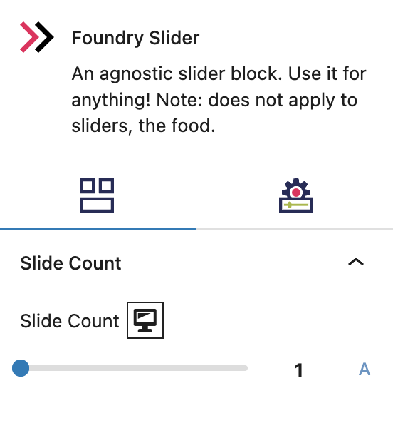
Slide Count Settings
These settings govern the number of Slider Items that will automatically be included in your Slider Block.
Slide Count
This setting determines the number of slides to appear within the parent container (the Slider Block). If you have a Slide Count of 5, you will have 5 containers of slide-able content in your carousel. Click the A icon to select Auto.
More about
WidthsSettings Tab
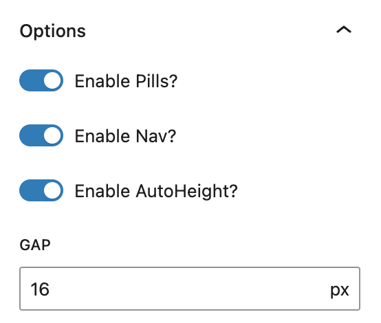
Option Settings
These settings govern additional functionality of your Slider Block.
Options
Enable Pills
This setting shows or hides the dot symbol indicators (usually below a slider) that show a user how many slides there are and which slide they are on. Pills are like breadcrumbs, so a user knows where they are in the carousel and how far they have to go to reach the end.
Enable Nav
This setting shows or hides the clickable arrow navigation for a user to move forward or backwards through the slides.
Enable AutoHeight
When toggled on, this setting will make all slides in the Slider the same height based on the tallest content. This ensures that the button/navigation doesn’t move up and down on the screen as slider content shrinks and expands.
Gap
Defines the space between each of the slides.
More about
ParallaxSlider Type
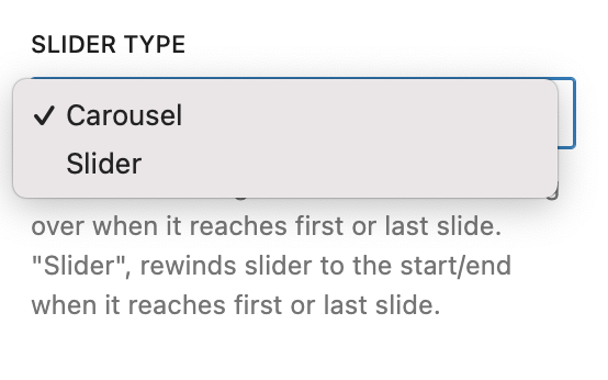
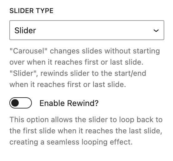
This setting allows you to choose between Carousel and a Slider.
Carousel
Carousel creates an infinite loop of slides which allows a user to advance the slides without reaching an end point or needing to rewind. It just moves to the first slide again when the user slides past the last item.
More about
ParallaxSlider
Slider rewinds the slides to the start/end when it reaches the last slide. Selecting Slider also reveals the Enable Rewind setting. When this is off, the slide will simply stop at the final slide requiring the user to click the previous slide button to manually rewind. When this is on, clicking next slide will automatically rewind the slider to the first slide.
More about
ParallaxAdvanced Settings
These settings are only accessible to Pro users (with the exception of HTML anchors), and also only accessible to site admins.
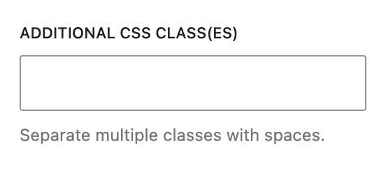
Additional CSS Class(es)
This allows you to enter a unique Class identifier, to facilitate custom CSS targeting within the theme for custom development.
It also enables the use of Refoundry utility classes.
More about
Theme Customizations