What is a Grid Block?
A Grid Block allows you to display content in a neatly organized grid. You can easily put other blocks into the grid, and control its presentation. It is a parent block that comes with the Icon Post Block to manage individual grid items (called “Icons” in the settings). The parent and child blocks are both details on this page.
How it Works
You can build any grid by creating a layout with columns and rows from scratch, but a Grid Block is quicker and more efficient way of doing this. There are tons of uses for a grid, including showcasing logos (see the specific Logo Grid Block), certifications, posts, locations, team members, highlights/icons, and much more.
Block Settings
You can customize the Grid Block using Style, Layout, and Settings options, giving you great flexibility in how you tailor elements to your design.
Styles Tab
Style Settings
Style settings give you options for the look of all of your grid items.
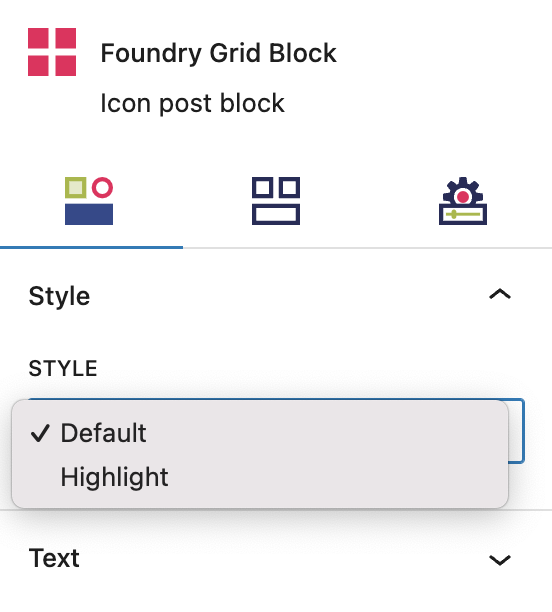
Style
This option controls the placement of the icon in each Icon Post. By default the icon will sit above and left aligned with the Heading, Paragraph and Button blocks.
When Highlight is selected the icon moves to the left of these blocks in a side by side layout.
More about
Global StylesText Settings
Text settings give you options for the look of the text within all of your grid items.
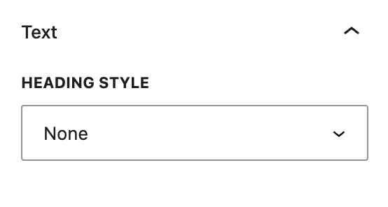
Heading Style
This setting allows you to choose an override for the default style the headings for all items in the Grid Block, based on the heading level set below in the Layout Tab and using your heading styles set in Global Styles > Typography. Selecting None means headings will display the default style for that heading level, ie. H1-H6.
More about
Global StylesLayout Tab
Layout Settings
Layout settings give you options for the layout of all of your grid items.
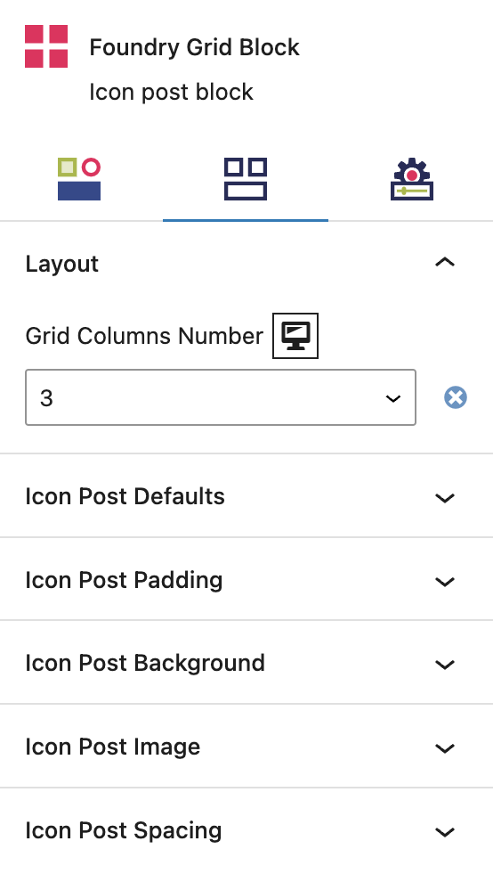
Grid Columns Number
Select the number of columns in your grid, between 1 and 4 or 6 (no 5 as this is based on a 12 column grid). If you choose 3, you will create a grid that has three items across the page, and as many rows as you need.
More about
Global StylesIcon Post Defaults Settings
These settings give you options for the styling of all of your grid items.
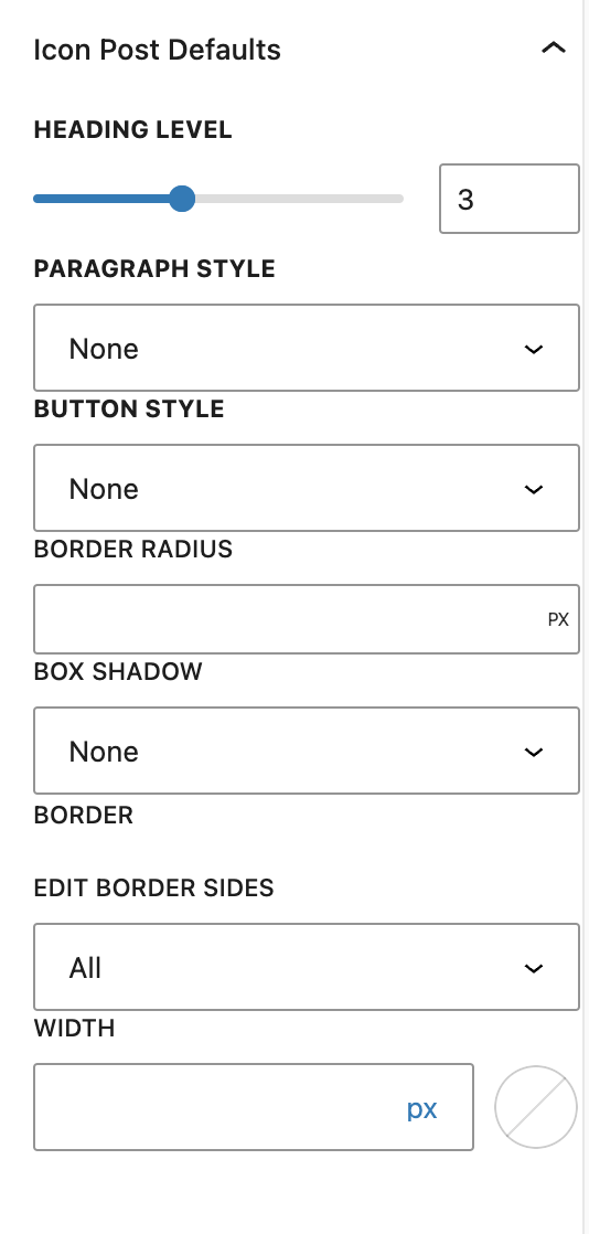
Heading Level
This option controls the default heading level (ie. H1-H6) of headings in your grid, when you add new grid items. The style for each heading level will come from the default for each heading level you have configured under Global Styles > Typography or from what was selected above in the Style Tab.
More about
Global StylesParargaph Style
This setting allows you to style the paragraph text for all items in the Grid Block, using your heading styles set in Global Styles > Typography. Selecting None means the default paragraph style will be displayed.
More about
Global StylesButton Style
This setting allows you to style the text for all buttons in your Grid Block using the styles you’ve set in Component Styles > Buttons. Selecting None means the default link style will be displayed.
More about
Component StylesBorder Radius
This value rounds the corners of the outer border edges for each item in the grid. When enabled, you can control how much each corner is rounded. When left empty, it will default to 0, or square corners.
More about
Borders & RadiusBox Shadow
This setting lets you add shadow effect on the borders of your Grid Block items from the Box Shadow presets set in Global Styles > Box Shadows.
More about
Box ShadowsBorder
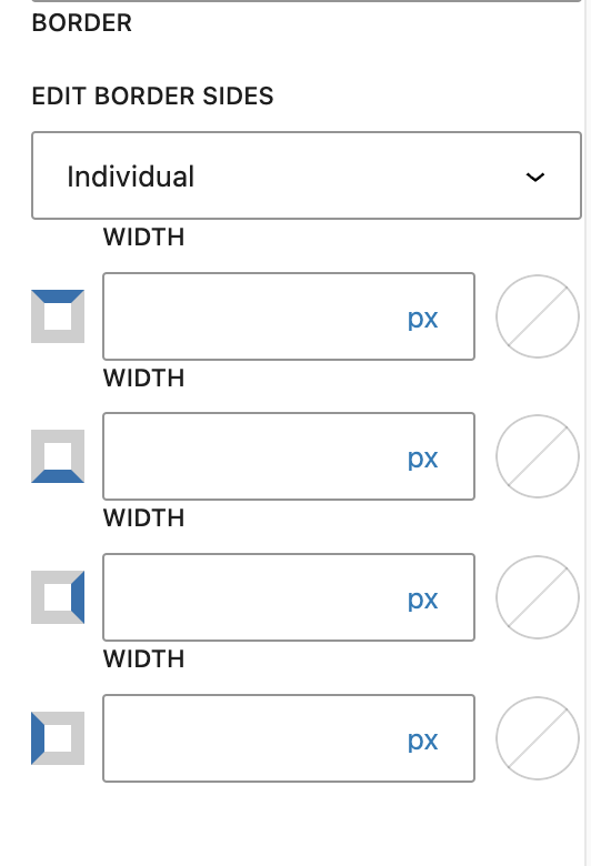
You can create equal specifications for all of your Grid Block item borders by choosing “All,” or customize each border’s specifications by choosing “Individual.” The options are Width and Border Color. The color options come from your settings found under Global Styles > Colors.
More about
Borders & RadiusIcon Post Padding Settings
This setting allows you to control the padding around each item (Icon) in your Grid Block, relative to other grid items and the inside edges of the container.
Padding
These top, right, bottom, and left sliders, with a range from 0 to 12, control the amount of interior space there is between the edges of the Icons (grid items) and their contents.
More about
SpacingIcon Post Background Settings
This setting allows you to add a background colour behind all items in your Grid Block, with options based on your palette(s) as configured in your Global Styles.
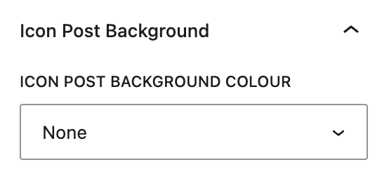
Icon Post Background Color
This setting allows you to add a background color behind all items in your Grid Block, with options based on your palette(s) as configured in Global Styles > Colors.
More about
ColorsIcon Post Image Settings
This setting allows you to do something
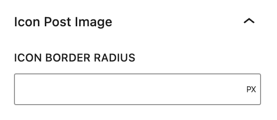
Icon Border Radius
This value rounds the corners of the outer border edges for each Grid Block item icon image that has been uploaded.
More about
Borders & RadiusIcon Post Spacing Settings
This setting allows you to do something
Icon Post Spacing
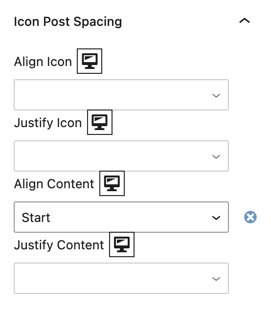
These settings utilize flex alignments to determine how your icons and content align within each Grid Block item’s container. All blocks within the Grid Block item are set as a Column display.
Align Icon controls the vertical alignment of each uploaded icon image file.
Justify Icon controls the horizontal alignment of each uploaded icon image file.
Align Content controls the vertical alignment of all contained content blocks.
Justify Content controls the horizontal alignment of all contained content blocks.
More about
Display SettingsSettings Tab
Link Settings
These settings control all links within your Grid Block.
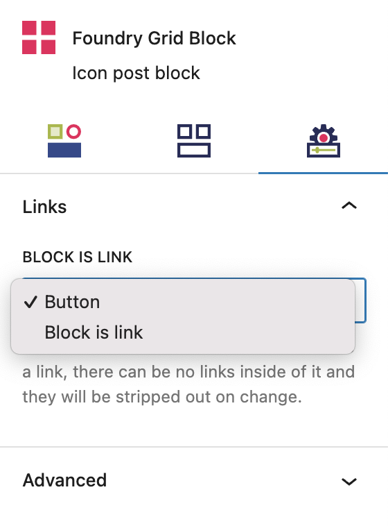
Block is Link
This setting determines if a Button block is included with each Grid Block item, or if the entire block is clickable.
When Block is link is selected, note that if the whole block is set to be a link, and there can be no links inside of it. Any added will be stripped out.
More about
Global StylesAdvanced Settings
These settings are only accessible to Pro users (with the exception of HTML anchors), and also only accessible to site admins.
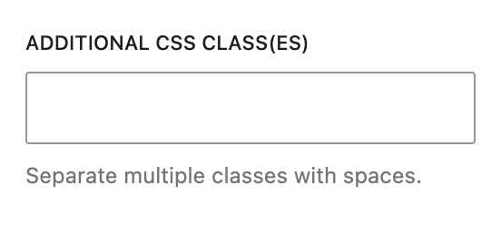
Additional CSS Class(es)
This allows you to enter a unique Class identifier, to facilitate custom CSS targeting within the theme for custom development.
It also enables the use of Refoundry utility classes.
More about
Theme Customizations