What is a Filter Dropdown Block?
A Filter Dropdown Block manages which filter options are presented to users for searching posts.
How it Works
The Filter Dropdown Block enables users to narrow down the content they see on a page by categories, subcategories, or other taxonomies (depending on what you have set up on your site). These become the dropdown options. For a strong and helpful user experience, it’s a good idea to limit the number of options within any dropdown to 10 or fewer, otherwise it can become difficult to navigate – and to decide which option to choose. This is especially true on mobile devices.
The Filter Dropdown Block is a child block to the main Filters Block.
Block Settings
You can customize the Filter Dropdown Block using Style and Settings options, giving you great flexibility in how you tailor elements to your design.

Styles Tab
Color Settings
These settings are just for the icon that expands the drop-down options in your filters.
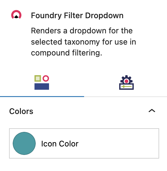
Icon Color
Choose the drop-down icon color from the preset color options you’ve configured in Global Styles > Colors.
More about
Colors
Settings Tab
Taxonomy Settings
These settings govern the taxonomy or taxonomies featured in your filters.
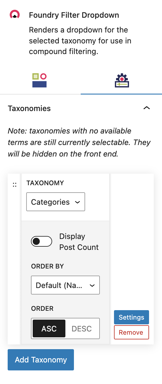
Taxonomy
To determine which taxonomies are displayed in the Filters Block, add and select them in this area. Only taxonomies that you’ve already created and assigned to the post type selected in the Query Block will be displayed here.
There is no limit to how many taxonomies you can display. Each selected taxonomy will be displayed as an individual drop-down, with all available terms displayed within that drop-down by default.
Settings
You can configure how the taxonomy terms are displayed in the drop-down here. The options are:
Display Post Count: Toggle this on to append the Term name with a post count number
Order by: Select an option to determine the order of the terms within the dropdown. The options include Default (Name), Post ID, Term Order, Slug, Count, Term Group, Description or Parent.
Order: You can select between ascending or descending ordering.
More about
ParallaxIcon Settings
These settings let you replace the default filter menu icon with a different icon.
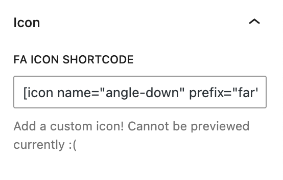
Font Awesome Shortcode
Enter a Font Awesome shortcode to replace the default dropdown icon.
More about
Font Awesome ShortcodesOption Settings
These settings govern whether or not a person has the ability to reset their selection.
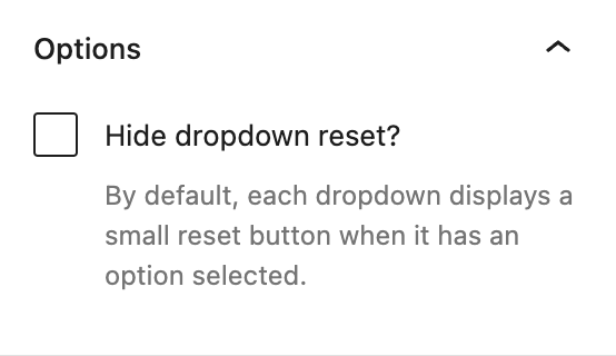
Hide Dropdown Reset
By default, each dropdown will display an “x” icon to the right of a selected term, which a user can click to reset the filter.
By selecting Hide dropdown reset, the “x” icon is removed and a user would have no way to reset their selection. They would need to use the ‘back’ button to get back to an unfiltered view of your posts.
More about
Font Awesome ShortcodesAdvanced Settings
These settings are only accessible to Pro users (with the exception of HTML anchors), and also only accessible to site admins.
Additional CSS Class(es)
This allows you to enter a unique Class identifier, to facilitate custom CSS targeting within the theme for custom development.
It also enables the use of Refoundry utility classes.
More about
Theme Customizations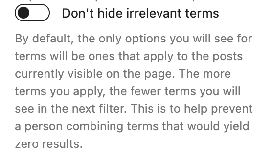
Don’t hide irrelevant terms
By default, the only terms that will be displayed in the drop-down are ones that have been assigned to at least one post. Any terms that not been assigned, will not be displayed as an option.
By toggling Don’t hide irrelevant terms on, the drop-down will display all terms, regardless of whether there’s currently a post assigned to them or not (potentially yielding zero results).
More about
Theme Customizations