What is a Button Block?
Like the title suggests, the Button Block is for adding and controlling buttons.
How it Works
Buttons can be set to link to other pages or posts on your site, to containers within a page (see HTML Anchors), or to an external page. They’re a great way to make a link stand out from the rest of the page, especially if it points to conversion content.
Block Settings
You can customize the Button Block using Style, Layout, and Settings options, giving you great flexibility in how you tailor elements to your design.
Styles Tab
Style Settings
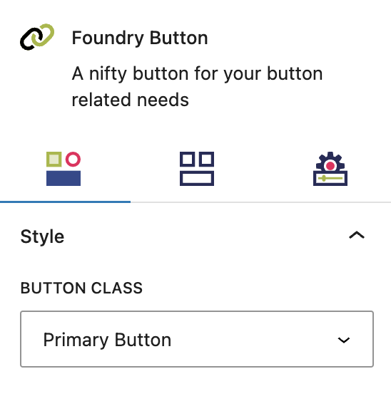
The style settings govern the look of your button.
Button Class
This setting allows you to configure the button’s appearance by selecting from a dropdown menu of preset button and link styles, which are set in the Button & Link Styles > Buttons area.
More about
Button & Link StylesLayout Tab
Spacing Settings
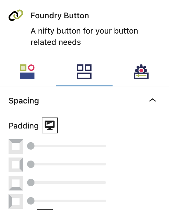
These settings govern the spacing within your Button Block, and the spacing around it.
Padding
These top, right, bottom, and left sliders, with a range from 0 to 12, control the amount of interior space there is between the edges of the button and its contents (ie. the text).
More about
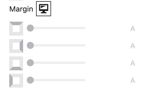
SpacingMargin
These sliders, with a range from 0 to 12, control the amount of exterior space there is around the button and adjacent objects. Each one controls the margins around the top, bottom, left, and right of the button.
More about
SpacingSettings Tab
Button Settings
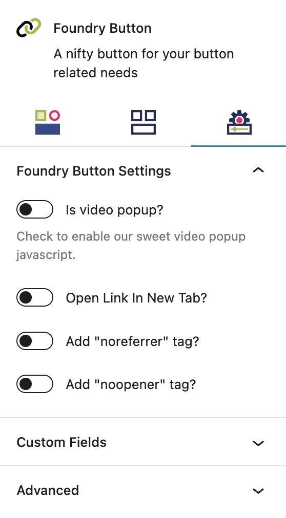
These settings control additional functions for your Button Block.
Link Behaviours
Video Popup
When linked to a video such as YouTube or Vimeo, this toggle will convert the link into a video popup, allowing the video to be played in a modal overview without leaving the page.
Open Link in New Tab
This is a popular setting for SEO, to share helpful links but not send people away from your website. If the link is clicked, the destination opens in a new tab instead of replacing your site in the same tab. This can create issues for accessibility, so you should read up on the pros and cons before deciding.
Add “noreferrer” Tag
The noreferrer tag hides the source of the link from the other site’s analytics, ie. any traffic resulting from clicking that button would not be seen in the other party’s analytics as referral visits from your domain. If you enable noreferrer, you can link to another site without passing on data about your site to that party.
Add “noopener” Tag
The noopener tag enhances website security, especially on links set to open in a new tab. If you enable noopener, you prevent the other website from gaining any kind of access to your page through the browser session.
More about
Theme CustomizationsCustom Field Settings
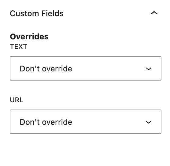
Custom Fields relating to Button Blocks are only available to Pro users.
Overrides
This is where you can choose to override the default button components with values entered into a post’s Custom Fields – meaning they are configured in Refoundry > Custom Fields. You create the Custom Field, and configure which post type it applies to. Then, anywhere that post type appears in Query Block on the site, the Custom Fields will appear as options. Values entered into those fields can be selected to be displayed here instead.
Text will override the button text displayed in the button and replace it with the value entered in the post. If this is the only Custom Fields option selected, the link will continue to be a link to the post.
URL will override the button link with the custom URL provided for the post. If this is the only Custom Fields option selected, the text entered in the button will continue to display as-is.
More about
Custom FieldsAdvanced Settings
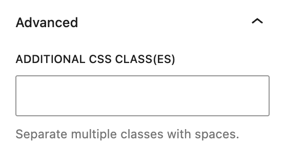
These settings are only accessible to Pro users (with the exception of HTML anchors), and also only accessible to site admins.
Additional CSS Class(es)
This allows you to enter a unique Class identifier, to facilitate custom CSS targeting within the theme for custom development.
It also enables the use of Refoundry utility classes.
More about
Theme Customizations