What is Typography?
In the context of Refoundry settings, typography is the predefined font options available for styling elements across your website. These fonts need to be configured before they appear as options for any block. Effective web typography supports readability, accessibility, and brand identity, making it a critical component of web design.
How it Works
To select or change default colours, navigate to your your WordPress side menu and click Refoundry > Global Styles > Typography.
The Body/Default section allows you to configure the typography for paragraph or non-alternative text across your site, while header styles let you customize how all headings should look at each level (H1 to H6). Once you’ve configured typography settings here, they will appear in the drop-downs within block settings. You can still override these settings on each page, but in general you want your typography to be consistent and on-brand.
Typography Settings
These are the settings you’ll see under Refoundry > Global Styles > Typography. You need to configure them to do any text styling on your site.
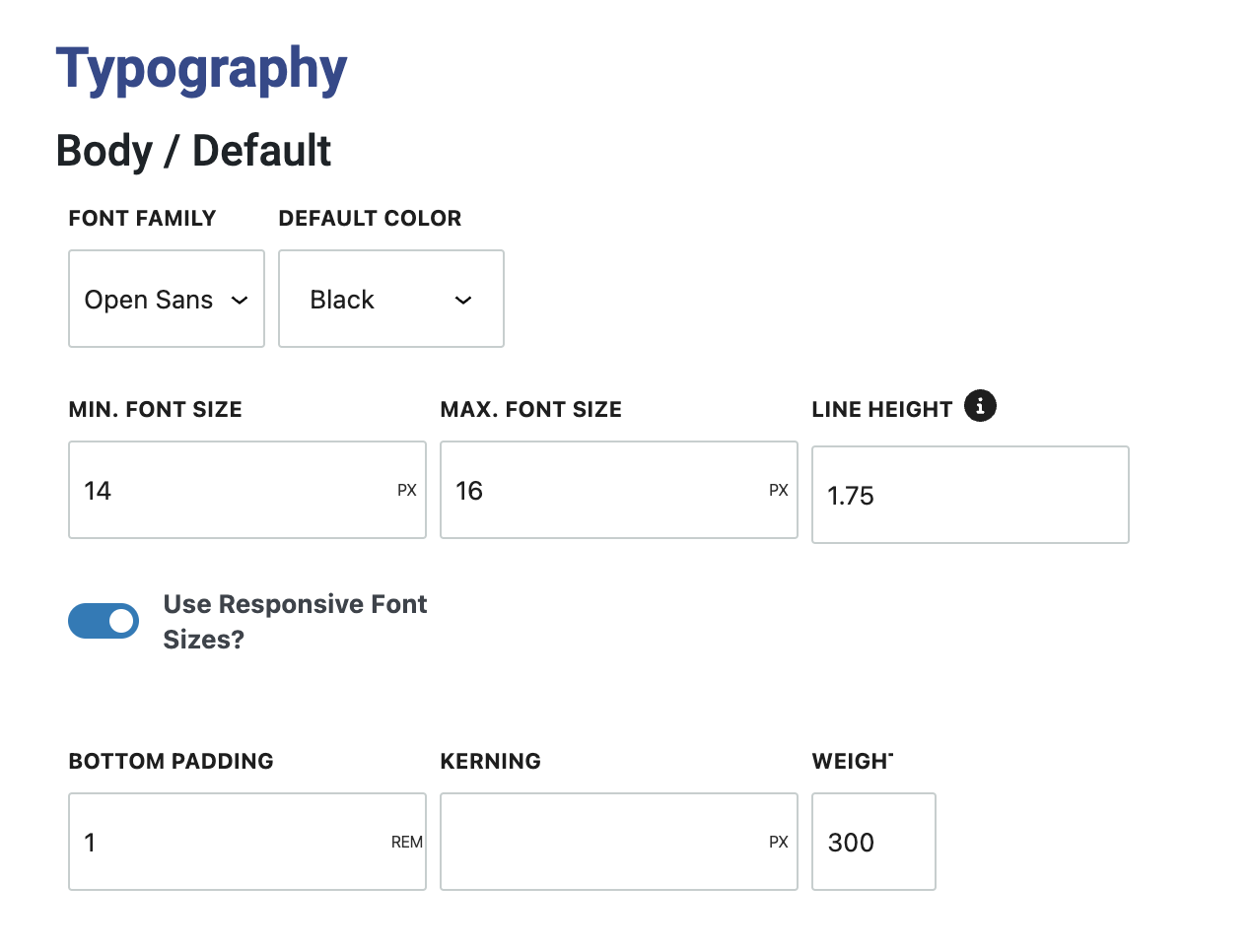
Body / Default
Paragraph text default styles in Refoundry define the standard appearance of all body text across your website, set most commonly in Paragraph Blocks, but throughout many other elements that utilize this common fallback.
These settings allow you to customize various aspects of your paragraph text to ensure a consistent and readable design that aligns with your site’s overall visual identity. By setting these defaults, you create a unified look for your content, enhancing both user experience and brand consistency.
Font Family: Choose a font family from the options you’ve set up in your font settings. This will be the default font used for all paragraph text on your site.
Default Color: Select the default color for paragraph text. This color will apply to all body text unless overridden by specific block settings.
Font Size: Enter the default font size for paragraph text. You can specify the size in various units, including pixels, ems, rems, percentages, viewport height (vh), or viewport width (vw), allowing for flexible and responsive typography.
Line Height: Set the space between lines of text, measured in ems. Proper line height ensures that your text is easily readable and visually balanced.
Responsive Font Sizes: Enable Bootstrap responsive font sizing to automatically adjust the font size based on the screen size. This setting allows you to define a minimum and maximum font size to ensure optimal readability across different devices.
Bottom Padding: Define the default space beneath each paragraph block, measured in ems or rems. This spacing helps maintain visual separation between paragraphs and can be adjusted within individual Paragraph Block settings.
Kerning: Adjust the spacing between letters, also known as letter spacing. This can be set in ems, rems, or pixels to refine the text’s appearance and improve readability.
Weight: Set the boldness or thickness of the font, known as the font weight. The weights available for selection must be loaded in your Font Settings, allowing you to choose the appropriate level of boldness for your paragraph text.
More about
Global StylesHeading Styles
Heading styles in Refoundry give you complete control over the appearance of your site’s headings, from H1 to H6. These settings allow you to customize the font, size, weight, and other styling options for each heading level, ensuring a consistent and visually appealing hierarchy throughout your website. By setting defaults for each heading level, you create a clear structure for your content, making it easier for users to navigate your site and for you to maintain a cohesive design.
You can also set an unlimited number of alternative heading styles to select from throughout out your website. When you define these heading styles, they populate the heading style drop-down in various block settings, such as the Heading Block and Accordion Block, allowing you to easily apply consistent styles across your site.
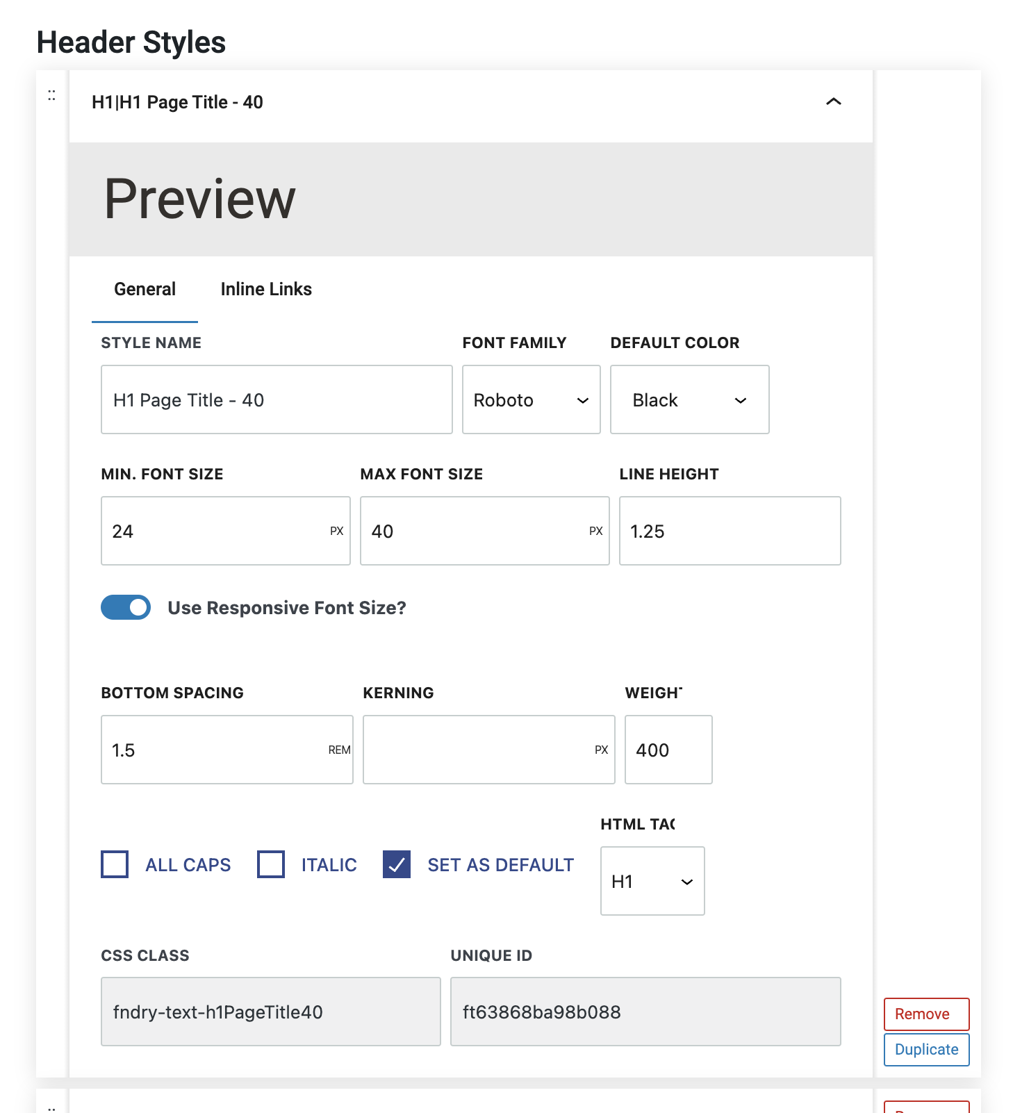
Preview: This feature provides a live preview of how your heading will look with the applied styles, allowing you to make adjustments before finalizing your settings.
General Tab: This is where you set all the typeface settings for your heading, including font family, size, weight, color, line height, and spacing. These settings control the basic appearance of your headings.
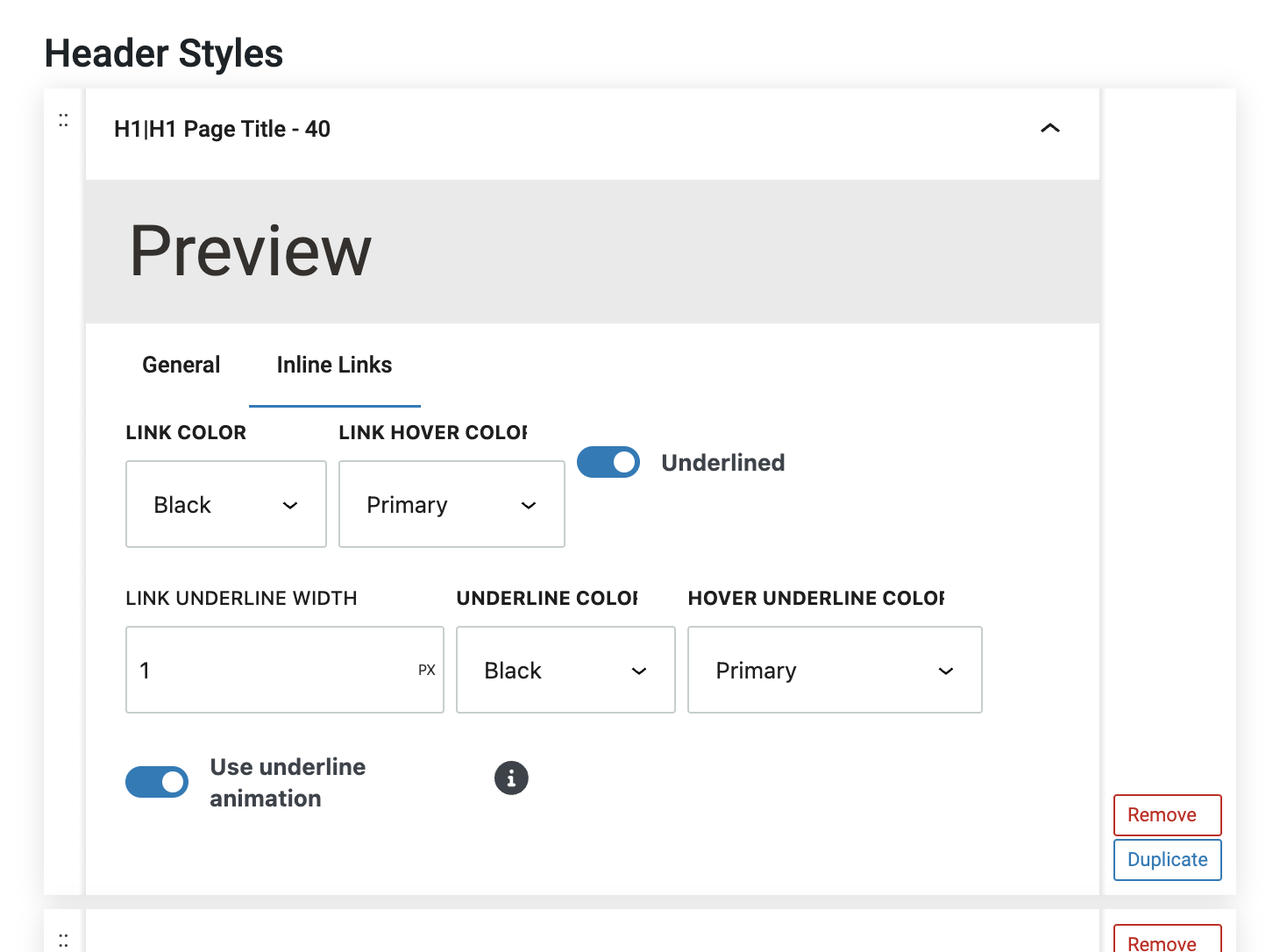
Inline Links Tab: In this tab you can define the styles for any linked text within your headings. This is useful for ensuring that linked text within your headings stands out appropriately, without disrupting the overall design.
Style Name: This is an arbitrary name that you assign to each heading style. This name will appear in the styles drop-down menu of the Heading Block and other blocks that come with headings, such as the Accordion Block. The Style Name also informs the utility class that is automatically generated for use in your CSS.
All the Same Fields as the Default Body Text: Just like with paragraph text, you can customize various properties such as font family, size, color, line height, kerning, and weight for your headings. These settings ensure that each heading level is styled appropriately according to your design needs.
All Caps: This option forces any text entered in the heading to be displayed in all uppercase letters, regardless of how it was originally typed. This can be useful for creating a more impactful or formal heading style, and to make sure heading consistency isn’t lost when many users are managing content.
Italic: Enabling this option forces the heading text to be italicized, adding emphasis or a stylistic flair depending on the design requirements.
Set as Default: This setting indicates that the selected heading style should be the default style for a specific heading level (H1 to H6). Once set as the default, this style will automatically be applied to all headings of that level across your site, unless manually overridden.
HTML Tag: The HTML Tag field specifies which heading level (H1 through H6) the style is the default for. This ensures that your chosen style is correctly applied to the appropriate heading tags in your HTML structure, supporting both design and SEO best practices.
CSS Class: The CSS Class field automatically generates a utility class based on the Style Name. This class can be used to apply the same heading style to other elements or in custom CSS for more advanced styling control.
More about
Global StylesText Styles
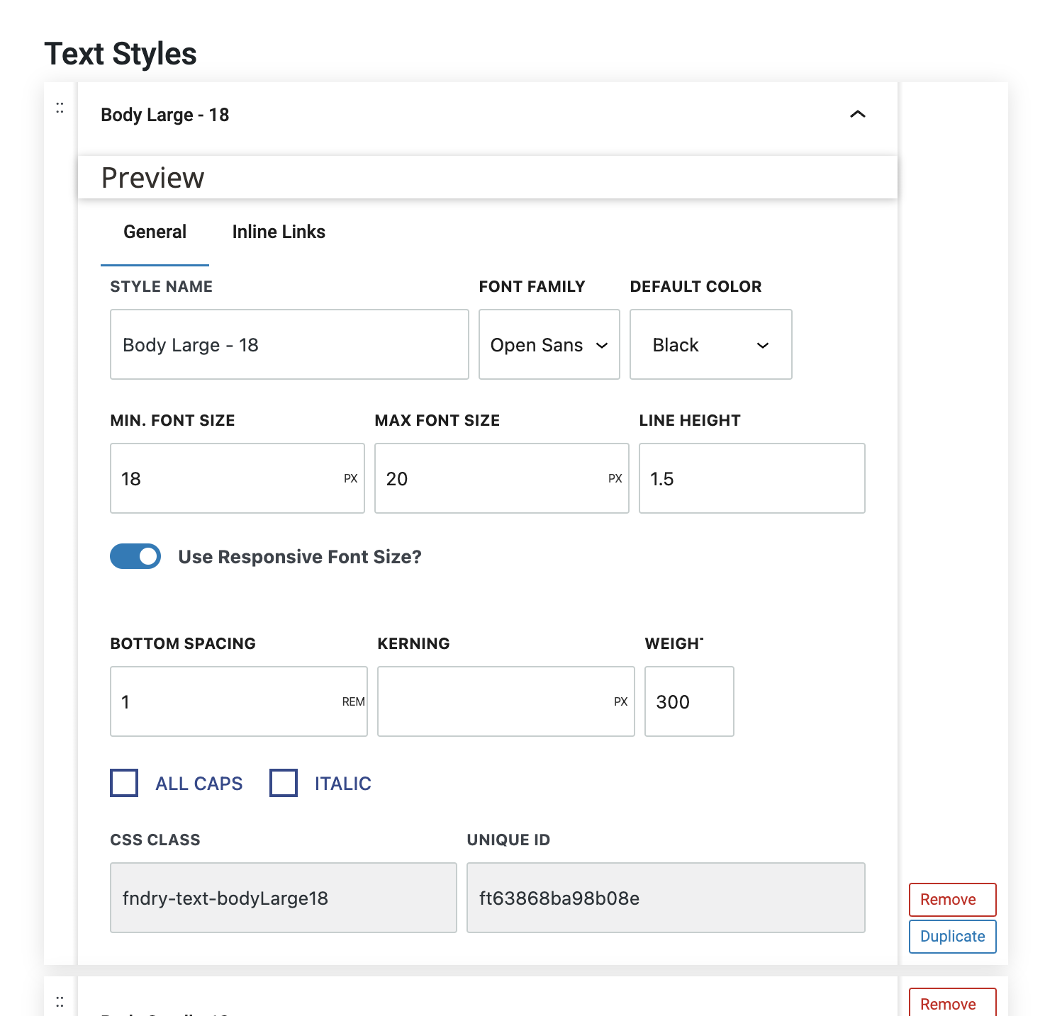
Text styles in Refoundry allow you to create alternative styles for your text elements beyond the default paragraph text style. These custom styles let you define different fonts, sizes, weights, colors, and other typographic attributes, offering flexibility in how you present specific content.
By setting up alternative text styles, you can easily apply unique formatting to different sections of your site, while still maintaining overall design consistency. For example, you might create an alternative paragraph style that stands out from regular paragraphs for section intros. Rather than fiddle with the typography at the block level, you can just create a style for this and apply it from the drop-down menu.
More about
Global StylesInline Links
The Inline Links settings in Refoundry allow you to customize the appearance of linked text within Paragraph and Heading blocks. These settings provide specific control over how links look within these blocks, overriding the default link styles set in the Button & Link Styles settings area.
Link Color: This determines the default color of linked text within your Paragraph and Heading blocks. It allows you to choose a color that complements your overall design, ensuring that links are noticeable without clashing with the surrounding text.
Link Hover Color: This defines the color of the linked text when a user hovers over it. This color change provides visual feedback to users, indicating that the text is clickable. It’s important to choose a hover color that contrasts well with the default link color to make the interaction clear.
Underlined: This lets you decide whether linked text should be underlined. Underlining is a common visual cue that text is a link, and enabling this option can improve accessibility and usability by making links more apparent to all users.
Link Underline Width: If you choose to underline your linked text, this setting allows you to specify the width of the underline. The width can be measured in pixels, ems, or rems, giving you flexibility in how prominent you want the underline to be. A thicker underline can make links stand out more, while a thinner underline might provide a subtler effect.
Underline Color: This field determines the color of the underline beneath the linked text. You can select a color that either matches or contrasts with the link color, depending on your design preference. The underline color can help reinforce brand identity or enhance the visibility of links.
Hover Underline Color: This specifies the color of the underline when the linked text is hovered over. This setting allows for dynamic styling, where the underline color changes on hover, adding a layer of interactivity to your links. This can be particularly useful for drawing attention to links when a user is interacting with them.
Use Underline Animation: This provides an advanced styling effect where the underline animates from left to right when the link is hovered over. This animation only appears if the Underlined option is selected. When this effect is enabled, the underline is not shown in the default state; it only appears during the hover action. This creates a sleek, modern effect that can make your links feel more interactive and engaging. However, if you prefer the underline to be always visible, you should avoid using this animation and stick with the standard underline option.
More about
Global Styles


