Component Library
Responsive UX components, ready to build.
Customizable Starter Components
We’ve created a big library of professionally designed, fully responsive component layouts that you can drop into your Refoundry projects – or fetch with our AI helper! Each can be turned into a Reusable Component Block, and fully customized to suit your brand and content.
Banners
Choose from a variety of popular page (and post) header layouts that will meet UX and SEO goals. Banners feature different combinations of headings, images, supporting text, and CTA buttons.
Explore Banners
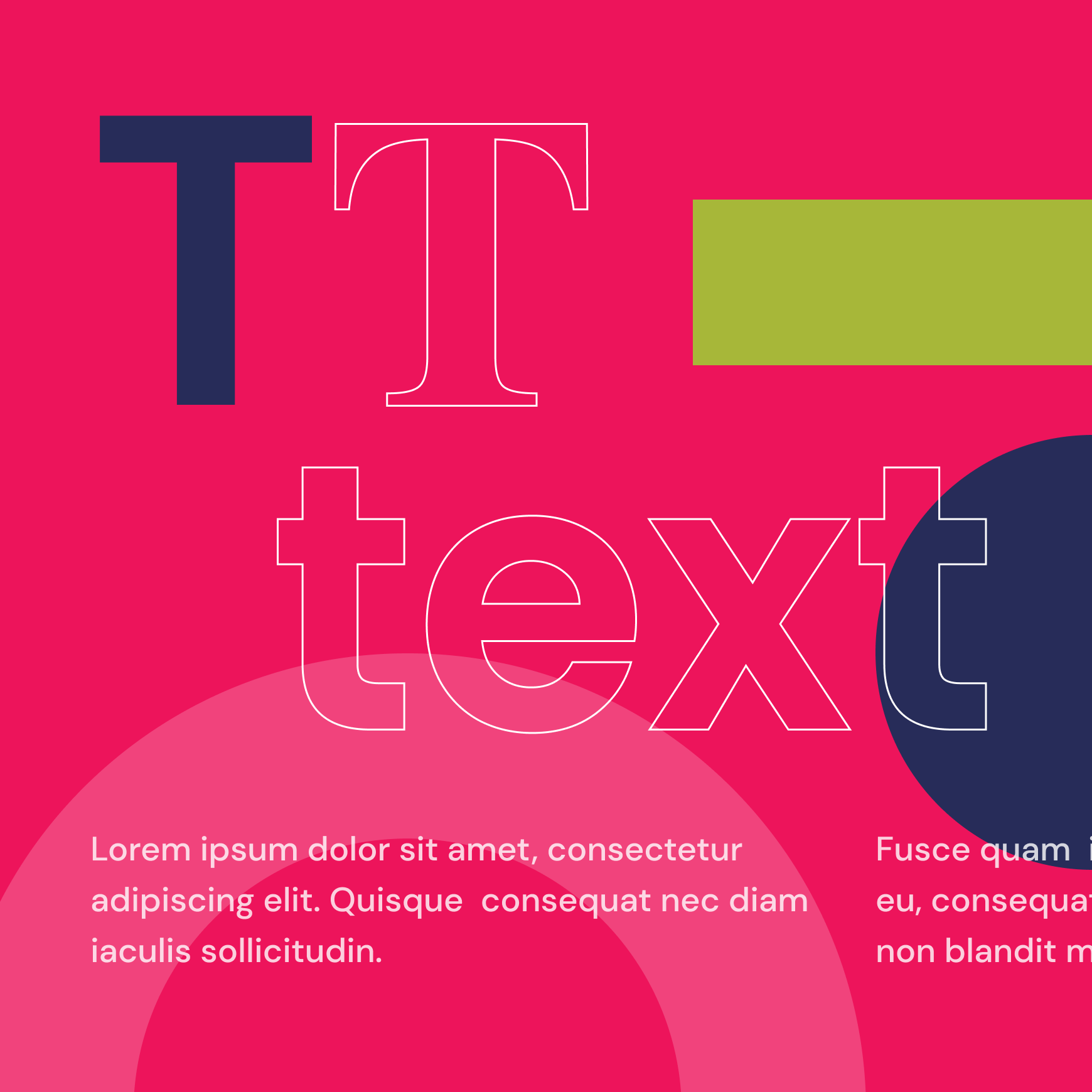
Text Sections
Text plays a vital role in conversions, and in SEO. From short intros to columns and paragraphs with a supporting image, browse these text section starters to find a strategic layout for your copy.
Explore Text SectionsGrid Sections
Grids can serve so many purposes! From presenting internal and external links to locations, values, benefits, highlights, process steps and more, you’ll find all those handy layouts right here.
Explore Grid Sections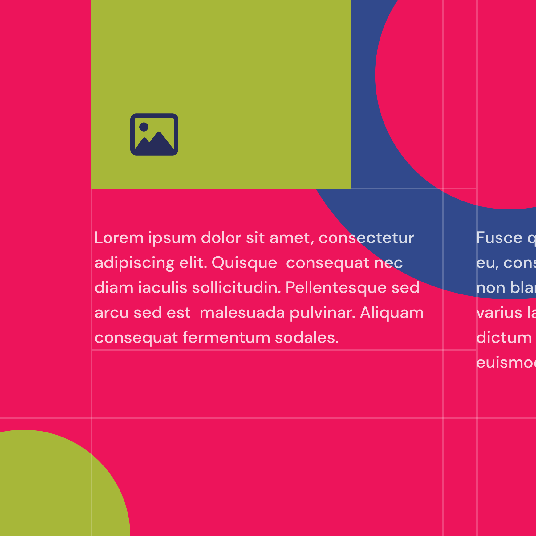
Callouts
Callouts drive engagement, and move site visitors closer to conversion. Pick one of these callout component blocks and customize it to grab your users’ attention.
Explore CalloutsPost Loops
Whether it’s creating a blog area for your site, or you want one section of a page to automatically showcase specific post content by the magic of taxonomies – you need a post loop! Here are a few popular layouts to get you started.
Explore Post Loops

Parts
Here are even more useful sections that can be quickly combined for faster builds. Like all of the other components, each is responsive and custom-crafted for common areas of your sites.
Explore PartsGet Started today!
You could be building a high-performance website right now with Refoundry or Refoundry Pro. What are you waiting for?