What is a Column Block?
The Column Block is the secondary base layer for all section layouts, following the Bootstrap Grid System like this: Container > Row > Column.
How it Works
The Column Block provides the third and final base layer for all section layouts, following the Bootstrap Grid System like this: Container > Row > Column.
The Column Block can ONLY be placed inside a Row Block, because rows exist to manage columns.
Any block EXCEPT a Row Block can be placed inside a Column Block (the Row Block can ONLY be placed inside a Container Block).
Think of a filing cabinet. It has a drawer (ie. a Container) with rails (ie. Rows) that create a framework for your hanging file folders (Columns). You have to hang those file folders from the rails, otherwise you just have a bunch of loose folders with hooks on the ends. Your folders can contain a huge variety of content like receipts, photos, maps, and manuscripts (it’s a stretch, just go with it). You can always choose to put those items loose in the drawer, or you can tuck them in file folders and hang them from the rails so they stay tidy and organized.
Block Settings
You can customize the Container Block using Style, Layout, and Settings options, giving you great flexibility in how you tailor elements to your design.
Styles Tab
Background Settings
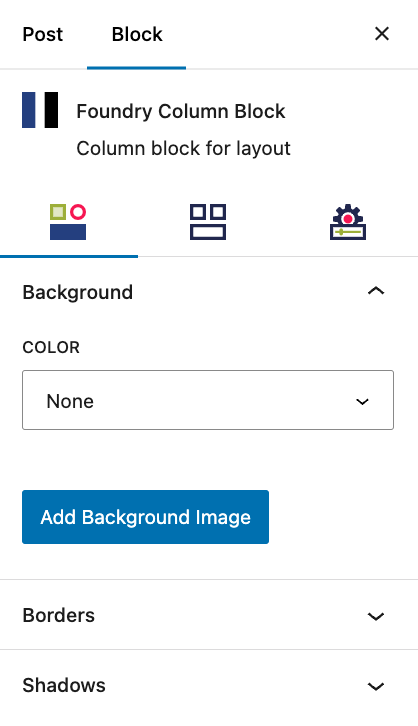
Background settings are exactly what they sound like: settings for the Column Block’s background.
Color
This option fills the entire Column Block background with the selected color. The colors you see in the dropdown options are set in the Global Styles > Colors area, in case you need to change your options.
More about
Global StylesBackground Image
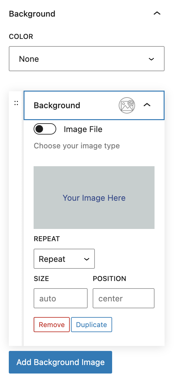
This allows you to add images as backgrounds within a Column Block, and to order those image and gradient layers.
More about
Image BackgroundsBackground Gradient
This allows you to add gradient backgrounds within the Column Block, and to order those image and gradient layers.
More about
Gradient BackgroundsBorder Settings
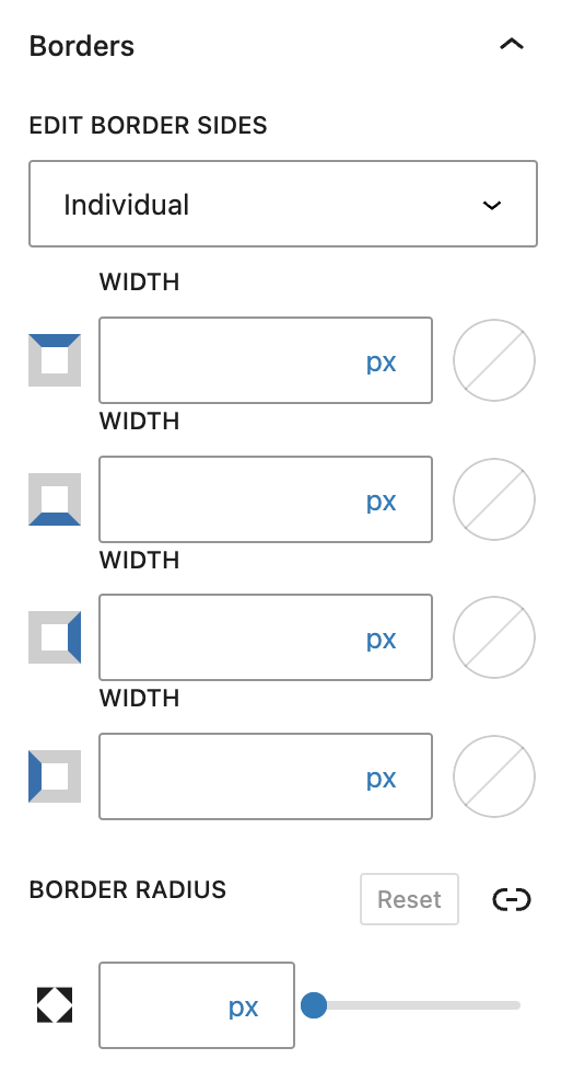
Border settings govern the borders around the Column Block.
Borders
You can create equal specifications for all of your Column Block’s borders by choosing “All,” or customize each border’s specifications by choosing “Individual.” The options are Width, Border Style, and Border Color. The color options come from your Global Styles.
More about
Borders & RadiusesBorder Radius
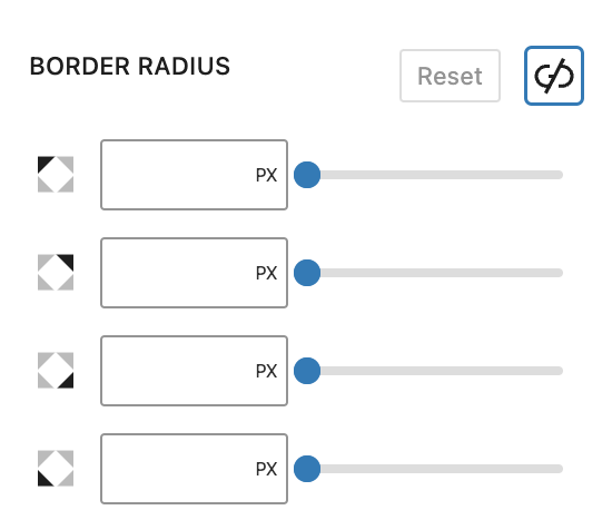
This value rounds the corners of the Column Block’s outer border edge. When enabled, you can control how much each corner of the Column Block is rounded. Use ‘Reset’ to bring everything back to zero.
More about
Borders & RadiusesBox Shadow
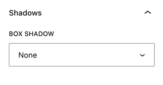
This setting lets you add shadow effect on the borders of your Column Block.
More about
Box ShadowsLayout Tab
Width Settings
These settings govern the width of the Column Block.
Column Width
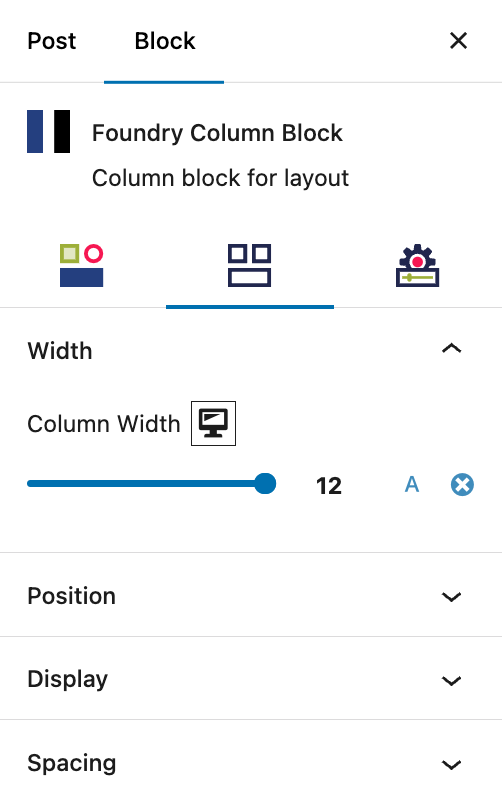
Columns use a 12-column system. The column width slider allows you to set the width of the Column Block from 1 to 12.
Assuming you’ve set your columns to 12, as long as the total value of columns is not greater than 12, the Column Blocks will align horizontally next to one another. Once a block sits greater than 12, it will automatically fall to the new row. This behaviour allows for Column Blocks to naturally create multiple rows of Column Blocks without requiring a new Row Block be added each time.
You can click on the A icon to set the column width to Auto.
More about
Auto WidthPosition Settings
These settings govern the Column Block’s position relative to surrounding page elements.
Position
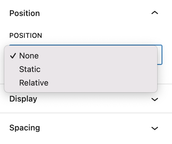
These dropdown selections for None, Static, and Relative positioning govern how the column is positioned within the surrounding page elements.
More about
PositionDisplay Settings
Description for Display settings
Block Display
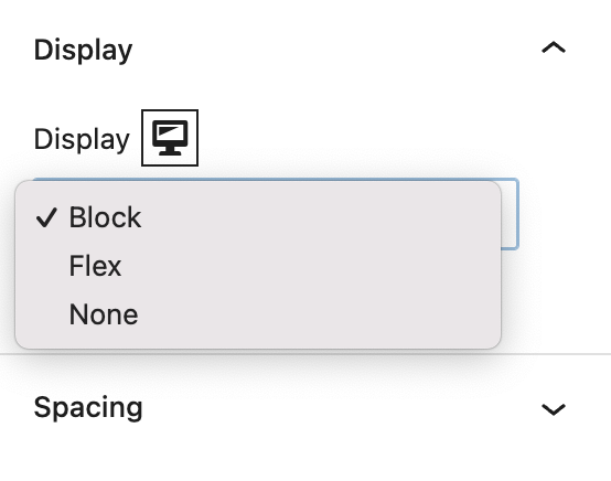
This controls how the Column Block is displayed within the Row Block, and governs the alignment or order of any child blocks. The options are Block, Flex, and None.
More about
Block DisplayFlex Display
This controls how the Column Block is displayed, and governs the alignment or order of any child blocks.
Flex Display
The element behaves like a block element and lays out its content according to the flexbox model. Options include Flex Direction (Column, Row, Column Reverse, Row Reverse), Flex Align (Start/Top, Center, End/Bottom), Flex Justify (Start/Left, Center, End/Right, Space Between).
More about
Flex DisplayNone
New copy, This controls how the Column Block is displayed, and governs the alignment or order of its child blocks as explained below.
None
This turns off the display of the Column Block and its contents, so that it has no effect on the layout (the document is rendered as though the element did not exist). This is specifically handy for making adjustments to layout and elements across desktop, tablet, and phone views.
More about
Responsive ViewsSpacing Settings
Description for Spacing settings
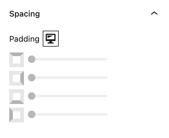
Padding
These top, right, bottom, and left sliders, with a range from 0 to 12, control the amount of interior space there is between the edges of the Column Block and its contents.
More about
SpacingSettings Tab
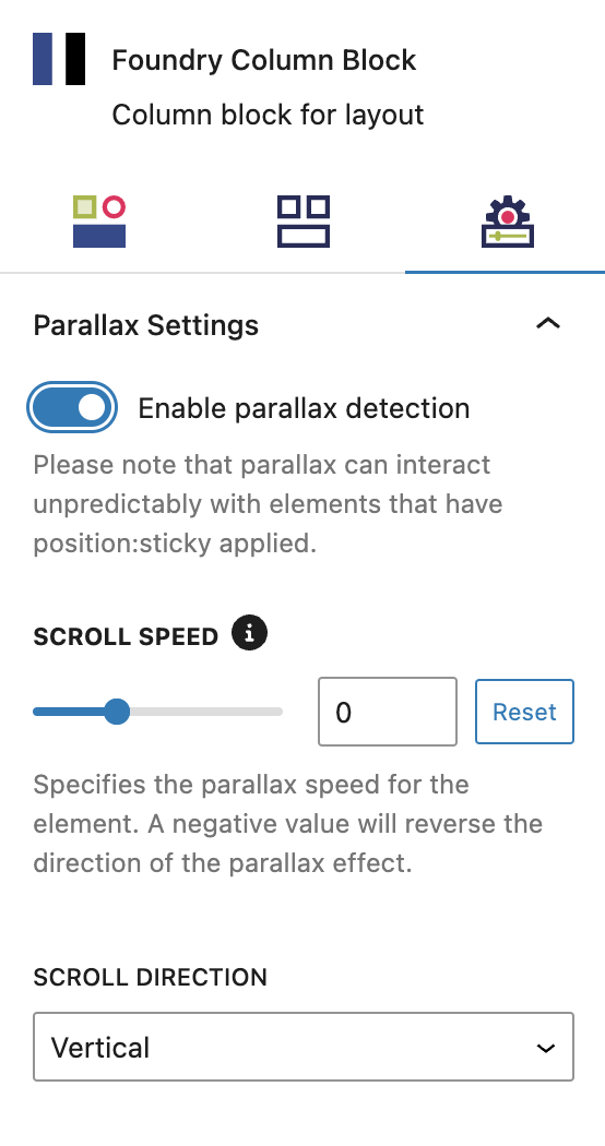
Parallax Settings
New text
Parallax
These settings control parallax on your animations.
Scroll Speed controls the speed with which this container will scroll through the viewport. The value “0” will have it move at the standard default speed, negative numbers more slowly and positive numbers more quickly
Scroll Direction controls which direction this container scrolls through the viewport, the options are vertical and horizontal
More about
ParallaxAdvanced Settings
These settings are only accessible to Pro users (with the exception of HTML anchors), and also only accessible to site admins.
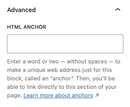
HTML Anchor
This allows you to enter a unique ID identifier, so you can create a URL for this specific Column Block within the page.
More about
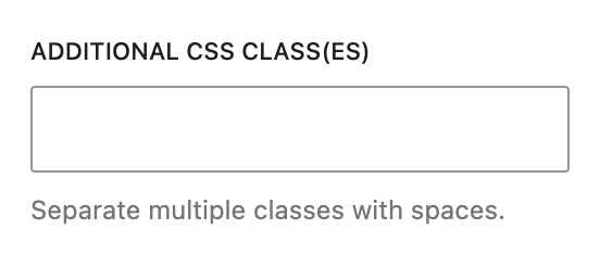
HTML AnchorsAdditional CSS Class(es)
This allows you to enter a unique Class identifier, to facilitate custom CSS targeting within the theme for custom development.
It also enables the use of Refoundry utility classes.
More about
Theme Customizations