What is a Logo Grid Block?
As the title suggests, the Logo Grid Block displays tidy grid of image fields for presenting logos. It is a parent block that comes with Logo Grid Items to manage individual logos within the grid.
How it Works
You can build a logo grid by creating a layout with columns and rows from scratch, but a Logo Grid Block is quicker and more efficient way of doing this. It is the go-to block for areas like certifications, partners, funders, ‘as seen in’ media logos, or integrations. If you need a more complex grid that allows for more content, see the Grid Block.
Block Settings
You can customize the Logo Grid Block using Style, Layout, and Settings options, giving you great flexibility in how you tailor elements to your design.
Styles Tab
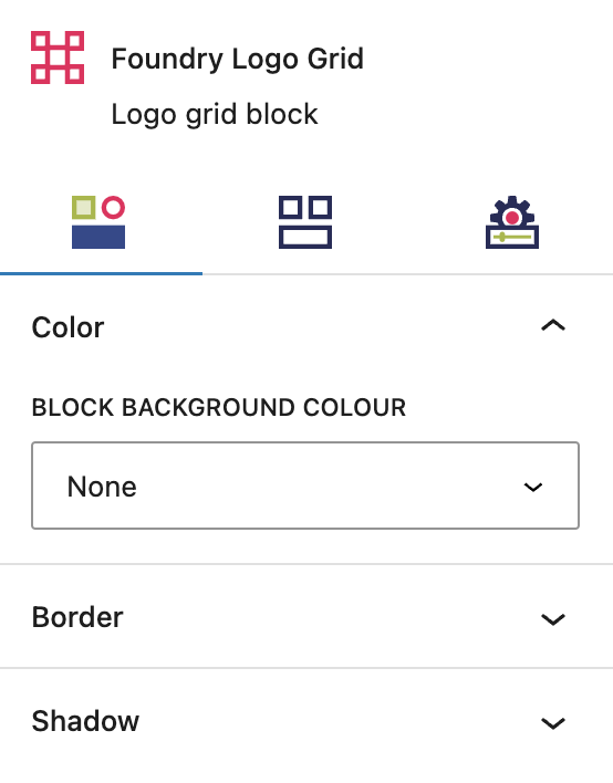
Color Settings
These settings govern the color options for all items within your Logo Grid Block.
Block Background Color
This setting allows you to select a background colour for all items in the grid, from your palette(s), as configured in Global Styles > Colors.
More about
ColorsBorder Settings
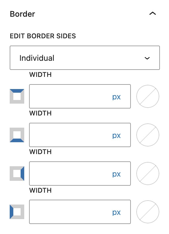
These settings allow you to create and customize borders around all logos within your grid.
Borders
You can create equal specifications for all of your Logo Grid Items’ borders by choosing “All,” or customize each logo border’s specifications by choosing “Individual.” The options are Width, Border Style, and Border Color. The color options come from your settings found under Global Styles > Colors.
More about
Borders & RadiusBorder Radius
This value rounds the corners of the outer border edges for each item in the grid. When enabled, you can control how much each corner is rounded. Use ‘Reset’ to bring everything back to zero.
More about
Borders & RadiusShadow Settings
These settings allow you to create and customize shadows for all items in your logo grid.
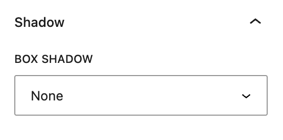
Box Shadow
This setting lets you add shadow effect on the borders of your Logo Grid Items.
More about
Box ShadowsText Settings
These settings are only available for Logo Grid Items, ie. each item in the grid. They are only applicable to that item.
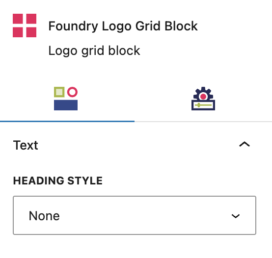
Heading Style
You can choose a different heading style for individual items in the grid. The options will always be default styles that you’ve configured for your headings in the Global Styles > Typography area.
More about
Global StylesLayout Tab
Grid Layout Settings
These settings allow you to manage the layout of your entire Logo Grid at once.
Grid Layout
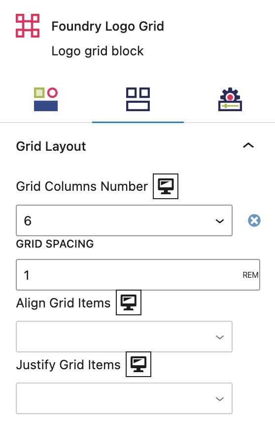
Grid Columns Number
Select the number of columns in your grid, between 1 and 6. If you choose 3, you will create a logo grid that has three items across the page, and as many rows as you need.
Grid Spacing
This numeric value controls the spacing between all logos in the grid.
Align Grid Items
This setting allows you to control the vertical spacing of all items in your logo grid.
Justify Grid Items
This setting allows you to control the horizontal spacing of all items within your logo grid.
More about
Display SettingsBlock Layout Settings
These settings allow you to manage the layout of all of the individual blocks within your Logo Grid at once.
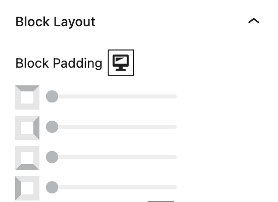
Block Padding
These top, right, bottom, and left sliders, with a range from 0 to 12, control the amount of interior space there is between the edges of the Logo Grid Block and its contents.
More about
SpacingAlign Block Contents
This setting allows you to control the vertical spacing of the content within your individual blocks, ie. the logo and any heading text.
More about
Display SettingsJustify Block Contents
This setting allows you to control the horizontal spacing of the content within your individual blocks, ie. the logo and any heading text.
More about
Display SettingsAdvanced Settings
These settings are only accessible to Pro users (with the exception of HTML anchors), and also only accessible to site admins.
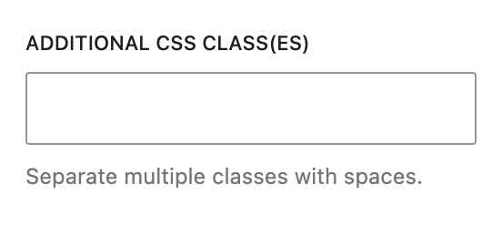
Additional CSS Class(es)
This allows you to enter a unique Class identifier, to facilitate custom CSS targeting within the theme for custom development.
It also enables the use of Refoundry utility classes.
More about
Theme Customizations