What are Container Widths?
Container Widths in Refoundry control how much horizontal space a Container Block occupies within a layout. They determine whether a container stretches to fill the entire width, adjusts to fit its content, or follows custom-defined dimensions, allowing for flexible and responsive design across various screen sizes.
How it Works
In Refoundry, Container Width settings offer flexible control over how a block occupies space within a layout. These settings allow Container Blocks to adapt to both content and screen size, making them essential for responsive designs. You can choose from several options depending on the layout needs.
For instance, 100% Width stretches the container to fill the entire available space, while Fit Content ensures it wraps tightly around its inner content. Max Content allows the container to expand to fit the largest content it contains, whereas Min Content keeps the container as small as possible while still displaying all content. Auto adjusts the container based on the surrounding context and content on the page, and Unset removes any predefined width, allowing it to inherit from the layout. For more precise control, the Custom option lets you define the width using units like pixels, percentages, or viewport width.
These width settings enable Container Blocks to behave responsively, ensuring that layouts remain flexible and visually consistent across devices.
Container Block Settings
These are the Width settings available for all Container Blocks.
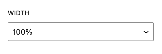
100%
The 100% Width setting in Refoundry’s Container Block ensures that the block spans the entire width of its parent container or, if it’s the parent container, the entire width of the viewport. This setting stretches the block to occupy the full available horizontal space, without exceeding the boundaries of its containing element.
The 100% width is flexible, adjusting automatically as the viewport size changes. This is particularly useful for full-width sections, page headers, or containers that need to adapt to different screen sizes.
More about
Global Styles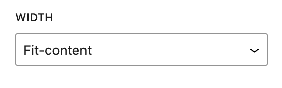
Fit Content
The Fit Content setting in a Container Block adjusts the width of the block to match exactly the width of its content. Instead of stretching to fill the full width of its parent container or viewport, the block will only occupy as much horizontal space as its inner content requires. This makes the block tightly wrap around the elements it contains, ensuring no excess horizontal space is included.
Use Fit Content when you want the Container Block to closely fit around its content, like for buttons, small content sections, or labels. It’s ideal when you need the block to maintain a compact size without expanding unnecessarily, allowing for a clean and precise layout. The width of the block will dynamically adjust as the content inside grows or shrinks, making it a flexible option for responsive designs.
More about
Global Styles
Max Content
The Max Content setting in a Container Block ensures the block takes up the maximum width required by its content. The block will expand as much as needed to fit all its content on a single line, but it won’t stretch beyond the size of the content.
Unlike Fit Content, which wraps tightly around its content, Max Content allows the block to expand fully based on the longest content within it.
Use Max Content when you want the Container Block to fully accommodate longer content or text, ensuring it does not get wrapped or cut off. This is useful for headings, long text blocks, or elements that need to stay on one line without exceeding the content’s natural size. The width will adjust automatically based on the largest content inside the block, maintaining a flexible and responsive layout.
More about
Global Styles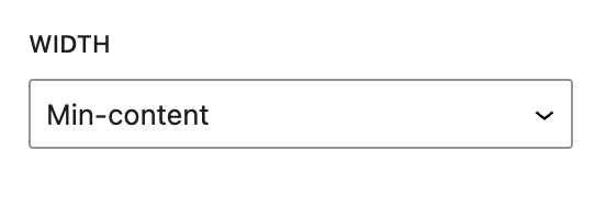
Min Content
The Min Content setting in a Container Block adjusts the block’s width to the smallest possible size that still accommodates the content without overflow. It ensures the block is only as wide as its narrowest content, meaning the content may wrap to fit within the minimum space required.
Use Min Content when you want the Container Block to take up the least amount of space while still displaying all the content. This is ideal for situations where you want to minimize the width of the block and allow content, like text, to wrap over multiple lines. It helps create compact layouts and can be particularly useful for blocks with smaller elements like buttons or labels.
More about
Global Styles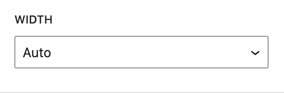
Auto
The Auto setting in a Container or Column Block allows the block’s width to be determined automatically based on its content and the surrounding context. The block will adjust to fill the available space, but without explicitly defining a fixed width, making it responsive to its parent container and content.
Use Auto when you want the block to adapt fluidly to its content and the layout. It’s useful for responsive designs where the block should expand or contract depending on the space available and the size of the content, without setting a fixed width. This setting works well in flexible layouts, ensuring the block takes up the appropriate amount of space in different screen sizes or parent containers.
More about
Global Styles
Unset
The Auto setting in a Container or Column Block allows the block’s width to be determined automatically based on its content and the surrounding context. The block will adjust to fill the available space, but without explicitly defining a fixed width, making it responsive to its parent container and content.
Use Auto when you want the block to adapt fluidly to its content and the layout. It’s useful for responsive designs where the block should expand or contract depending on the space available and the size of the content, without setting a fixed width. This setting works well in flexible layouts, ensuring the block takes up the appropriate amount of space in different screen sizes or parent containers.
More about
Global Styles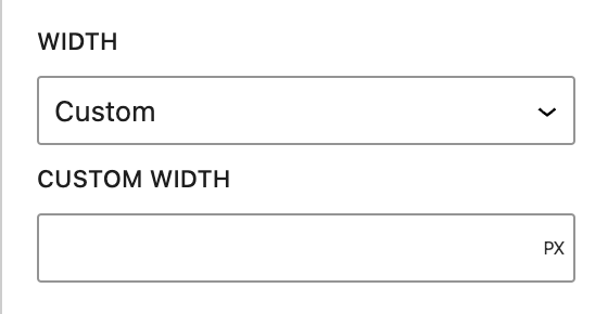
Custom
The Custom setting in a Container Block allows you to manually define the block’s width using specific measurement units. With this option, you can set an exact width in pixels, percentage, em, rem, or viewport width (VW), giving you precise control over the block’s dimensions.
In the Custom Width Field, you enter the desired dimension and unit:
Pixels (px): Defines a fixed width
Percentage (%): Sets the width relative to its parent container
Em/Rem: Relative to the parent element or root font size, respectively
VW: Sets the width as a percentage of the viewport width
Use Custom when you need precise control over the Container Block’s width, such as setting specific pixel values for exact layouts or using responsive units like percentage or viewport width for adaptable designs. This setting provides the most flexibility for controlling how the container fits into your design.
More about
Global Styles