What are Responsive Block Settings?
Responsive Block Settings in Refoundry allow you to set device-specific values for individual fields within blocks. This enables you to customize layouts, spacing, and other design elements specifically for desktop, tablet, and phone views.
How it Works
When editing a block in Refoundry, you’ll notice toggle options that allow you to switch between desktop, tablet, and phone views. For each view, you can set unique values for various block properties such as Padding, Margin, Width, and more. This means you can, for example, increase the padding around on a container block on desktop for a spacious look, while reducing it on mobile to save space and improve readability.
These settings work in conjunction with WordPress’ responsive preview feature, providing a more granular level of control. While the responsive previews simply allow you to see how your design adapts to different screen sizes, the Responsive Block Settings enable you to fully adjust individual elements specifically for each device type. This level of customization ensures that your site not only looks good but also provides an optimal user experience, regardless of the device being used.
For Container Blocks, you can customize the Padding and Margin for desktop, tablet, and phone views, ensuring that the spacing around your content adapts perfectly to each device.
Row Blocks offer responsive control over all Flex Display options, allowing you to adjust the alignment, distribution, and wrapping of content within a row based on the screen size. This ensures that your layout remains visually consistent and user-friendly across all devices.
For Column Blocks, you can set custom Column Widths, as well as adjust Padding, Margin, and all display options, including flex settings. These responsive controls allow you to fine-tune the layout and spacing of columns, ensuring that your design is optimized for desktop, tablet, and phone views.
In the Query Template Block, you have responsive options for post Width, post Flex Display, and post Padding and Margin. You can also customize how individual post elements are displayed using responsive flex settings. These options ensure that posts within a Query Block’s loop are consistently styled and accessible across all devices.
The Navigation Block includes responsive settings for Menu Display, Flex Display, and Orientation options. These controls allow you to adapt your navigation menus for different screen sizes, ensuring they remain intuitive and easy to use on desktops, tablets, and phones.
For Accordion Blocks, you can adjust Padding and Margin settings, ensuring that these elements look great and function well on any device.
The Logo Grid Block provides responsive controls for Padding, Margin, and Alignment options, and the number of logos displayed per row, allowing you to optimize the presentation of logos across different devices.
In the Slider Block, you can adjust the number of slides displayed per view based on the device, ensuring that your sliders are effective and visually appealing on all screen sizes.
The Slideout Block offers responsive settings for grid columns, allowing you to customize the layout and spacing of slideout content to suit different screen sizes.
By utilizing Responsive Block Settings, you can create a highly tailored design that adapts perfectly to any screen size, making your site both visually appealing and user-friendly across all devices.
Responsive Block Settings
These are the responsive settings available in the various blocks. Each one will give you the ability to customize elements for that view.
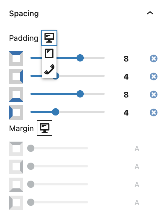
Preview Toggle
Desktop View: When in desktop view, you can adjust settings specifically for larger screens.
Tablet View: Switching to tablet view lets you see how your content will adapt to medium-sized screens. You can customize elements to ensure a comfortable browsing experience on touch-based devices, where space is more limited than on desktops.
Phone View: In phone view, you can tailor your design to fit the smaller screens of smartphones.
More about
Global Styles