What are Display Settings?
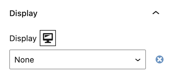
Display Settings in Refoundry are options within block settings that control how elements are rendered and arranged on the page. These settings correspond to CSS display properties, specifically Block, Flex, and None, which determine the layout and visibility of content in your site.
How it Works
Display Settings are essential for managing the layout and structure of a page. They dictate how elements are displayed, either as standalone blocks, flexible layouts, or hidden content. By adjusting these settings, you can control the positioning and visibility of elements, ensuring your design is both functional and visually appealing.
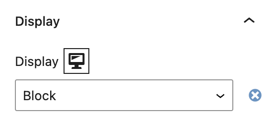
Block: This Display Setting renders an element as a block-level element. In Refoundry, this option is available only on the Column Block. When set to Block, the element will take up the full width of its container, starting on a new line and stacking vertically with other block-level elements. Use the Block setting on Column Blocks when you want the content within to stand on its own line, such as organizing text or images into distinct sections. Most Refoundry blocks are set up as block-level elements by default, ensuring a structured layout.
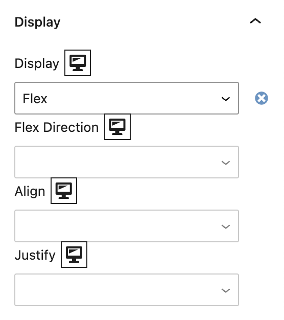
Flex: This Display Setting enables a flexible box layout, where child elements can be aligned and distributed within a parent container. This setting is available on Row Blocks, Column Blocks, Query Post Template Blocks, and Navigation Blocks, allowing for responsive and dynamic layouts. Use the Flex setting to arrange elements in rows or columns with flexible spacing and alignment. It’s ideal for creating navigation bars, aligning content in columns, or organizing post templates where elements need to adjust based on screen size or content. For more details on how to effectively use Flexbox in your designs, you can refer to the official Flexbox Layout documentation.
None: The None display setting completely hides an element from the page. In Refoundry, this option is available only on the Column Block. When set to None, the element is not rendered and does not occupy any space in the layout. Use the None setting on Column Blocks when you want to temporarily hide content without removing it from the code. This is useful for creating interactive designs where certain content needs to be hidden or revealed based on screen size or if you want to hide an unused section in one instance of a Component Block without deleting it from the Editor.
Display Settings
These are the settings available in the Display tab for relevant blocks.
Block
When a Column Block within a standard Bootstrap grid system is set to `display: block`, it overrides the grid’s default `display: flex` behavior, causing the column to act as a block-level element. This makes the column take up the full width of its parent container, stacking vertically with other block-level elements, and disrupting the grid’s layout.
By switching the display setting to Block, the column loses the flexible alignment and responsive features provided by Flexbox, meaning it will no longer sit side-by-side with other columns in the grid. Instead, the column will occupy its own line, potentially leading to layout inconsistencies. This setting should be used carefully when you need a column to break out of the grid structure for specific design purposes.
More about
Global StylesFlex
When a Column Block in a Bootstrap grid system is set to Flex, it enables Flexbox for the arrangement of the blocks within the column, not the column itself. This setting makes the column a flex container, allowing for precise control over how its child elements are aligned, spaced, and distributed.
With Flex, the blocks inside the column can be arranged horizontally or vertically, centered, or spaced evenly, depending on the flex properties applied. This enhances the layout flexibility for the content within the column while maintaining the column’s position and responsive behavior within the overall grid structure.
Row Blocks, Column Blocks, Query Post Template Blocks, and Navigation Blocks are flex containers by default, so they will only have Flex Direction, Align and Justify options to select from as a result.
Keep reading the next sections for more explanation of Flex Direction, Align and Justify settings.
More about
Global StylesFlex Direction
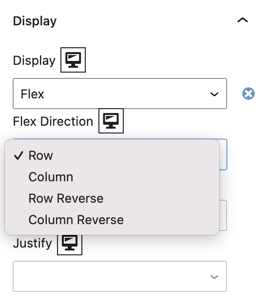
Flex Direction is a CSS property used in Flexbox layouts to define the direction in which the flex container’s child elements are placed. It determines whether the elements are laid out horizontally or vertically, and in which order. In Refoundry, when Flex is applied to a block, you can control the layout direction of the blocks it contains using the Flex Direction setting.
Row (default): This setting arranges the child elements in a horizontal line from left to right, which is the default behavior for Flexbox. Use row when you want elements to be aligned side by side in a horizontal layout, such as in a navigation menu or a series of buttons.
Column: This setting arranges the child elements in a vertical line from top to bottom. Use column when you want elements to stack on top of each other vertically, such as a stack of containers or content blocks.
Row Reverse: This setting arranges the child elements in a horizontal line but in reverse order, from right to left. Use row reverse when you need to reverse the order of elements in a horizontal layout, such as for right-to-left languages or specific design needs. This is handy when using the Responsive Block Settings controls to adjust layouts between different screen sizes.
Column Reverse: This setting arranges the child elements in a vertical line but in reverse order, from bottom to top. Use column reverse when you need to reverse the order of elements in a vertical stack, such as for content that needs to be read from bottom to top or for specific visual effects. This is useful when using the Responsive Block Settings controls to adjust layouts between different screen sizes.
More about
Global StylesAlign Items
Align Items is a CSS property used in Flexbox layouts to control the alignment of flex container’s child elements along the cross axis (the axis perpendicular to the Flex Direction).
This property is crucial for determining how elements are positioned vertically in a row layout or horizontally in a column layout.
Start: In a Row layout this aligns the child elements at the top of the container. In a Column layout it aligns the child elements to the left of the container.
End: In a Row layout this aligns the child elements at the bottom of the container. In a column layout it aligns the child elements to the right of the container.
Center: In a Row layout this aligns the child elements vertically in the center of the container. In a Column layout it aligns the child elements horizontally in the center of the container.
Stretch (default): In a Row layout this stretches the child elements to fill the height of the container, ensuring they all have equal height. In a Column layout it stretches the child elements to fill the width of the container, ensuring they all have equal width.
More about
Global StylesJustify Content
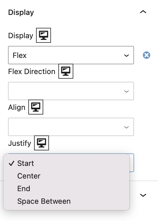
Justify Content is a CSS property used in Flexbox layouts to control the alignment of child elements along the main axis (the axis defined by the flex direction).
This property determines how the space between and around flex items is distributed within a container, making it crucial for organizing the layout in a visually balanced way.
Start: In a Row layout this aligns the child elements at the beginning (left side) of the row. In a Column layout it aligns the child elements at the top of the column.
End: In a Row layout this aligns the child elements at the end (right side) of the row. In a Column layout it aligns the child elements at the bottom of the column.
Center: In a Row layout this centers the child elements horizontally in the row. In a Column layout it centers the child elements vertically in the column.
Space Between: In a Row layout this distributes the child elements evenly across the row, with the first item aligned to the start and the last item aligned to the end, and equal space between them. In a Column layout it distributes the child elements evenly along the column, with the first item at the top and the last item at the bottom, with equal space between them.
More about
Global StylesNone
Display: none is a CSS property that completely hides an element, removing it from the page layout so it doesn’t take up any space or appear to users. In Refoundry, this setting is available for Column blocks.
When applied to a Column block, None hides the entire block and its contents, making it invisible and non-interactive. The block won’t be rendered by the browser, effectively removing it from the page – without deleting it. It also hides it in the Editor. But it’s still an option to use later, without having to recreate it.
Responsive Design: Hide content on certain devices, like large images on mobile, to optimize the user experience, by taking advantage of the Responsive Block Settings.
Staging Content: Temporarily hide sections that aren’t ready for live viewing, keeping them in the layout for future use.
More about
Global Styles