What are Color Codes?
Color codes are alphanumeric values used to represent specific colors in digital design. In the context of Refoundry, they work the same way they do in styling a website on any other website builder: they allow you to define and use precise colors, ensuring consistency and accuracy in your design elements like backgrounds, overlays, text, and buttons.
How it Works
Color codes serve as precise identifiers that tells computers the exact colors to display on screens. When you set a color using a code, the code instructs the browser on how to render that color.
By using standardized color codes, such as HEX, HSL, or RGB while styling your site in Refoundry, you ensure that the colors appear uniformly across different devices and browsers, maintaining the visual integrity of your design. This system allows for both creativity and precision, enabling you to fine-tune your site’s aesthetic while ensuring consistency and accessibility.
Color Code Settings
New content
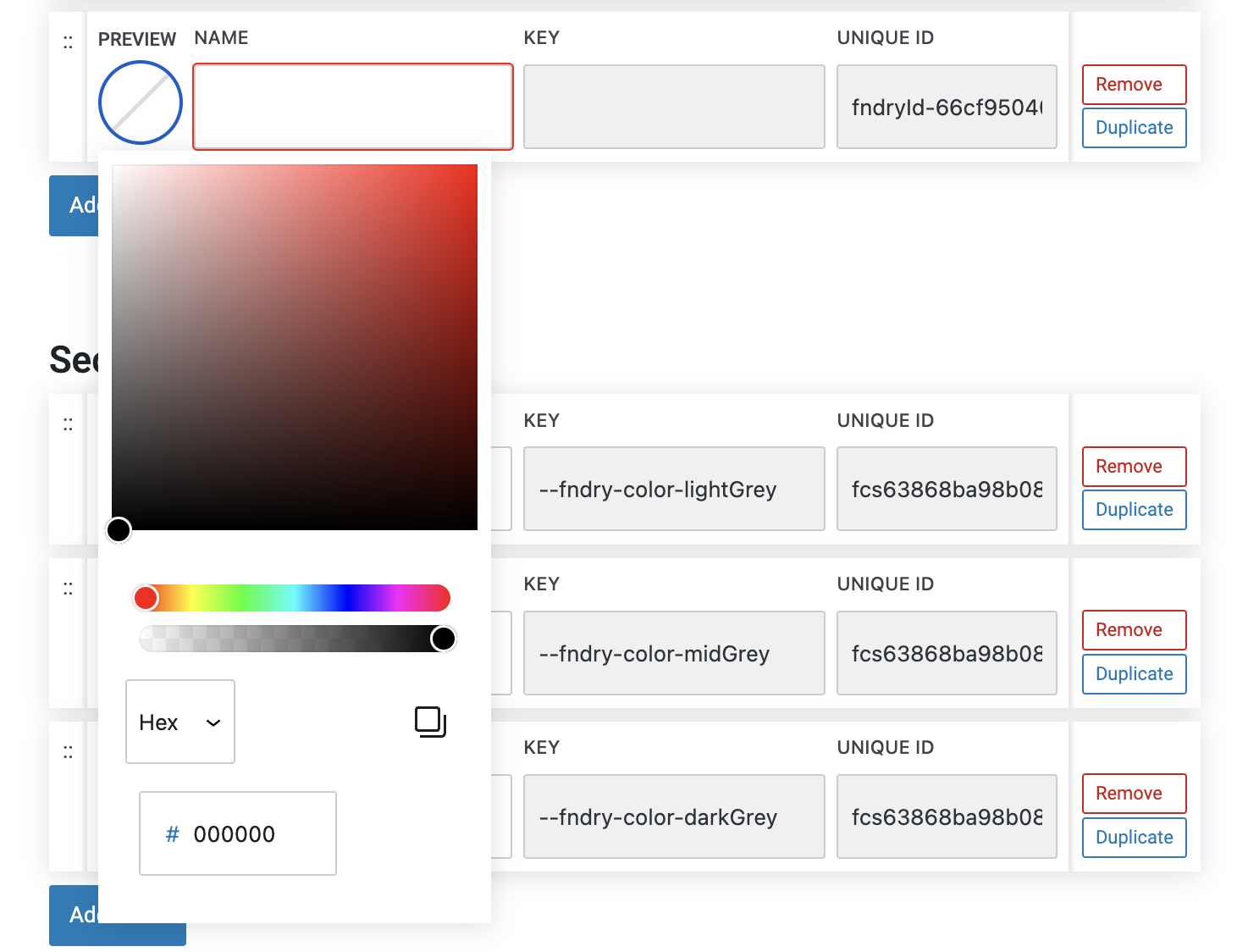
HEX Codes
HEX codes are a way to represent colors in web design using a six-character combination of numbers and letters. Each HEX code, formatted as #RRGGBB, encodes the intensity of red, green, and blue components of a color. The code is divided into three pairs, with each pair representing the level of red, green, or blue on a scale from 00 (no color) to FF (full intensity).
This format allows for over 16 million possible color combinations, ensuring precise and consistent color rendering across different devices and browsers. HEX codes are widely used in web design because they are simple, compact, and compatible with CSS, making them a standard choice for defining colors in digital projects.
You can also control the opacity of a HEX color with additional codes.
More about
Global StylesHSL Codes
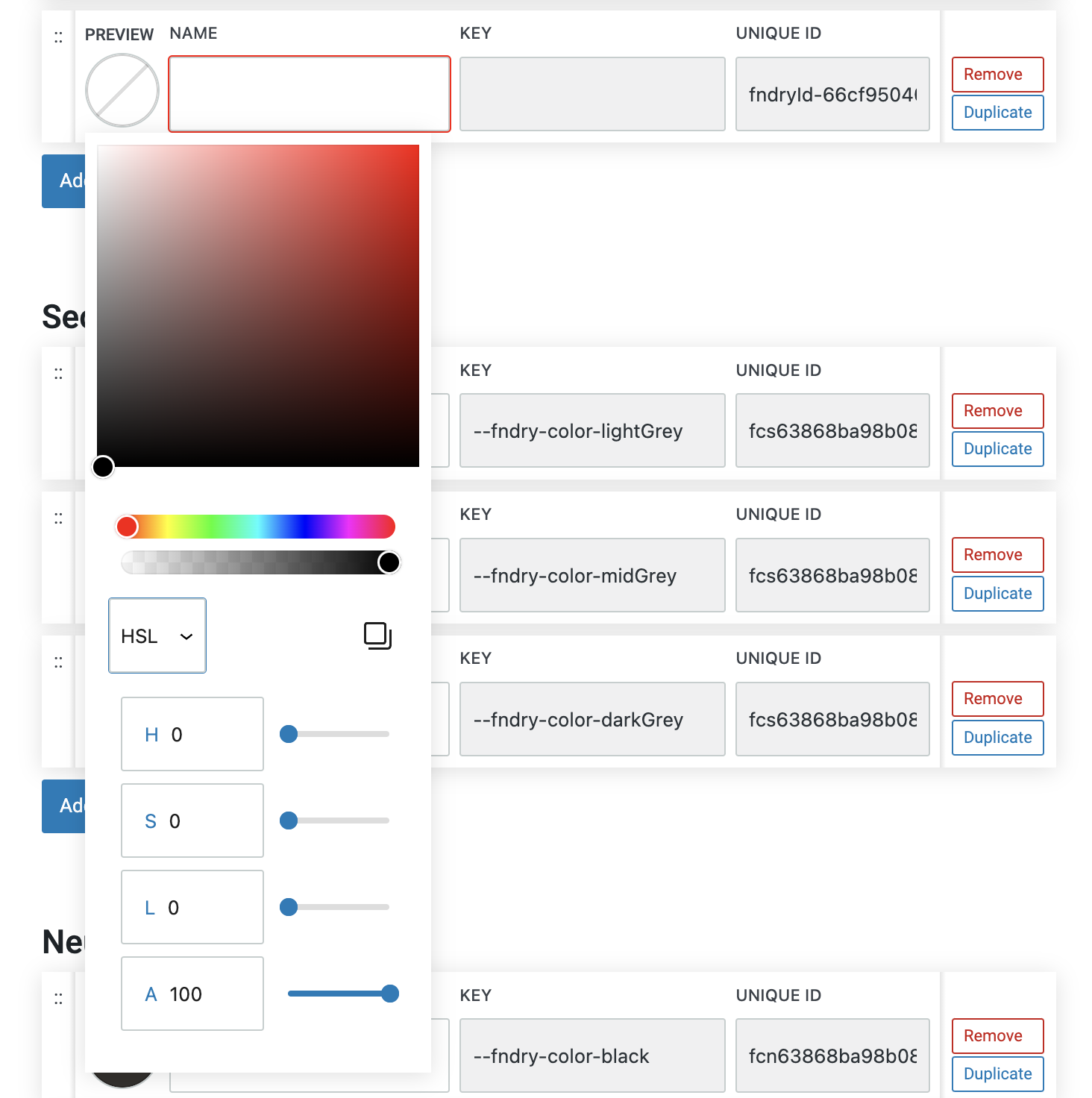
HSL stands for Hue, Saturation, and Lightness, and it’s a color model that describes colors in a way that’s more intuitive for humans to understand. In HSL:
Hue represents the type of color and is measured in degrees on a color wheel (0 to 360), where 0 is red, 120 is green, and 240 is blue.
Saturation measures the intensity or purity of the color, expressed as a percentage. 100% is the full color, while 0% is a shade of gray.
Lightness indicates how light or dark the color is, also expressed as a percentage. 50% lightness is the true color, 100% is white, and 0% is black.
HSL is particularly useful for adjusting colors based on how they appear visually, making it easy to create variations of a color by tweaking its saturation or lightness, while keeping the hue constant. This model is often preferred by designers because it allows for more straightforward color adjustments than the traditional RGB or HEX formats.
More about
Global StylesRGB Codes
RGB stands for Red, Green, and Blue. This color model mixes these three primary colors in varying intensities to create a wide range of colors.
In the RGB color model, each color component—red, green, and blue—is represented by a value ranging from 0 to 255. By varying these values, you can create a wide spectrum of colors.
The RGB model is additive, meaning that the more you add of each color, the closer you get to white. This is the standard model used in digital screens, ensuring that colors are displayed accurately across different devices. RGB is fundamental in web design and digital media, as it directly correlates with how colors are rendered on screens.
More about
Global StylesManual Color Selection
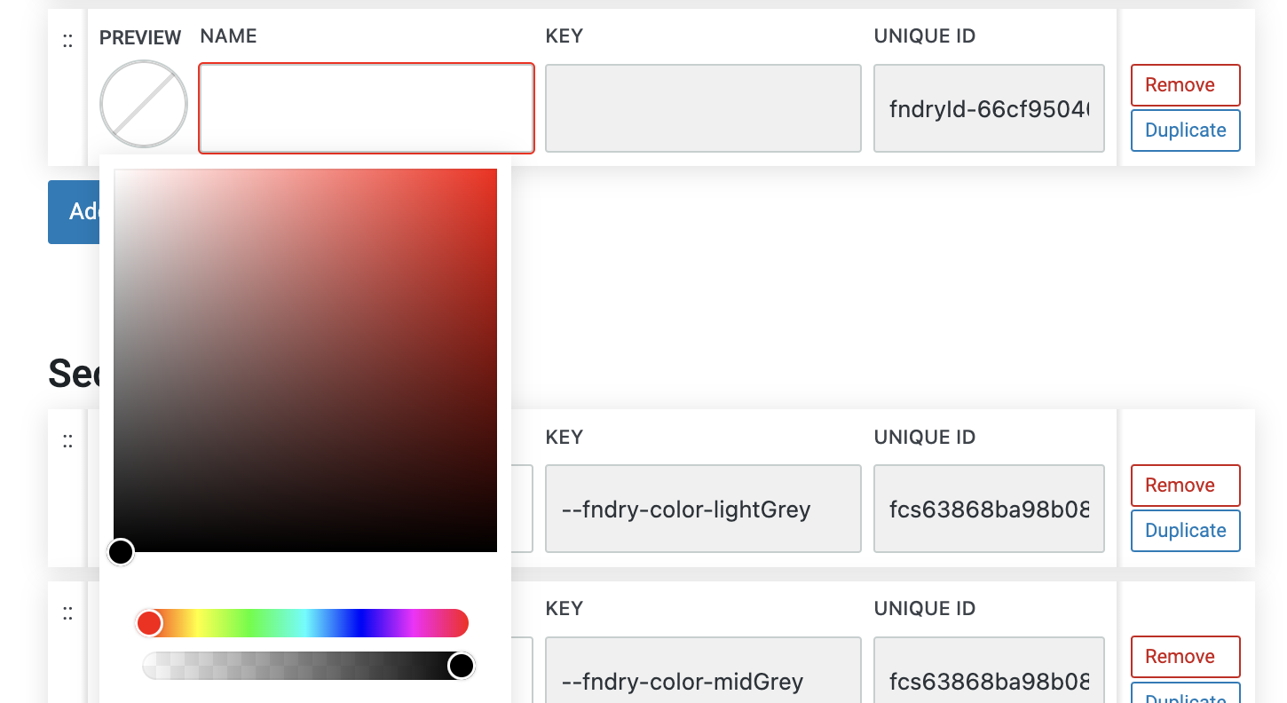
A manual color picker is a tool that allows you to visually select colors for your design without needing to input specific color codes. It typically includes a gradient panel, a hue slider, and an opacity slider.
Gradient Panel: The main area of the color picker displays a gradient of colors, allowing you to choose the exact shade and tint you need by dragging a selector dot within the panel. The colors change dynamically based on the hue selected.
Hue Slider: The hue slider lets you choose the base color by adjusting the hue, which represents the color’s position on the color wheel. As you move the slider, the gradient panel updates to reflect different variations of that hue, ranging from pure color to shades of gray.
Opacity Slider: The opacity slider allows you to adjust the transparency of the color. Sliding it from 100% (fully opaque) to 0% (fully transparent) lets you fine-tune how solid or see-through the color appears.
This combination of tools in a manual color picker provides an intuitive way to select and customize colors, offering both precise control and flexibility in achieving the desired color effect for your design.
More about
Colors


