What are Button & Link Styles?
Button & Link Styles in Refoundry are settings that allow you to customize the appearance of all text links and buttons across your website. This includes setting default styles for text links, and creating individual button styles, including a default button style for forms and other interactive elements.
How it Works
The Button & Link Styles settings in Refoundry. They give you control over how links and buttons appear throughout your website. This section is divided into two main parts: text link styles and button styles. Text links stand apart from other text and images, and are like buttons but without a visible background. Buttons stand apart and have that visible background shape.
Text Link Styles: Here, you define the default appearance of all text links on your site. You can customize the color, hover effects, and underline settings, ensuring that links are both visually appealing and consistent with your overall design. These default settings apply globally, affecting every text link across your website unless overridden by specific local settings, such as the Inline Links settings within Paragraph Blocks or Heading Blocks.
Button Styles: In this section, you can create and customize individual button styles that will be available throughout your site. This includes setting default button styles that will be applied to elements like Gravity Forms automatically. You can define the button’s font, size, color, border, shadow, and hover effects, among other properties. These styles ensure that buttons are consistent with your site’s design and brand identity while also being user-friendly and accessible.
Each button style you create can be named and saved, making it easy to apply the same style across multiple pages or elements.
Button & Link Settings
These settings are found under Component Styles > Default and Component Styles > Buttons. They allow you to control the links and buttons you provide users for navigation.
Default Link Style
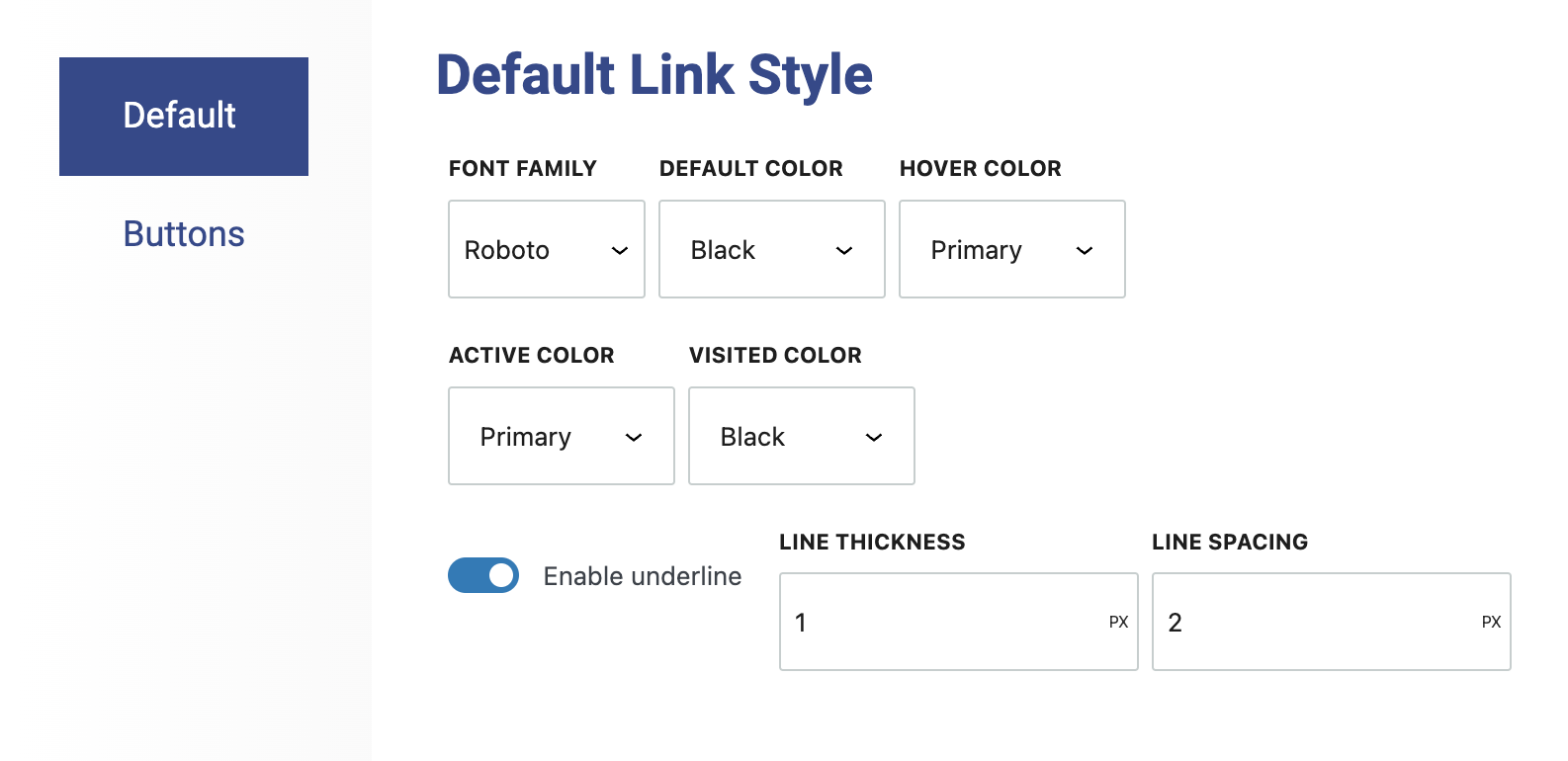
The Default Link Styles in Refoundry allow you to set the baseline appearance for any inline text links across your website. Here’s a detailed explanation of the available settings.
Font Family: This setting allows you to choose the font family for your inline text links, from the preloaded fonts available in Global Styles > Typography. This ensures that the links are visually consistent with the rest of your text, maintaining a cohesive design.
Default Color: This determines the initial color of all text links on your site. This is the color that links will be when they are not being hovered over or clicked. Choosing a color that contrasts well with the surrounding text can help ensure that links are easily noticeable to users.
Hover Color: This setting specifies the color that links will change to when a user hovers over them. This helps the user see that the text is interactive and clickable. Choosing a hover color that stands out from the default color can enhance the user experience by clearly showing the link’s active state.
Active Color: This defines the color that a link turns into when it is clicked or is currently active (for example, the page that’s already open). This setting is useful for helping the user see that the link has been successfully engaged. The active color should be distinct enough to signal this state, but should still fit within the overall color scheme.
Visited Color: This setting allows you to define the color of links that have already been clicked and viewed by the user. This feature helps users differentiate between links they have already visited and those they have not, improving navigation and usability. It’s typically a subtle variation of the default color.
Enable Underline: This toggle determines whether or not your inline text links are underlined by default. Underlining is a common way to signify that text is a link, enhancing accessibility and making links more obvious to users. The default state for this toggle is off, but turning it on will underline all text links.
Line Thickness: If the Enable Underline option is turned on, this setting allows you to control how thick the underline appears beneath your links. You can measure this thickness in pixels, ensuring the underline is prominent or subtle according to your design preferences.
Line Spacing: This setting controls the distance between the text and the underline. This is important for maintaining visual clarity and avoiding a cluttered look. Proper spacing ensures that the underline is close enough to indicate that it’s part of the link, but far enough away to avoid overlapping or crowding the text.
More about
Global StylesButton Styles
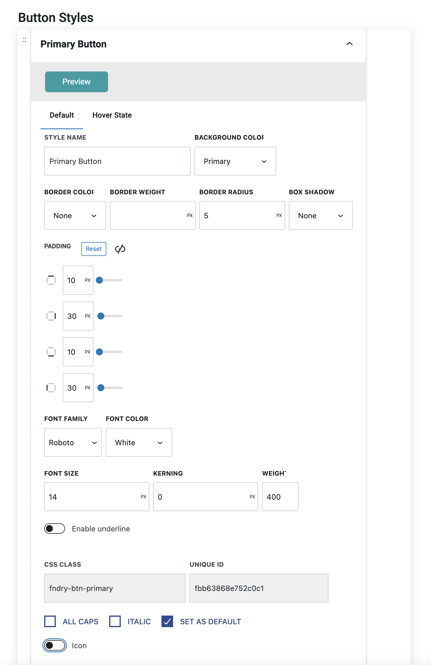
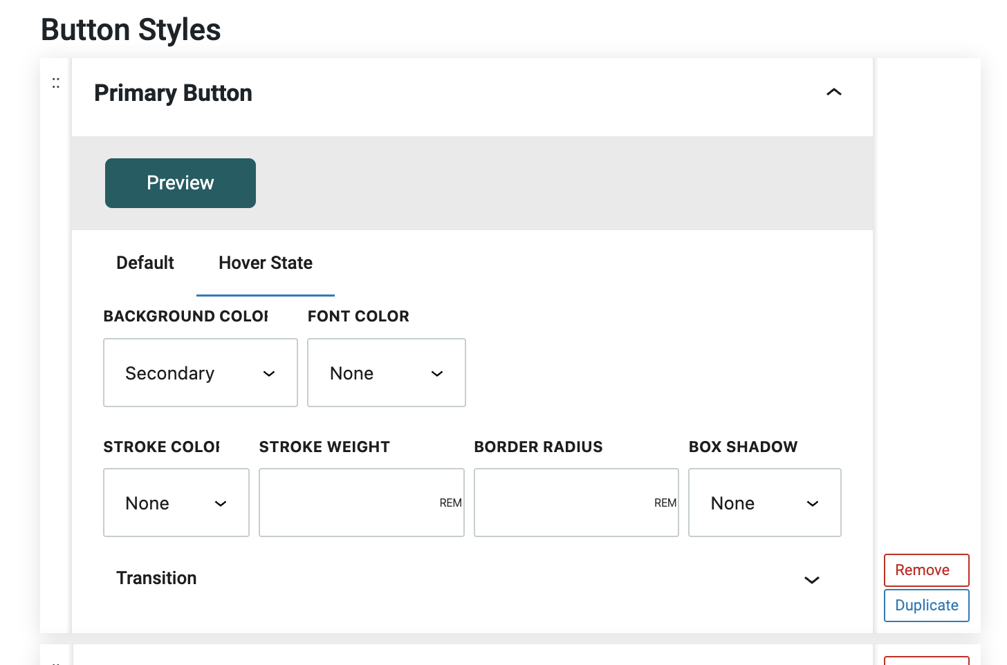
Button Style Settings in Refoundry allow you to fully customize the appearance of buttons across your website, ensuring they align with your design and branding. These settings provide control over the button’s look and feel in various states, including the default state. Below is a detailed overview of the available fields and their functions.
Preview: This section offers a live view of what your button will look like on the front end of your website. As you adjust the settings, this preview updates in real-time, allowing you to see how your changes will impact the button’s appearance before finalizing them.
Default Tab: This is where you configure all the settings for the button’s default state—how it looks when it’s not being interacted with.
Hover State Tab: This is where you configure the changes in the default styles you want to see when the link is hovered over.
Style Name: This is an arbitrary name you assign to the button style for organizational purposes. This name will appear in button style drop-down options in block settings, making it easy to select and apply the style across different buttons on your site. Additionally, the Style Name informs the utility class name, which can be used in custom CSS.
Border Color: This setting determines the color of the button’s border. This can either match the button’s background for a seamless look or contrast it to make the border stand out.
Border Weight: This controls the thickness of the button’s border. This can be set to a specific value in pixels, giving you the ability to create anything from a subtle, thin border to a bold, prominent outline.
Border Radius: This setting defines the curvature of the button’s corners. A higher radius creates more rounded corners, which can make the button appear softer and more approachable, while a lower radius results in sharper, more angular corners for a more defined look.
Box Shadow: This option allows you to apply a preset shadow effect to the button, adding depth and dimension. Shadows can help the button stand out from the background, making it more noticeable and visually appealing.
Padding: This controls the internal spacing inside the button, affecting how much space surrounds the button’s text or content. You can set padding uniformly for all four sides or adjust it individually for the top, right, bottom, and left sides. Proper padding ensures the button is balanced and the text is well-positioned.
Font Family: This setting lets you choose a font for the button’s text from your preloaded options in Global Styles > Typography. This ensures the text on the button aligns with your overall site typography, maintaining a consistent look across your design.
Font Color: This determines the color of the text within the button. Choosing a color that contrasts with the button’s background ensures that the text is readable and visually appealing.
Font Size: This allows you to set the size of the text inside the button. This can be adjusted to make the text more prominent or subtle, depending on the design requirements and the importance of the button’s action.
Kerning: This controls the spacing between characters in the button’s text. Adjusting kerning can enhance readability and ensure that the text fits well within the button, especially when using larger or smaller font sizes.
Weight: This setting determines the thickness or boldness of the text on the button. This can range from light to bold, depending on the emphasis you want to place on the button. Heavier weights can make the text more noticeable, which is useful for call-to-action buttons.
Enable Underline: This will toggle on the underline settings for the link style.
Enable Icon: This will toggle on the icon settings that allow you to set and manage custom icons for the link style.
All Caps: This forces all entered text to be displayed in capital letters.
Italic: This forces all entered text to be italicized.
Set as Default: This applies the selected buttons style as the default link or button style, for example the submit button in a Gravity Form.
More about
Global StylesUnderline Styles
The underline settings for button styles in Refoundry allow you to customize the appearance of underlines on text within buttons. Here’s a brief overview of each setting.
Line Thickness: Controls the thickness of the underline. You can adjust this to make the underline more prominent or subtle, depending on your design needs.
Line Color: Determines the color of the underline. This can either match the button text color or contrast with it to make the underline stand out.
Line Spacing: Sets the distance between the text and the underline. Proper spacing ensures the underline is close enough to be associated with the text but not so close that it affects readability.
More about
Global StylesCustom Icon Styles
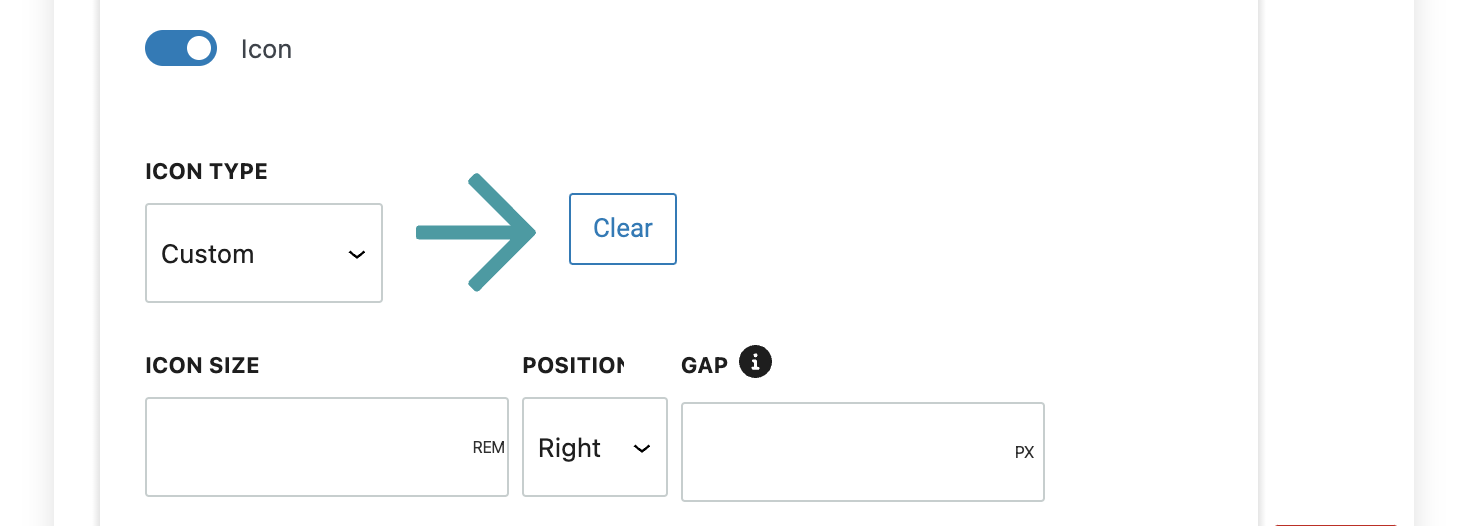
Custom Icon Styles in Refoundry allow you to enhance your buttons by adding icons, making them more visually engaging. You can choose custom images or Font Awesome icons, position them, and adjust spacing for a well-balanced design.
Icon Type: Select either a custom image or a Font Awesome icon.
Image: Choose or upload an image file to be displayed as the icon if you’ve selected the custom image option.
Icon Size: Adjust the size of the icon.
Position: Decide whether the icon appears on the left or right of the text.
Gap: Set the space between the icon and the text for a clean layout.
More about
Global StylesFont Awesome Icon Styles
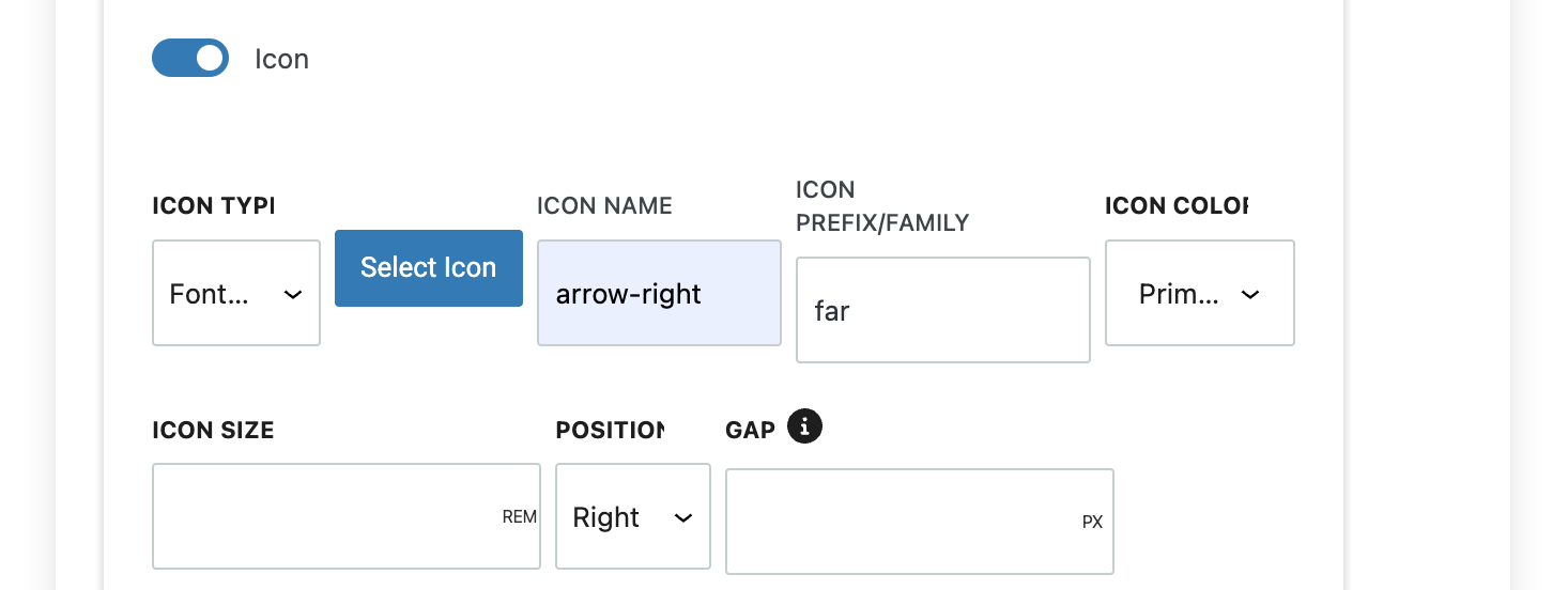
Font Awesome Icon Styles in Refoundry let you easily add and customize icons within your buttons, using the Font Awesome library. This enhances your buttons with recognizable icons or brand logos, improving both functionality and design.
Select Icon: Search and choose an icon from the Font Awesome library, automating other field inputs.
Icon Name: Enter the icon name directly if you already know it.
Icon Prefix/Family: Choose the icon style—far (Regular), fas (Solid), fal (Light), or fa-brands (Brand logos).
Icon Color: Select the color of the icon.
Icon Size: Adjust the size of the icon.
Position: Decide whether the icon appears on the left or right of the text.
Gap: Set the spacing between the icon and the text for a balanced design.
More about
Global StylesHover & Animation Settings
These settings control any hover and animation effects you might add to your links and buttons.
Hover Settings
The Hover Tab settings in Refoundry allow you to define how your buttons will look and behave when users hover over them. These settings ensure that your buttons respond visually to user interactions, enhancing the overall user experience by making buttons more enticing.
Background Color: This field allows you to set the background color of the button when it’s hovered over. Changing the background color on hover can make the button stand out even more, signalling to users that it’s interactive.
Font Color: The Font Color field lets you specify the color of the button’s text when hovered. Adjusting the font color on hover can improve readability and contrast, especially if the background color changes in hover state. This ensures that the text remains clear and inviting whether the user hovers or not.
Stroke Color: This setting controls the color of the button’s border when it’s hovered over. A different stroke color on hover can add emphasis to the button, making it more noticeable and reinforcing the button’s active state.
Stroke Weight: Stroke Weight determines the thickness of the button’s border on hover. Increasing or decreasing the stroke weight can create a more pronounced or subtle effect, depending on the design intent.
Border Radius: The Border Radius field allows you to adjust the curvature of the button’s corners when hovered. You can increase the border radius for a more rounded appearance or decrease it for sharper corners, depending on the desired hover effect.
Box Shadow: This field enables you to apply a shadow effect to the button when it’s hovered. Adding a box shadow can give the button a lifted or 3D effect, making it appear more dynamic and interactive.
More about
Global StylesTransition Defaults
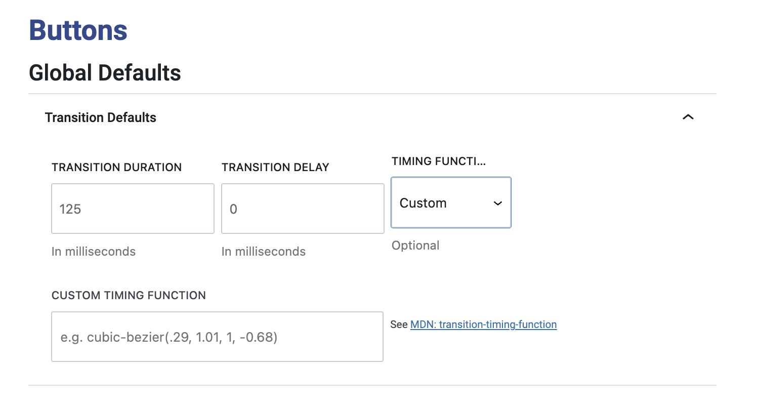
The Animation Transition Settings in Refoundry control how button styles animate when hovered over, adding dynamic effects to enhance user interaction. These settings allow you to customize the smoothness, speed, and timing of the transition, making your buttons more engaging.
Transition Duration: Sets the length of time (in seconds or milliseconds) the animation takes to complete, allowing you to control how quickly the button transitions from one style to another on hover.
Transition Delay: Specifies the delay before the animation starts after a hover event, enabling you to create more complex interactions.
Timing Function: Determines the pacing of the animation. You can choose from several options. Ease (the default), which starts slow, speeds up, and then slows down. With Linear, the animation progresses at a constant speed. Ease In starts slow and then speeds up. Ease Out starts fast and then slows down. Ease In/Out combines both effects by starting slow, speeding up, and then slowing down. There’s also a Custom option that allows for a custom timing function.
Custom Timing Function: If “Custom” is selected for the timing function, this text field lets you enter a custom timing function based on the CSS transition-timing-function specification, giving you precise control over the animation behavior.
More about
Global StylesTransition In Override
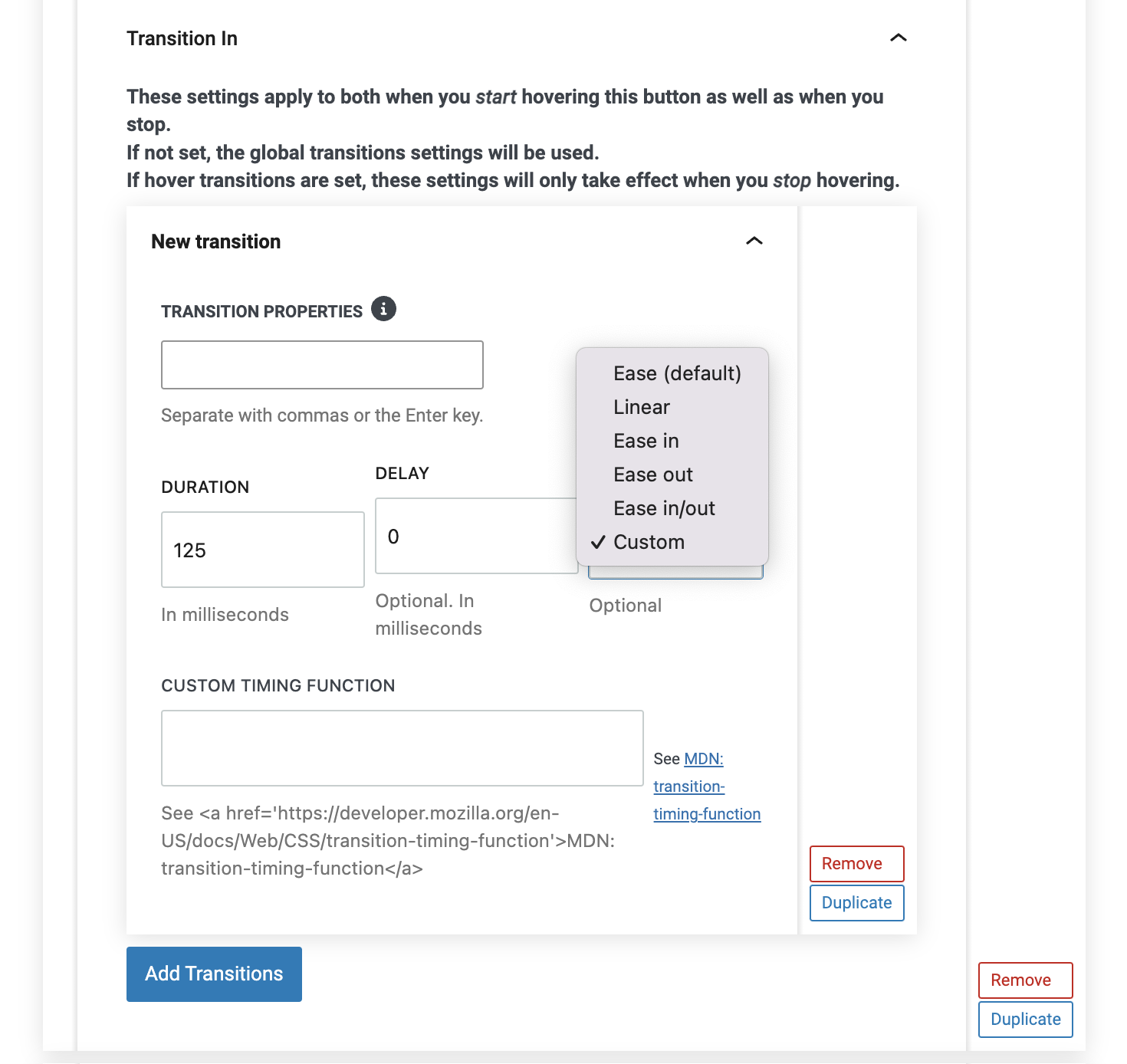
In Refoundry, you can add custom animation transitions to individual button styles, allowing for specific animations tailored to each button’s design. This level of customization helps create dynamic, engaging buttons that enhance user interaction and contribute to a polished, professional website experience.
Transition Properties: This field lets you specify which CSS properties the transition should apply to. Using “all” will apply the transition to all animatable properties, which is convenient but more memory-intensive. For optimized performance, you can specify individual properties like background-color, border, or transform.
Duration: This setting determines how long the animation takes to complete, measured in seconds or milliseconds. A shorter duration creates a snappier transition, while a longer duration results in a smoother, more gradual effect.
Delay: The delay field specifies the amount of time before the animation begins after a hover event. This can be useful for creating staggered effects or drawing attention to specific interactions.
Timing Function: This determines the pacing of the animation, with options such as Ease (the default, which starts slow, speeds up, and then slows down), Linear (constant speed throughout), Ease In (slow start, then speeding up), Ease Out (fast start, then slowing down), and Ease In/Out (a combination of slow start, fast middle, and slow end). A Custom option is also available for more precise control.
Custom Timing Function: If the “Custom” timing function is selected, this text field allows you to input a custom timing function based on the CSS transition-timing-function specification, providing fine-grained control over the animation’s behavior.
More about
Global StylesTransition Out Override
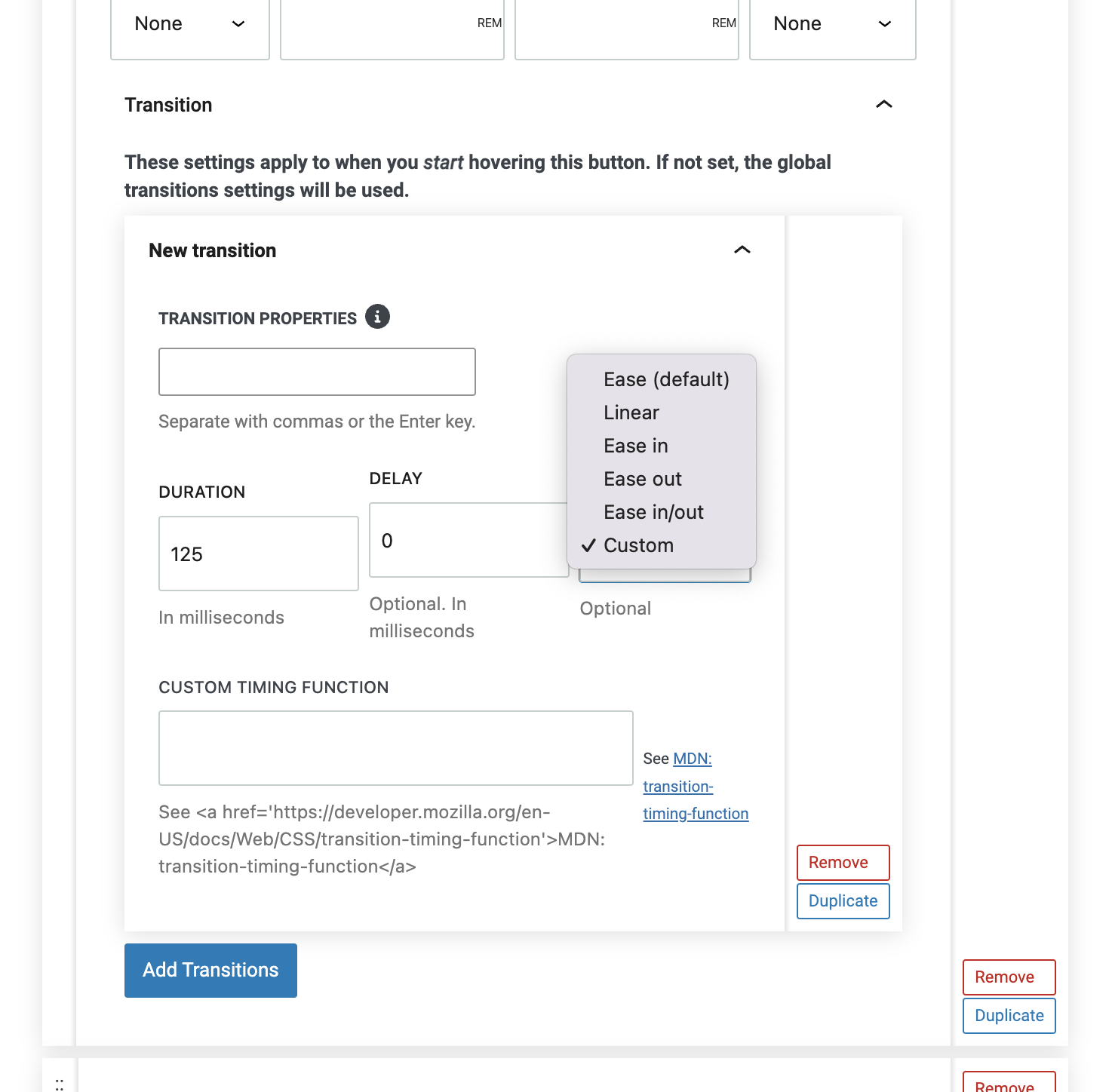
The Transition Out Overrides settings in Refoundry allow you to create custom animations for when a button is no longer hovered over, overriding the global transition settings. These specialized settings let you fine-tune how buttons return to their default state after a hover event, providing a smooth and engaging user experience.
Transition Properties: This field lets you specify which CSS properties the transition should apply to when the hover state is exited. While “all” can be used to apply the transition to all animatable properties, specifying individual properties like background-color, border, or transform can optimize performance.
Duration: Sets the length of time the transition takes when the hover state is exited. You can adjust this duration (in seconds or milliseconds) to control how quickly the button returns to its default style.
Delay: Specifies the delay before the transition begins after the hover state is exited. This can be used to create a more gradual or deliberate transition back to the default state.
Timing Function: Determines the pacing of the transition out animation. You can choose from options like Ease (the default, with a slow start and end), Linear (constant speed), Ease In (slower start), Ease Out (slower end), and Ease In/Out (a combination). There’s also a Custom option for more precise control.
Custom Timing Function: If the “Custom” option is selected, this field allows you to input a custom timing function based on the CSS transition-timing-function specification. This provides exact control over how the transition behaves when the button is no longer hovered.
More about
Global Styles