What are Global Styles?
Global Styles are the foundational styles configured in the backend for your website, feeding the settings in every single block and layout.
How it Works
Traditionally with WordPress, your site’s colors, fonts, and type styles are coded into the WordPress theme. Bulky theme code slows down page loads (which can impact your SEO), and it also requires a developer to edit when you want to make even small changes to these key elements of your site’s look and feel. One of Refoundry’s biggest benefits is that it moves these settings into the plugin settings, taking all that hefty theme code out of your pages and eliminating the need for a developer to tweak your styling.
To locate Global Styles, navigate to your WordPress side menu and click Refoundry > Global Styles. You can find Button & Link Styles in the same menu.
Colors
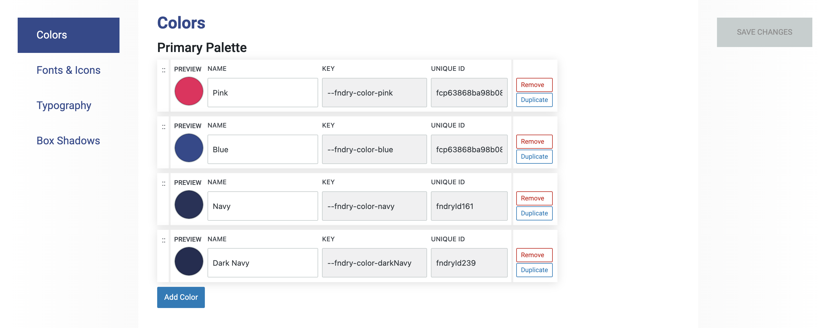
This setting allows you to select colors for your primary site-wide palette, plus a secondary palette and even a neutral palette if you want to really organize your colors. These settings make colors available in drop-downs menus for each block’s style settings. Without them, you won’t have color options.
Colors and Palettes
The Colors section in Refoundry is where you define and organize the color options for your website’s design. These colors are categorized into Primary, Secondary, and Neutral sections.
Primary colors are the core elements that define your site’s visual identity, often used for key elements like headings and buttons.
Secondary colors complement the primary palette, providing variety for subheadings, borders, and less prominent buttons.
Neutral colors, including shades of black, white, and gray, are used for backgrounds and typography to create a balanced, clean look.
Each color requires a color code and custom name, which appears in drop-downs menus for each block’s style settings. The order of colors in these sections can be rearranged, reflecting how they appear in drop-down menus throughout block settings. This ensures your color palette is both organized and easy to manage.
More about
ColorsColor Codes
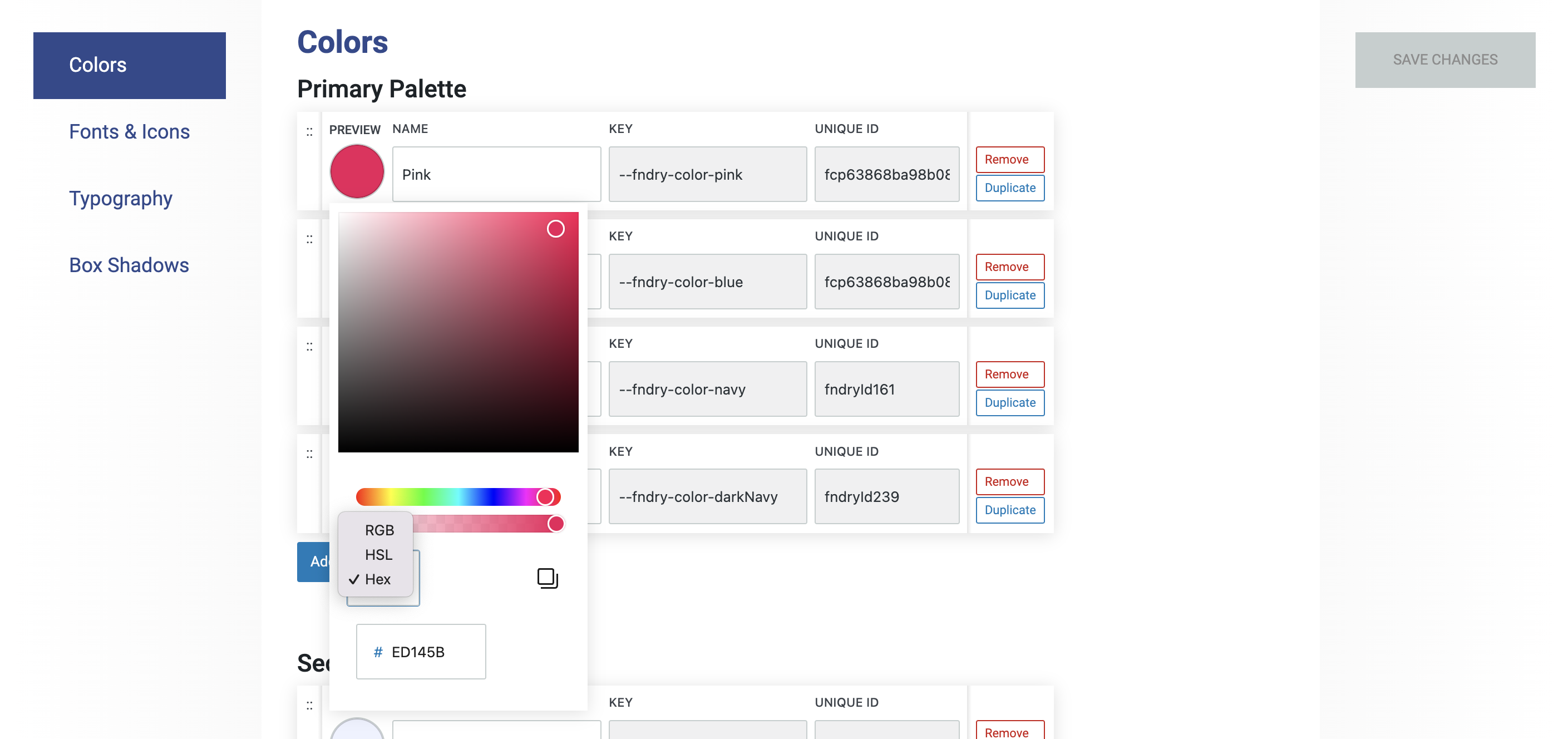
HEX, HSL, and RGB are different methods for defining colors in web design.
HEX (Hexadecimal) is a six-digit code that represents colors using a combination of numbers and letters, often prefixed with a #. It’s widely used in web development for specifying exact colors. You can further set a color’s opacity using additional codes.
HSL stands for Hue, Saturation, and Lightness. This format describes a color by its hue (the type of color), saturation (intensity), and lightness (brightness), offering a more intuitive way to adjust colors based on how they appear.
RGB stands for Red, Green, and Blue. This color model mixes these three primary colors in varying intensities to create a wide range of colors. RGB values are expressed as a combination of three numbers, each ranging from 0 to 255.
Each of these formats allows you to precisely define and manipulate colors for your website’s design.
More about
Color CodesFonts
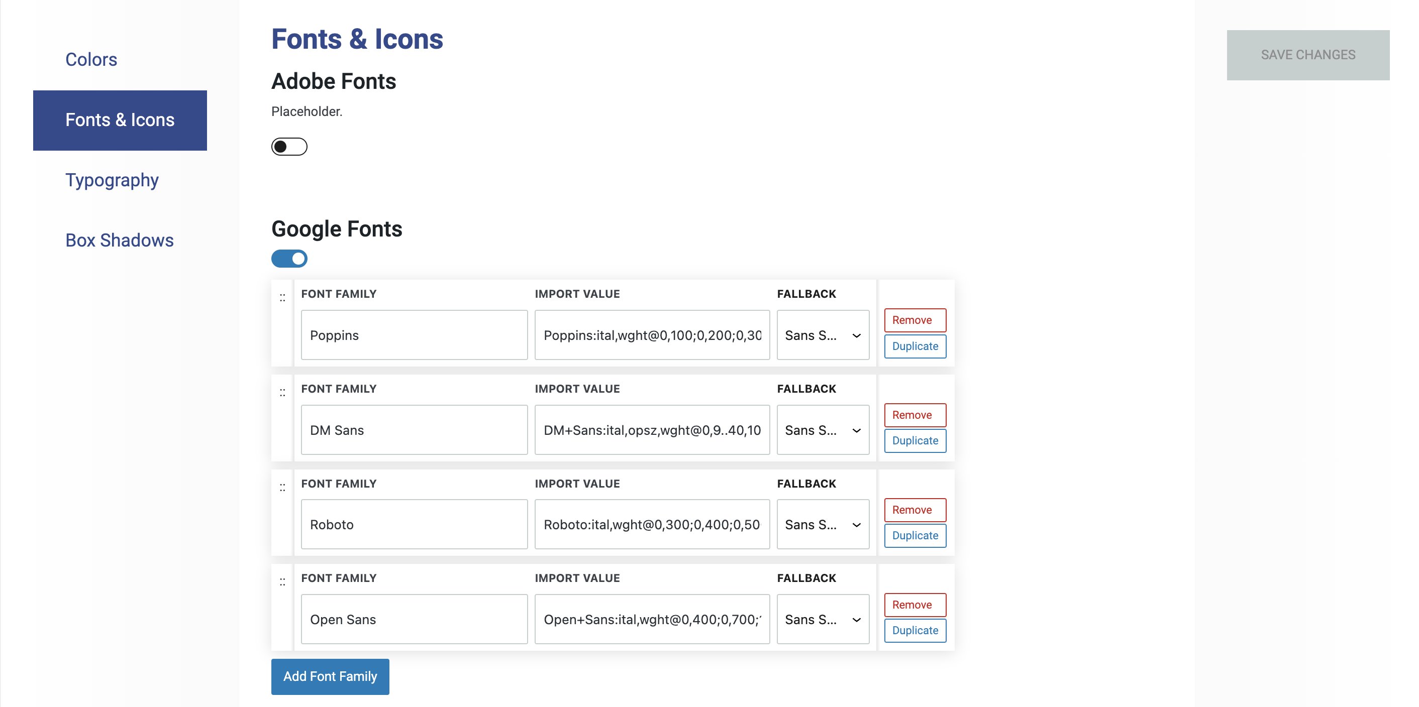
This setting allows you to set default fonts for your website, using Adobe and Google Fonts.
Google Fonts
This section allows you to select and manage Google Fonts for use across your website. By setting up fonts here, you ensure consistent typography for headings, body text, and buttons. Once configured, these fonts become available in drop-downs menus for each block’s style settings, making it easy to apply your chosen typography across your site.
More about
Google FontsAdobe Fonts
Adobe Font Kits are collections of fonts available through Adobe Fonts, a service that provides access to a vast library of high-quality typefaces via a paid membership. These kits allow you to integrate Adobe’s extensive font offerings into your website, ensuring consistent and professional typography. Adobe Font Kits are typically managed through Adobe’s platform, and once set up, they can be easily applied to your site’s design elements, just like other web fonts. This service is particularly useful for designers looking to use premium or unique typefaces in their projects.
More about
Adobe Font KitsTypography
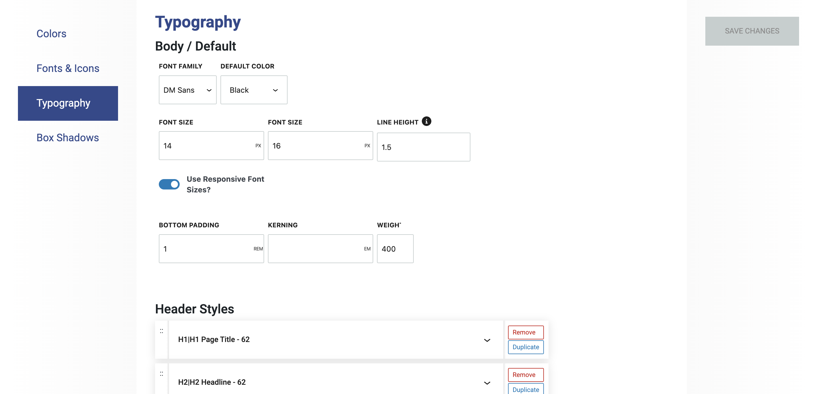
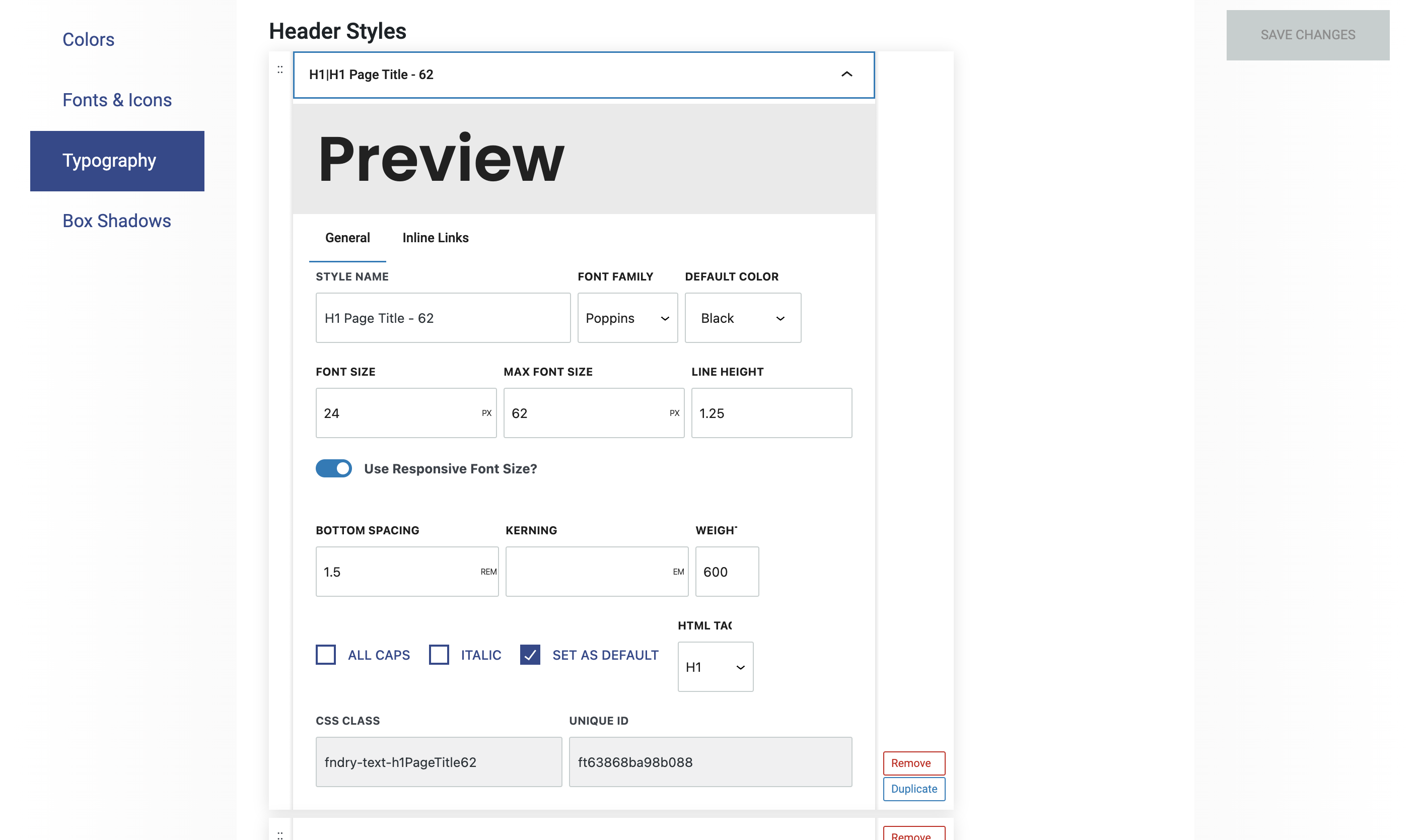
The Typography Settings in Refoundry allow you to configure all your heading and type styles, which populate the drop-downs menus for each block’s typography style settings. This is where you set the default styles for headings (H1 to H6) and paragraph (P) text, ensuring a consistent and cohesive look throughout your website.
Body/Default
Paragraph text default styles in Refoundry define the standard appearance of all body text across your website. These settings allow you to customize the font, size, weight, line height, and spacing for paragraph text, ensuring that your site’s typography is consistent and easy to read. By setting these defaults, you maintain a design that aligns with your overall brand identity.
More about
TypographyHeader Styles
Heading styles in Refoundry allow you to customize the appearance of your site’s headings, from H1 to H6. These settings let you define the font, size, weight, and other styling options for each heading level, ensuring a consistent and visually appealing hierarchy across your website. By setting defaults for H1 to H6, you establish a clear structure for your content, making it easier for users to navigate and for you to maintain a cohesive design.
More about
TypographyText Styles
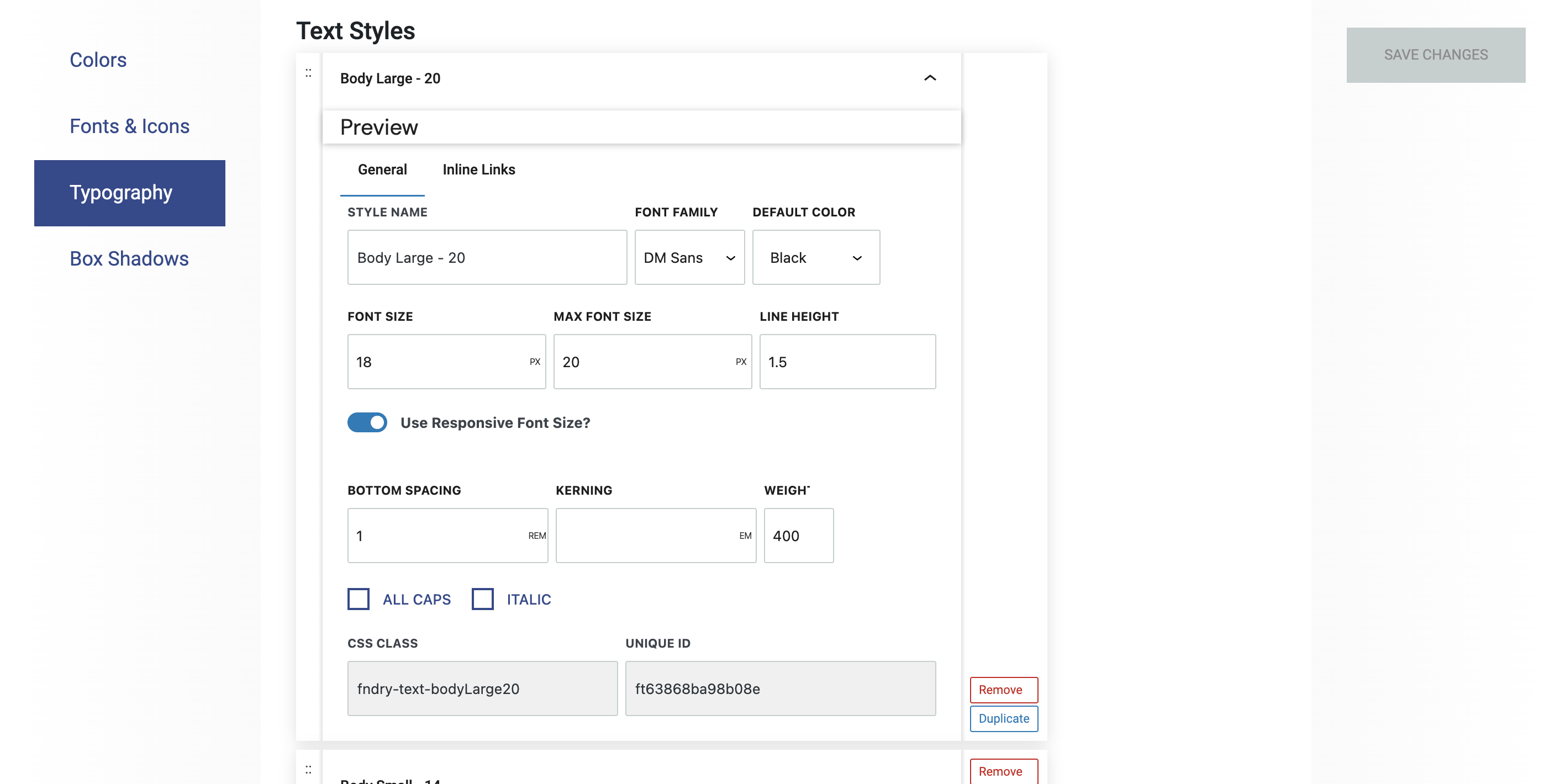
Text styles in Refoundry allow you to create alternative styles for your text elements beyond the default paragraph text style. These custom styles let you define different fonts, sizes, weights, colors, and other typographic attributes, offering flexibility in how you present specific content.
By setting up alternative text styles, you can easily apply unique formatting to different sections of your site, such as callouts, captions, or highlighted text, while still maintaining overall design consistency. For example, you might create an alternative paragraph style that stands out from regular paragraphs for section intros. Rather than fiddle with the typography at the block level, you can just create a style for this and apply it from the drop-down menu.
More about
TypographyInline Links
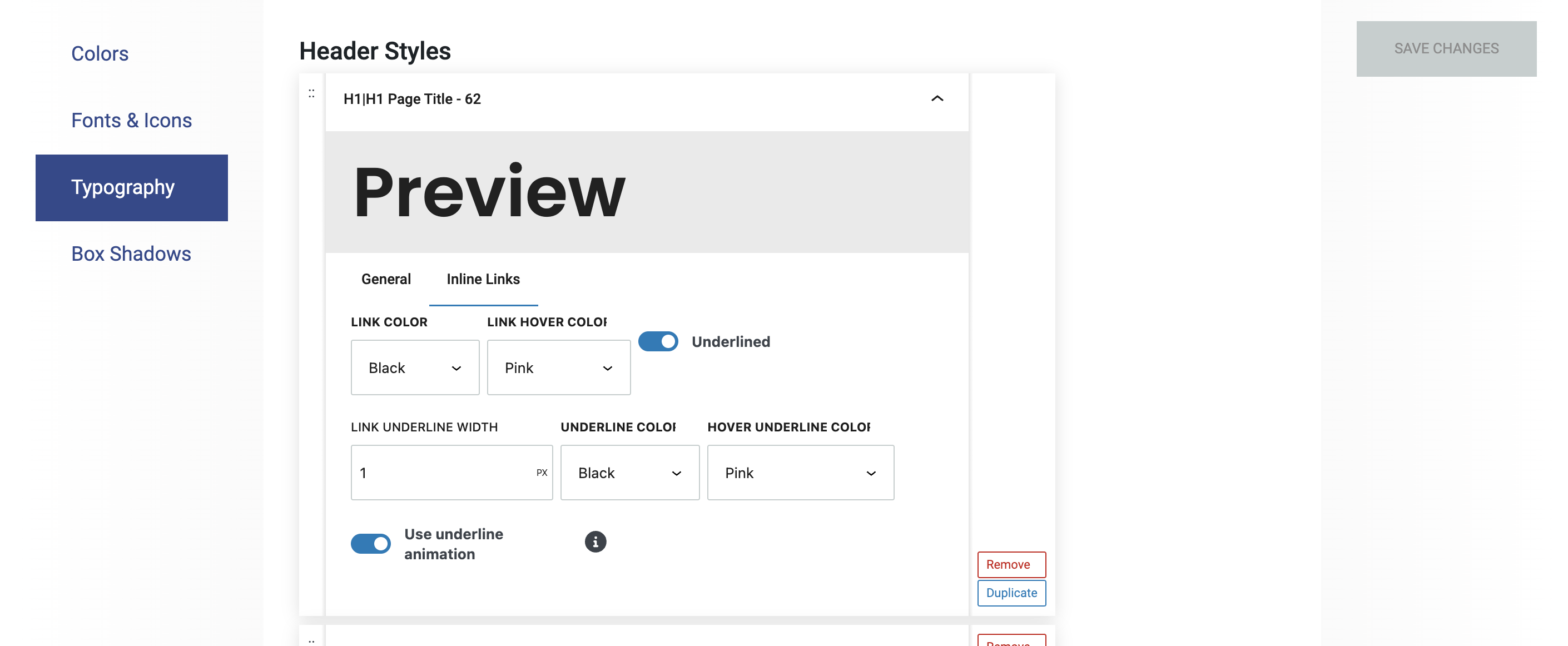
This is where you set the link colors and hover animations for linked text that is entered in Heading or Paragraph Blocks.
More about
TypographyBox Shadows
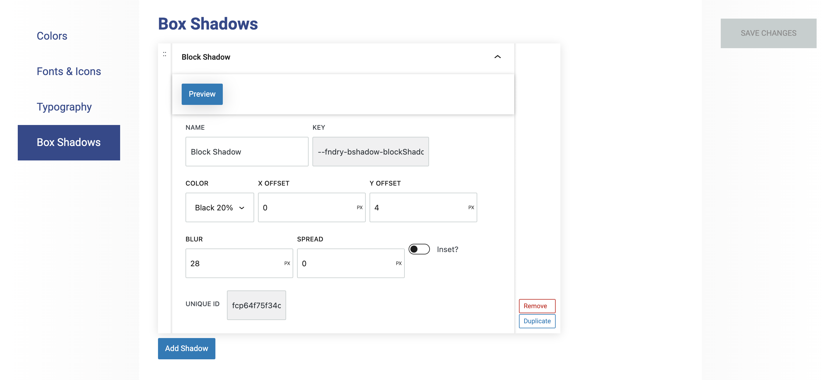
Box shadows create a shadow effect. There are several blocks on which these can be set: Container, Column, Query Post Template, Logo Grid, and Grid Block.
Box Shadows
Box shadow settings in Refoundry allow you to add and customize shadows around elements like buttons, containers, or columns on your website. These settings let you control the color, size, blur, spread, and position of the shadow, giving you the ability to create depth and emphasis within your design. By adjusting these parameters, you can create subtle or dramatic shadows that enhance the visual appeal and readability of your content.
More about
Box Shadows