What is a Navigation Block?
The Navigation Block is for creating menus and customizing them, within a header that you’ve created (this is best saved as a WordPress pattern). Every site will need to use this block at least once!
How it Works
The most common menus are headers (global main menus at the top of the page) and footers (larger global menus at the bottom of the page), but you may need additional menus depending on your site and content. You can create and style as many menus as you need using the Navigation Block. A brand new Navigation Block will display the most recently created Menu by default.
Toolbar Settings
The Toolbar Settings are available in the pop-up menu within the editor, as opposed to other block settings found in the settings panel to the right of the editor.

Toolbar
Select Menu
This option does exactly what it says, and lets you select which menu you want to edit from the menus you’ve already created in the Full Site Editor – or to create new menus within the visual editor.
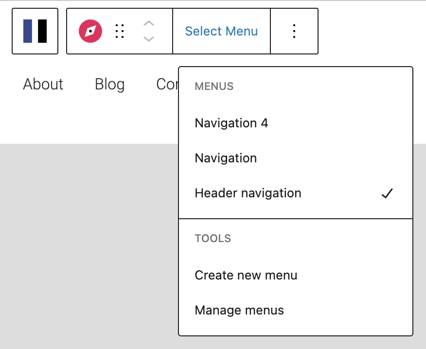
Menus
All menus that you’ve already created will be displayed here for selection. You can use the Menu Name setting in the Settings Tab (see Settings section at the end of this documentation) to customize the name of each menu.
More about
PaddingTools
Create new menu
This allows you to create a new empty menu. Add menu items by clicking the grey “+” icon and searching for any page, post, term, or media file to add to the menu. You can also create manual custom links in your menu by entering text and manually setting the link via the Navigation Item toolbar.
Manage menus
This stakes you to the area in the Full Site Editor where the menus are saved. This is an alternate way to manage menus.
More about
PaddingLink Setting Tools
These settings help you make sure all menu items are linked. Link styling happens in the Styles tab of the regular Settings menu.
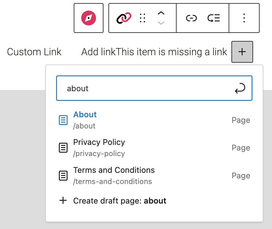
Adding Links
Click the grey “+” icon and type the name of the page, post, term or media file you want to add, and then select from the search results list. Select the content you want linked and it will instantly be linked to that menu item.
More about
Padding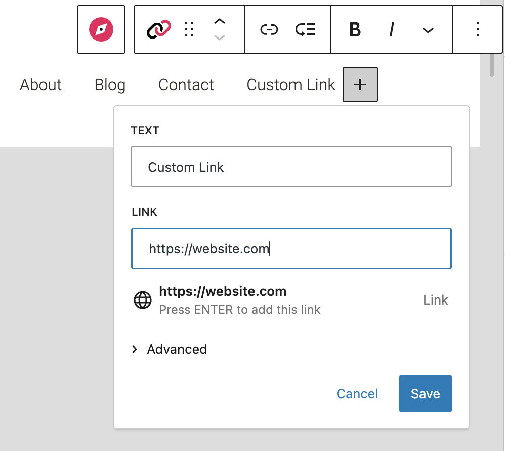
Custom Links
To add a custom link, type the link text you want (ie. the label) and hit ‘enter’. From there, use the Link Block to set the label’s link URL manually.
More about
PaddingSubmenu Tools
These tools within the toolbar appear for submenus, ie. any drop-down menus from your main menu items. It’s essentially like managing a menu within a menu.
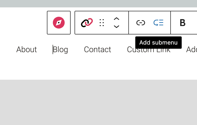
Creating Sub Menus
Click the Add submenu option to convert the default link block to a submenu block.
You can nest up to 3 layers of submenus.
More about
Padding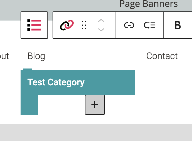
Adding Submenu Items
Similar to adding primary links, you can search to add existing pages, posts, terms or media files, or create custom links.
More about
PaddingBlock Settings
You can customize the Navigation Block using Style, Layout, and Settings options, giving you more flexibility with how you tailor elements to your design.

Styles Tab
Color Settings
These settings govern the color(s) of your menu and any submenus within the Navigation Block.
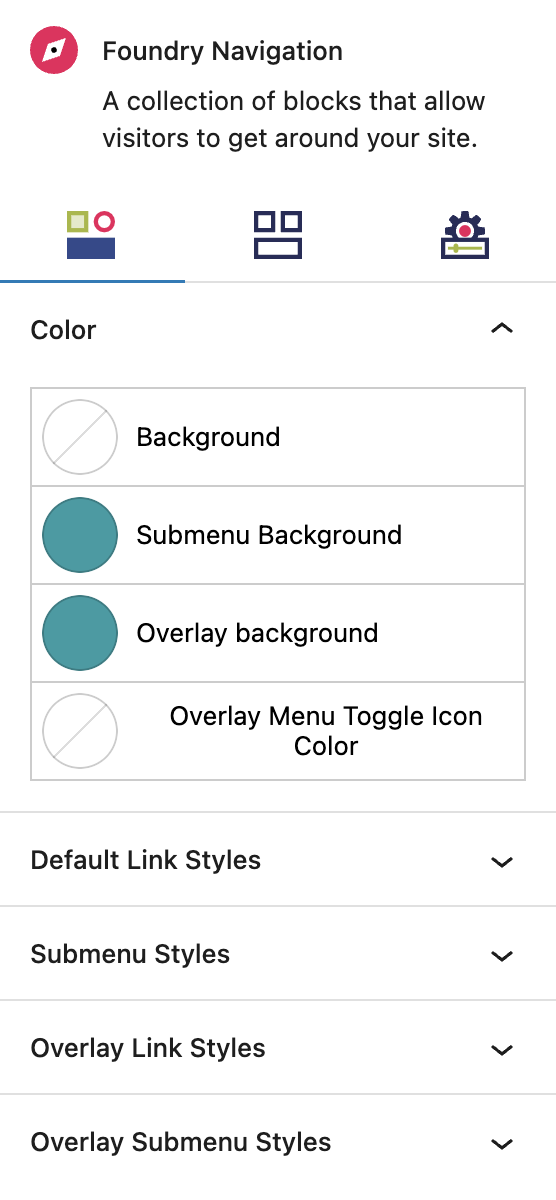
Color
The options in each of the rows will be colors you’ve set in the Global Styles > Colors area.
Background is the color behind the menu items on your main site.
Submenu Background is for any submenus (ie. drop-down menus) that come off of your main menu.
Overlay Background is the color for your mobile menu, which could be different from or the same as your desktop menu interface.
Overlay Menu Toggle Icon Color is the color of the mobile menu icon toggle, often a hamburger or similar symbol.
More about
Global StylesLink Styles Settings
These settings give you a whole lot of options to style all of your menu’s links.
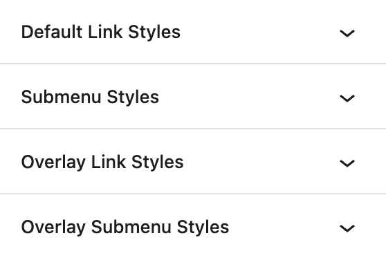
Link Styles
Default Link Styles
These settings style the top level or primary level navigation links, ie the main items you see in your menu.
Submenu Styles
These settings give you options to style your submenu links, ie. the text in any submenus that come off of your main menu. Examples are a list of services, categories, subpages, or locations. All of the Default Link Settings above (Default, Hover, Active/Current) are exactly the same settings available for submenus, so you can check those three sections for more on the settings. This also sets the style for flyout menus, ie children of these dropdown items.
Overlay Styles
These settings give you options to style your mobile menu links. All of the Default Link Settings above (Default, Hover, Active/Current) are exactly the same settings available for submenus, so you can check those three sections for more on the settings.
Overlay Submenu Styles
These settings give you options to style your mobile submenu links, ie. the text in any submenus that come off of your main mobile menu. Examples are a list of services, categories, subpages, or locations. All of the Default Link Settings above (Default, Hover, Active/Current) are exactly the same settings available for submenus, so you can check those three sections for more on the settings.
More about
Global Styles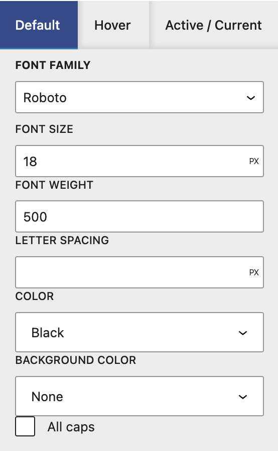
Default
The options in this menu are for the text items in your menu, ie. the labels like About, Products, Services, Blog. You will have many options for customization:
Font Family options are taken from your Global Styles.
Font Size can be customized here.
Font Weight can be customized here.
Letter Spacing can be customized here.
Color is the text color, and the colors come from your Global Styles.
Background Color is the color behind the text, and the colors come from your Global Styles.
All Caps can make the menu items all caps, regardless of how they are input.
More about
Global Styles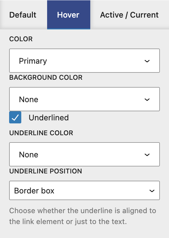
Hover
The options in this menu are for the hover effect over the text items in your menu.
Color is the color the text turns when a user hovers over it, and the colors come from your Global Styles.
Background Color is the color behind the text when a user hovers over it, and the colors come from your Global Styles.
Underlined controls whether or not link text appears underlined when a user hovers over it.
Underline Color (if Underlined is enabled) controls the color of the line under the text when a user hovers over it.
Underline Position (if Underlined is enabled) controls the position of the line under the text when a user hovers over it. The options are Border Box and Content Box.
More about
Global Styles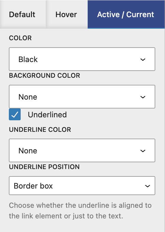
Active/Current
The options in this menu are for the menu item that matches the page a user is currently on. For example, they have clicked ‘About’ and are now on the About page. You only need to set these if you want a visual indication for the user of which page they’re viewing.
Color allows you to change the text color for the active page, and the colors come from your Global Styles.
Background Color allows you to change the background color behind the text for the active page, and the colors come from your Global Styles.
Underlined controls whether or not link text appears underlined when a user is on that page.
Underline Color (if Underlined is enabled) controls the color of the line under the text when a user is on that page.
Underline Position (if Underlined is enabled) controls the position of the line under the text when a user is on that page. The options are Border Box and Content Box.
More about
Global Styles
Layout Tab
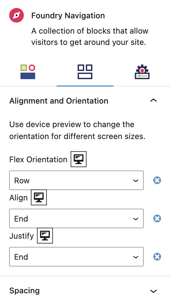
Alignment and Orientation Settings
Flex settings allow items to grow and shrink in proportion to one another to support responsive design, ie. how elements change when viewed on different screen sizes.
Display Settings
Flex Orientation
This governs the direction in which flexible elements within the menu responsively move, depending on the size and type of the screen viewing the containing page’s content. The options are Row, Column, Row Reverse, and Column Reverse.
Align
This governs the vertical spacing of text items within the menu, using Start (top), Center, End (bottom), or Stretch alignment.
Justify
This governs the horizontal spacing of text items within the menu, using Start (left), Center, End (right), or Space Between alignment.
More about
Display SettingsSpacing Settings
These settings govern the spacing the Navigation Block, and the spacing around it.
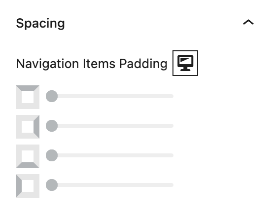
Navigation Items Padding
These top, right, bottom, and left sliders, with a range from 0 to 12, control the amount of interior space there is between the edges of the Navigation Block and its text contents.
More about
SpacingMobile Positioning
These settings define the position of the mobile overlay and the close button.
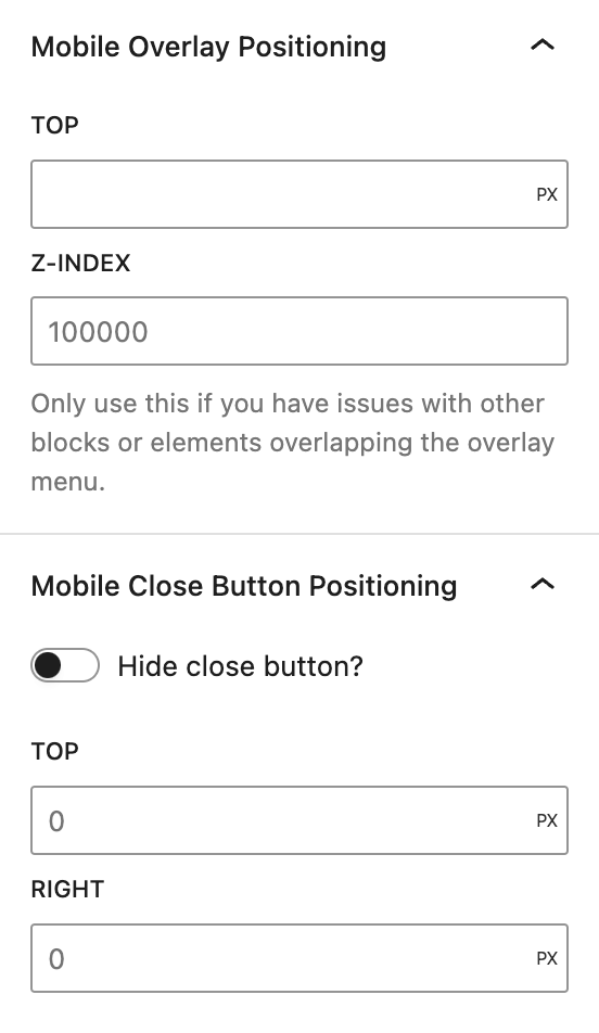
Mobile Overlay Position
Top
Defines the amount of space between the mobile overlay and the top of the screen. This is used to display both the header and the mobile overlay at once.
Z-Index
Used to ensure that the mobile overlay is not hidden behind other content on the page.
Hide Close Button
This option allows you to choose whether the close button for the overlay is displayed or hidden. The header, by default, has a close button, so if both the overlay and header are visible, then the close button should be hidden.
Top
Defines the amount of space between the close button and the top of the mobile overlay.
Right
Defines the amount of space between the close button and the right side of the mobile overlay.
More about
Positioning
Settings Tab
Mobile Settings
These settings give you even more options to customize your mobile menu.
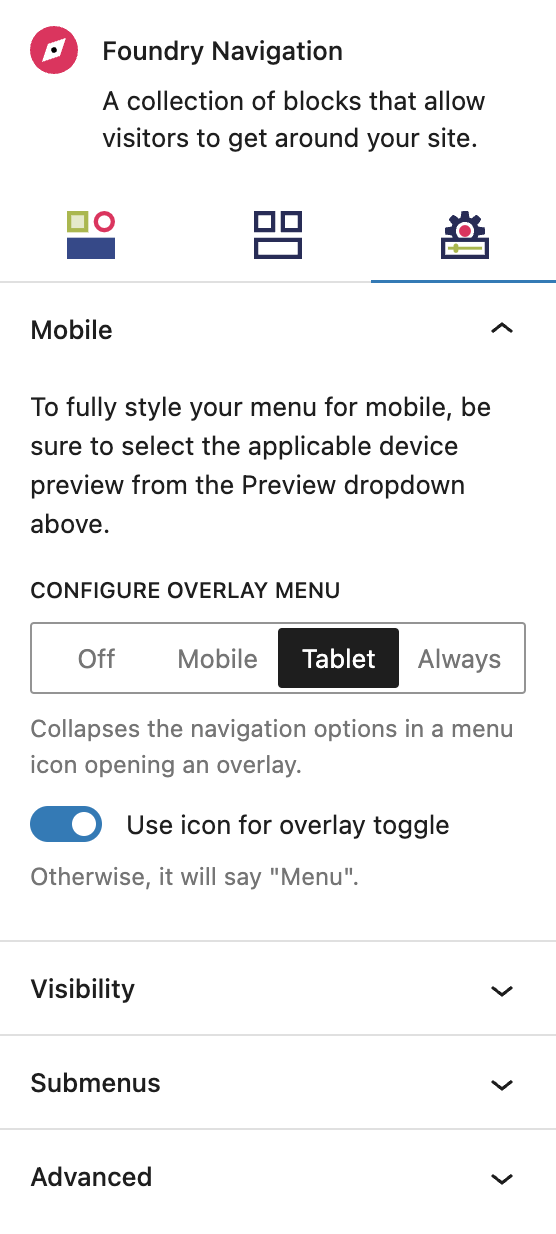
Configure Overlay Menu
These options allow you to configure your mobile menu in the visual editor. Each tab gives you more options.
Off means you are configuring the desktop menu.
Mobile means you are configuring a unique menu for mobile.
Tablet means you are configuring a unique menu for tablet devices.
Always means you are configuring one menu to be used for all devices.
More about
Padding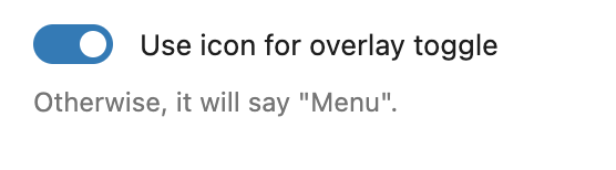
Use Icon for Overlay Toggle
This toggle turns on and off the ability to use an icon for toggling open the mobile menu, such as a hamburger or other symbol. If not turned on, the word ‘menu’ will appear where a user can open the menu.
More about
PaddingVisibility Settings
These settings give you options to control when a menu is shown.
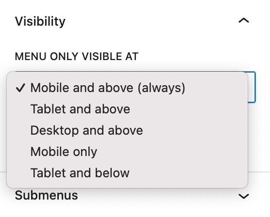
Menu Only Visible At
This drop-down gives you options to manage when your menu is visible. You would use this if you had multiple menus and wanted them all to only show for certain devices. The options are:
Mobile and Above shows the menu for all devices (mobile being the smallest screen size).
Tablet and Above shows the menu for all devices tablet and larger.
Desktop and Above shows the menu for all devices desktop and larger.
Mobile Only shows the menu for mobile devices only.
Tablet and Below shows the menu for tablet and mobile devices only.
More about
PaddingSubmenus Settings
These settings give you more options to customize submenus, ie. drop-down menus.
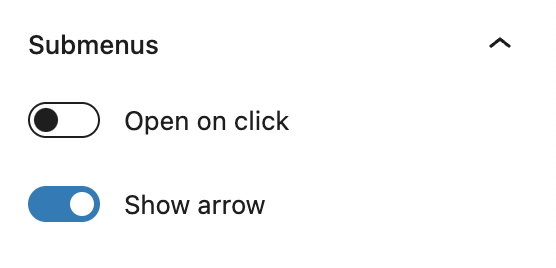
Submenus
Open on click
The default is for submenus (ie. drop-downs) to open on hover, but this toggle changes it to only open on click. You would probably only use this if you had main menu items that do not click through to a unique page, meaning only your submenus items are clickable. For example, an ‘Our Company’ label that is not clickable to an ‘Our Company’ page, but when you click ‘Our Company’ it opens a submenu of related content like About Us, Governance, Community, Careers.
Show Arrow
This enables you to have an arrow that clearly indicates there is a drop-down menu, or to not have one.
More about
PaddingAdvanced Settings
These settings are only accessible to Pro users (with the exception of HTML anchors), and also only accessible to site admins.
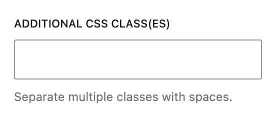
Additional CSS Class(es)
This allows you to enter a unique Class identifier, to facilitate custom CSS targeting within the theme for custom development.
It also enables the use of Refoundry utility classes.
More about
Theme Customizations