What is an Advanced Filter Block?
The Advanced Filter Block is an advanced filtering tool that operates within a Query Block, replacing the standard Filters Block. It supports a child Filter Search block and provides an overlay display for complex filtering. This block allows you to use multiple taxonomy filters, which can be configured as drop-downs, checkboxes, or radio buttons, enabling a sophisticated multi-taxonomy filtering experience for managing large volumes of posts.
How it Works
The Advanced Filter Block is designed to provide enhanced filtering capabilities within a Query Block, offering a more sophisticated and customizable approach than the standard Filters Block. It is embedded within a Query Block and supports advanced multi-taxonomy filtering options.
This block features an overlay display that allows users to interact with multiple taxonomy filters without leaving their current page. It supports a variety of filter styles, including dropdowns, checkboxes, and radio buttons, making it flexible for different filtering needs. Users can add and configure various taxonomies to this filter block, tailoring the display style and functionality according to their preferences.
The Advanced Filter Block also includes a child Filter Search block, which complements the taxonomy filters by providing a search field for more specific queries. Additional display settings are available to customize the appearance and behavior of the filters, including adjustments for spacing, alignment, and style.
This block is ideal for sites with extensive content, enabling users to perform detailed searches and narrow down results based on multiple criteria. Its advanced features and customization options make it an essential tool for managing and filtering large volumes of posts effectively.
Block Settings
You can customize the Container Block using Style, Layout, and Settings options, giving you great flexibility in how you tailor elements to your design.

Styles Tab
Text Settings
New
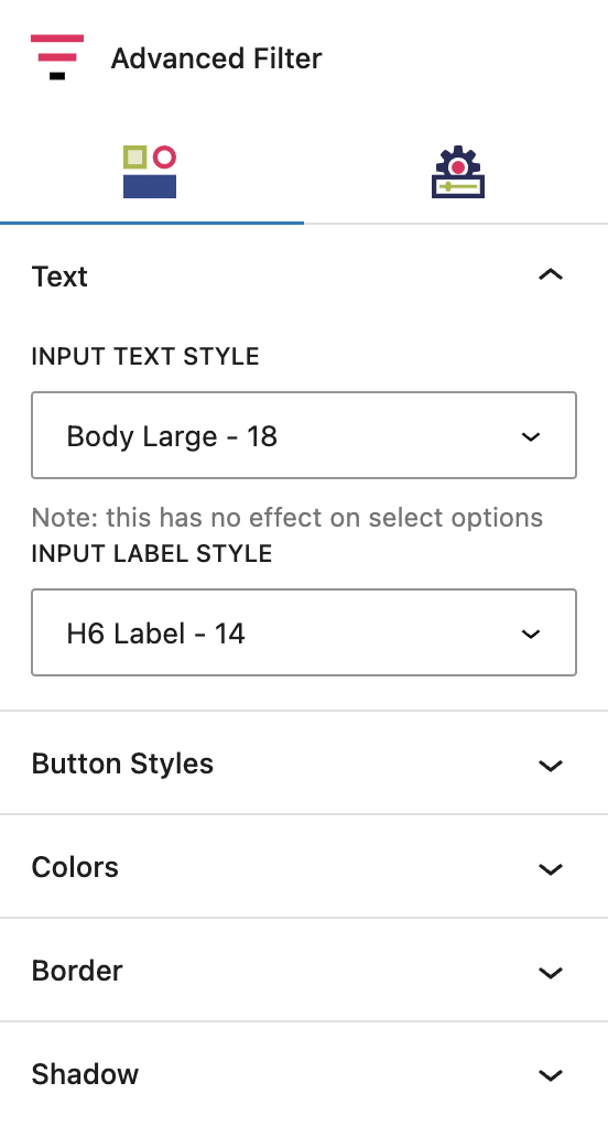
Text
Input Text Style
This sets the styling for the terms outputted in checkbox or radio button groups. It does not style terms in a dropdown.
Input Label Style
This sets the styling for the headings/labels above each taxonomy sections.
More about
Global StylesButton Settings
New
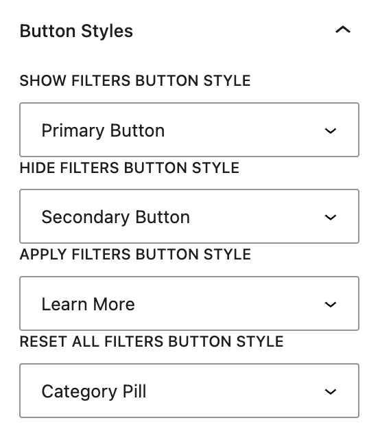
Button Styles
Show Filters Button Style
This sets the style of the main Show Filters button initially displayed on the page. Clicking this button activates the filter overlay.
Hide Filters Button Style
This sets the style of the Hide Filters button found at the top of the overlay panel. Clicking this button classes the filter overlay.
Apply Filters Button Style
This sets the style of the Apply Filters button found underneath the taxonomy groups at the bottom of the overlay panel. Clicking this will submit the post search and reload the page with the results.
Reset All Filters Button Style
This sets the style of the Reset All Filters button found underneath the taxonomy groups and the Apply Filters button at the bottom of the overlay panel. Clicking this will reset all selections currently made to taxonomy terms within the taxonomy groups.
More about
Button & Link StylesColor Settings
New

Colors
Input Background Color
This sets the background color of the checkboxes, radio buttons or dropdown select.
Input Check Color
This sets the color of the checkmark displayed when checkbox or radio button selections are made.
Overlay Background Color
This sets the background color of the whole overlay itself.
Overlay Text Color
This sets the color of the checkbox or radio button terms text.
Collapse Toggle Background
This sets the background color of the toggle that’s displayed when there are child terms that can be shown or hidden.
Collapse Toggle Color
This sets the color of the icon inside the collapse toggle.
More about
ColorsBorder Settings
New
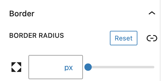
Borders
This sets the borders for checkboxes, radio buttons and dropdown selects.
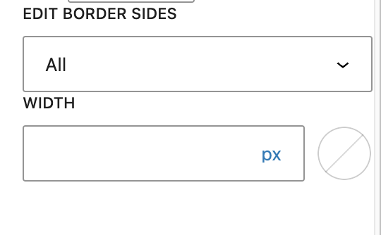
Edit Border Sides
Choose all or individual border sides.
Width
Set the width of the borders
Color
Set the color of the borders.
More about
Borders & RadiusShadow Settings
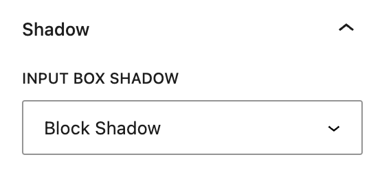
New

Settings Tab
Taxonomy Settings
New
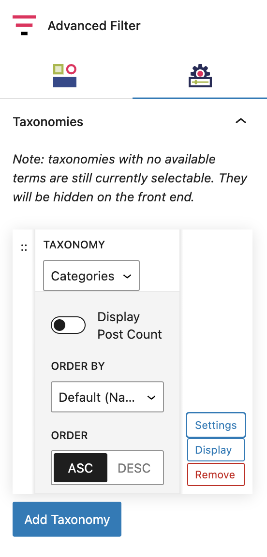
Taxonomy
To determine which taxonomies are displayed in the Advanced Filters Block, add and select them in the taxonomies area. Only taxonomies assigned to the post type selected in the Query Block will be displayed here.
There is no limit to how many taxonomies you can display. Each selected taxonomy will be displayed as an individual dropdown, with all available terms displayed within that dropdown by default.
Settings
You can configure how the taxonomy terms are displayed in the dropdown here. The options are:
Display Post Count: Toggle this on to append the Term name with a post count number
Order by: Select an option to determine the order of the terms within the dropdown. The options include Default (Name), Post ID, Term Order, Slug, Count, Term Group, Description or Parent.
Order: You can select between ascending or descending ordering.
More about
ParallaxDisplay Settings
These settings are located in the Display option in each taxonomy section.
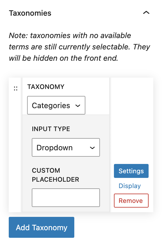
Dropdown
The Dropdown input type displays the taxonomy in a dropdown select format, just like the Filters Dropdown block.
This input type allows for only one term to be selected at time and does not support hierarchy.
The Custom Placeholder field allows you to set placeholder text in the dropdown select, ie Choose one…
More about
Parallax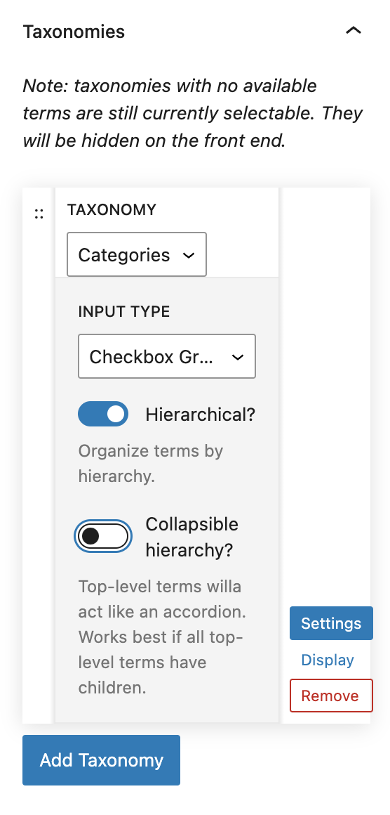
Checkboxes
The Checkbox input type displays the taxonomy as a list of terms with associated checkboxes.
This input type allows for multiple terms to be selected for filtering.
Toggle the Hierarchal setting to on to display Child terms underneath their Parents. Leaving this in the default off state will output all terms equally.
Toggle the Collapse Hiearchy setting to on to display only Parent terms first with an expand toggle available to reveal the Child terms. Leaving this in the default off state will show the child terms as well on load.
More about
Parallax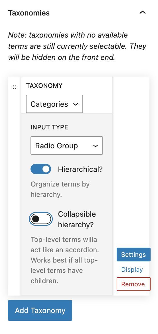
Radio Buttons
The Radio input type displays the taxonomy as a list of terms with associated radio button selectors.
This input type allows for only one term to be selected for filtering.
Toggle the Hierarchal setting to on to display Child terms underneath their Parents. Leaving this in the default off state will output all terms equally.
Toggle the Collapse Hiearchy setting to on to display only Parent terms first with an expand toggle available to reveal the Child terms. Leaving this in the default off state will show the child terms as well on load.
More about
ParallaxAdvanced Settings
These settings are only accessible to Pro users (with the exception of HTML anchors), and also only accessible to site admins.
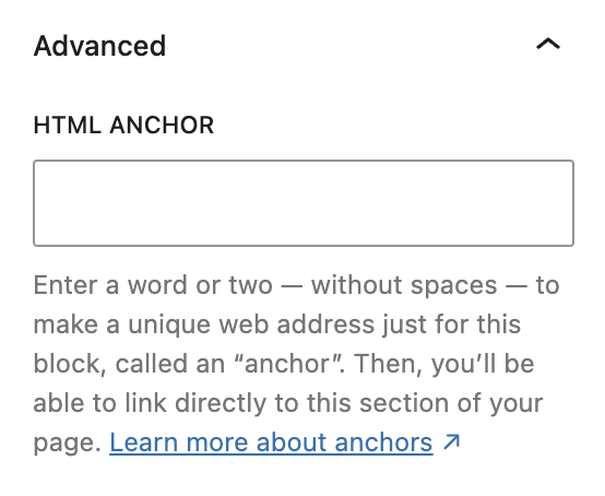
HTML Anchor
This allows you to enter a unique ID identifier, so you can create a URL for this specific Container Block within the page.
More about
HTML Anchors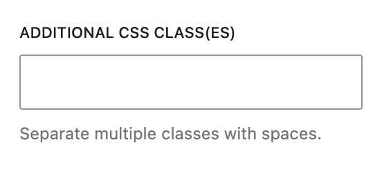
Additional CSS Class(es)
This allows you to enter a unique Class identifier, to facilitate custom CSS targeting within the theme for custom development.
It also enables the use of Refoundry utility classes.
More about
Theme Customizations