What are Responsive Previews?
Responsive Previews in WordPress allow you to see how your website will appear on different devices—desktop, tablet, and phone—within the Gutenberg editor. This feature is important for ensuring that your design looks and functions well across all screen sizes.
Not to be confused with Refoundry’s Responsive Block Settings, which let you actually customize your site to suit each device. Responsive Previews are only intended for viewing the page or post before you publish it.
How it Works
WordPress’ Responsive Preview feature, in the Gutenberg full site editor, lets you simulate how your website will appear on various devices, directly within the editor. This tool is helpful for checking how various elements you’re working on will respond on different devices, so you can adjust before publishing.
When working in the Gutenberg editor, you can toggle between desktop, tablet, and phone views using the responsive preview options. These previews adjust the editor’s display to mimic the width and aspect ratio of the selected device, allowing you to see how elements like text, images, and layout blocks will behave on smaller screens. This can help you ensure that your content looks good and performs correctly across all platforms, from large desktop monitors to small mobile screens.
In addition to these previews, Refoundry blocks offer enhanced responsive controls via Responsive Block Settings. These settings complement the Responsive Previews. They allow you to set custom values for different screen sizes directly within the block settings. This means you can tailor the appearance and behavior of specific elements—such as column width, padding, and margins—for desktop, tablet, and mobile views individually. By leveraging both the WordPress responsive previews and the additional controls provided by Refoundry, you can fine-tune your site’s design to ensure it looks perfect on any device.
For more detailed information on using the Responsive Preview features, you can refer to the WordPress documentation.
Responsive Preview Settings
These are the settings available for WordPress’s Responsive Previews.
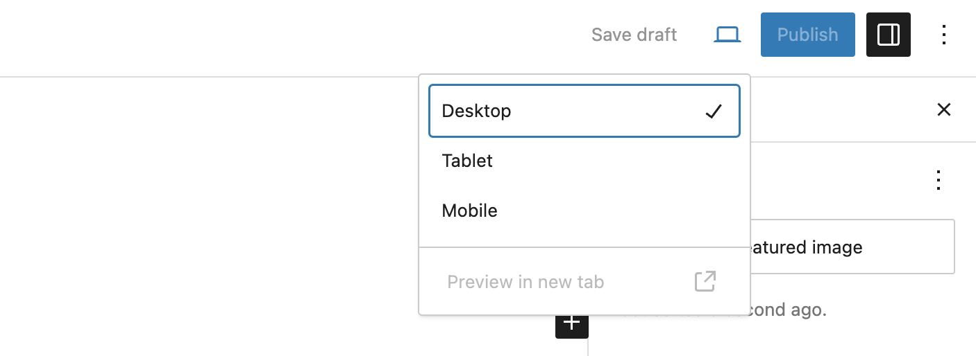
Responsive Preview Selector
Desktop Preview: This mode shows how your website will appear on a standard computer screen. This view typically reflects a wider layout, accommodating elements like sidebars, full-width images, and multi-column layouts. It’s useful for ensuring your design looks polished and professional on larger screens.
Tablet Preview: This mode simulates how your site will look on a tablet, offering a mid-sized screen perspective. This view helps you check how your design adapts to a more compact layout, ensuring that images, text, and buttons remain appropriately sized and spaced.
Phone Preview: This mode shows how your website will appear on a smartphone, which is crucial for ensuring mobile-friendliness. This view typically involves single-column layouts, readable text sizes, and tappable buttons. Given that a significant portion of web traffic comes from mobile devices, optimizing your design for this view is critical.
More about
Responsive Block Settings