Global Styles
Brand-safe by default.
Refoundry’s Global Styles centralize your design system—so colors, type, and interactions stay consistent across every page, with room for creative control where you need it.
Design without limits
Use Layout, Content, Post, and Interactive blocks to build any structure your project needs.
Lightweight and lean
Lightweight markup improves Core Web Vitals and site performance by default.
Accessible for everyone
Blocks are built to meet WCAG standards, so every site launches inclusive.
Get Started FreeColor Palette
Keep every project perfectly on-brand.
Define an unlimited palette once and apply it everywhere. With support for HEX (including transparencies), RGB, and HSL, Refoundry gives designers precise control and keeps every block and component aligned to your brand system.
Unlimited Swatches
Build as many colors as your brand or project needs—no limits.
Organized by Use
Group into primary, secondary, and neutral categories so your most important colors always appear first.
Locked Consistency
Blocks can only pull from your defined palette—no stray hex codes or off-brand guesses sneaking into a site.
Visual + Code-Ready
Custom names create both intuitive dropdowns and utility class names, bridging design and dev seamlessly.
Fonts & Typography
Type that scales beautifully.
Refoundry centralizes your typography so body copy, headings, and text styles stay consistent across every page. Configure defaults once, then extend with unlimited styles—all while keeping everything accessible and responsive.
Google + Adobe Fonts
Full integration with Google and Adobe fonts, plus Font Awesome for icons—no workarounds required.
Responsive Text Sizing
Scale type automatically across breakpoints with support for rem, em, and px units.
Unlimited Styles
Set defaults for body and H1–H6, then create unlimited heading and text style variations for custom use.
Advanced Link Controls
Style inline links with hover colors, underline options, and animated effects to keep designs dynamic and engaging.
Button & Link Styles
Consistent interactions, everywhere.
Refoundry gives you full control over how links and buttons look and behave—keeping your calls-to-action on-brand and accessible. Define defaults once, then create unlimited styles for any use case, with hover effects and icon options built in.
Global Link Defaults
Set baseline styles for every inline link on your site, with color states, underlines, and hover animations you can refine down to line thickness and spacing.
Unlimited Button Styles
Create as many button variations as you need, from primary CTAs to subtle secondary actions. Assign defaults for forms and reuse them everywhere.
Underline & Icon Options
Style underlines with custom thickness, spacing, and animations—or add icons using Font Awesome or custom uploads for more visual impact.
Hover Controls Without Limits
Tweak hover colors, borders, shadows, or transitions with granular settings. Subtle or bold, every interaction feels intentional.
Parallax & Animations
Depth and motion, without the complexity.
Bring your pages to life with smooth scrolling, layered parallax effects, and entrance animations that feel intentional—not distracting. Refoundry integrates advanced motion tools directly into your block settings, so you can design immersive experiences while keeping everything accessible.
Smooth & Seamless Scrolling
Powered by the Locomotive Scroll library, every page flows with polished, fluid motion. Long layouts feel effortless to navigate instead of jarring.
Creative Positioning
Use sticky and fixed positioning on containers and columns to build interactive layouts—like anchored CTAs, floating sidebars, or pinned visuals that move with your story.
Custom Scroll Speeds
Control the pace of individual elements for layered parallax depth. Backgrounds glide slowly, content scrolls faster—adding dimension without extra code.
Future-Ready Animations
Define global defaults for entrance animations or add unique motion at the block level. From subtle fades to directional reveals, you can craft scroll-based experiences that enhance your design system.
Simple pricing, clear value
Plans that grow with your workflow.
Start free in a 30-day sandbox to test Refoundry on real projects, or book a call to see how it fits your team. When you’re ready, flexible plans scale with your workflow—giving you predictable costs and no surprises.
See it in action
Real projects. Real results.
From fast launches to scalable systems, agencies and teams are using Refoundry’s Flexible Blocks to cut build time, deliver polished sites, and keep clients empowered. Explore their stories for inspiration.
-
Axis Insurance
Axis’s marketing team needed a flexible, post-driven site with strategic taxonomies and the ability…
-
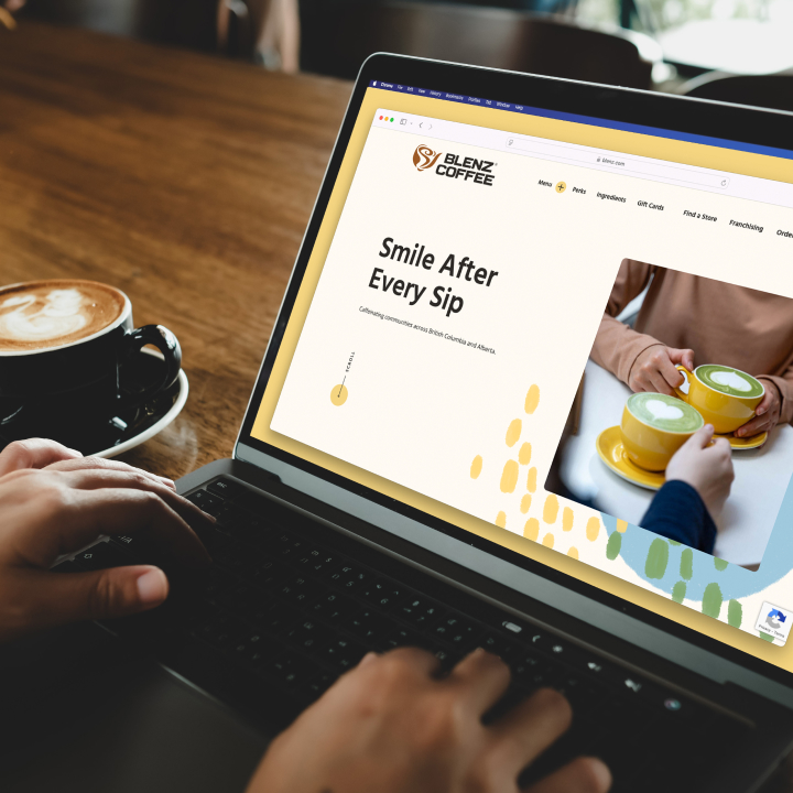
Blenz Coffee
Blenz needed a significantly improved mobile user experience, and the ability to easily manage…
-
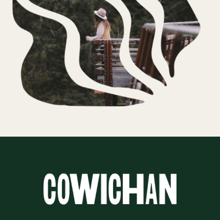
Tourism Cowichan
Tourism Cowichan needed a beautifully redesigned website that empowered their team to edit layouts…

Component Library
Everything you need for faster, better builds.
Drop in system-aligned, reusable sections to assemble full pages in seconds. Components adapt to your Global Styles and support global updates with local overrides—so you move faster without sacrificing consistency.
Component Categories:
Get Started with Global Styles
Design consistency made effortless.
Start free in a 30-day sandbox to explore Global Styles across colors, typography, links, buttons, and animations. Or book a discovery call to see how Refoundry Pro keeps every detail on-brand. When you’re ready, flexible plans scale with your needs—no surprises.