What is a Pagination Block?
A Pagination Block displays navigation options to indicate that the content continues on further pages. The most common use is a blog or products area, but it can be used anywhere that you have multiple pages of the same content.
How it Works
When added, the Pagination Block will also add the following child blocks: a Page Numbers Block, a Next Page Block, and Previous Page Block. This set makes up the complete pagination navigation.
Block Settings
You can customize the Pagination Block using Style and Settings options, giving you great flexibility in how you tailor elements to your design.
Styles Tab
Text Settings
Text settings govern the small amount of text that is involved in pagination.
Text Style
This setting allows you to style the text using the styles you’ve set in Global Styles > Typography.
More about
Global StylesNext/Previous Button Style
This setting allows you to style the text using the styles you’ve set in Component Styles > Buttons.
More about
Component StylesSettings Tab
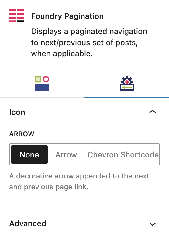
Icon Settings
These settings let you customize the pagination icon.
Arrow
This area allows you to add a directional symbol before the Previous Page block and after the Next Page block, to give a visual representation of navigating forward and backward through archive pages.
If you choose Arrow or Chevron, you’ll see the symbol in the editor. If you choose Shortcode, you must then click on Previous Page Block and Next Page Block to access the settings for each. From there, you can add a Font Awesome icon shortcode.
More about
Font Awesome ShortcodesAdvanced Settings
These settings are only accessible to Pro users (with the exception of HTML anchors), and also only accessible to site admins.
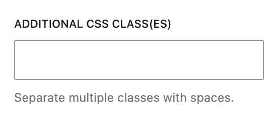
Additional CSS Class(es)
This allows you to enter a unique Class identifier, to facilitate custom CSS targeting within the theme for custom development.
It also enables the use of Refoundry utility classes.
More about
Theme Customizations


