What is a List Block?
The List Block is how you create bullet or numbered lists in Refoundry. It’s pretty straightforward! Use the List Block to break up your text content, and showcase specific points.
How it Works
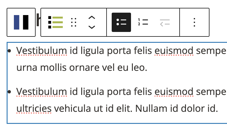
You can add a list by inserting a List Block, or by swapping an existing Paragraph Block to a List Block via the Toolbar Menu. Then you can choose your list style (bullets or numbers), and write text directly into any List Block the same way you would any text editor. WordPress will automatically underline errors with your spelling and grammar. If you copy/paste content from another source, such as a Google Doc, Refoundry will automatically convert any existing styling into your Global Styles, and will automatically retain formatting and convert it into the matching Refoundry blocks, including paragraphs, headings, and lists.
The List Block is also a parent block. When you add your first point on the list, it automatically adds a List Item for that and each following point. The List Item Block controls each individual list item. If you have a List Block with 10 items, you will have 10 List Item blocks. The text styles for list items will default to the body text style set in Global Styles > Typography.
Toolbar Settings
The Toolbar Settings are available in the pop-up menu within the editor, as opposed to other block settings found in the settings panel to the right of the editor.
Toolbar
List Tools
These are basic tools you can use to edit the List Block from within the editor.
List Style
Select either Bullet or Numbered to determine the list type you want to use.
More about
PaddingList Item Indent
Use the left or right indent tool to determine if a list item nests with the parent item, or sits as its own item. This way you can have one or more indented list items within a larger list, to show sub-topics or points in a visually distinct way.
More about
PaddingBlock Settings
You can customize the List Block using various Style options, giving you great flexibility in how you tailor elements to your design.
Styles Tab
Text Settings
The text settings govern the actual text in the List Block.
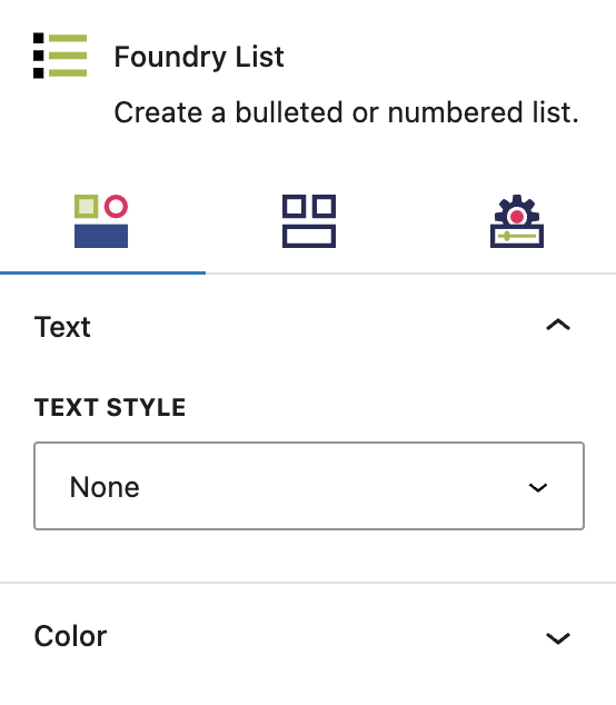
Text Style
The Heading Block text style will always default to the default style configured for paragraphs in the Global Styles > Typography area. The text style dropdown allows you to replace the default text style for all list items with any other preset text style without manually adjusting size and font.
You can also set the type style for each item separately in the List Item block settings.
More about
Global StylesColor Settings
These settings let you customize the color of all of your list markers. You can use the same setting for the List Item, to customize just one marker’s color.
Color
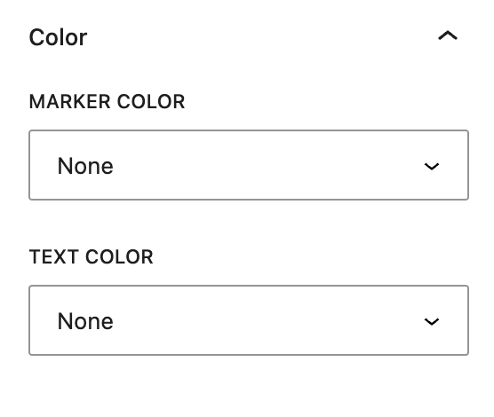
Marker Color
This setting allows you to choose a custom color for the bullet or number marker next to the list, from your palette(s) set in Global Styles > Colors for all list items.
You can also set the marker color per list item in the List Item block settings.
Text Color
This setting allows you to change the default color of the list item text to any other color from your palette(s) set in Global Styles > Colors.
More about
Global StylesLayout Tab
Display Settings
The display settings govern the layout of the items within the List Block.
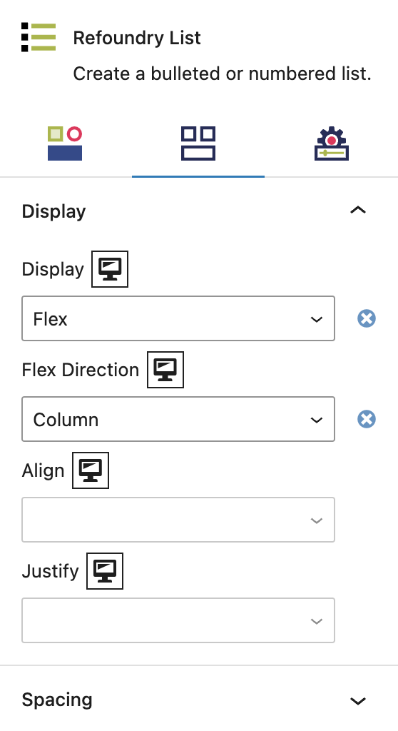
Display
This controls how the label container is displayed, and governs the alignment and order of the labels within.
The element behaves like a block element and lays out its content according to the flexbox model. Options include Flex Direction (Column, Row, Column Reverse, Row Reverse), Flex Align (Start/Top, Center, End/Bottom), Flex Justify (Start/Left, Center, End/Right, Space Between).
The Label Gap option determines the number of pixels between each label if no Flex Justify option is selected.
More about
DisplaySpacing Settings
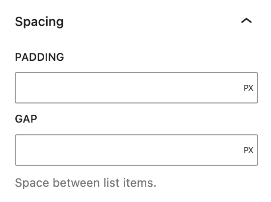
The spacing settings are about the spacing within the List Block.
Spacing
Padding
This controls the space around the list items.
Gap
This controls the space between the list items.
More about
PaddingSettings Tab
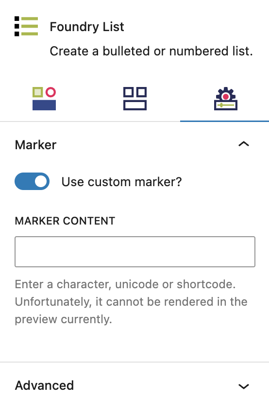
Marker Settings
These settings let you customize the look of all list markers even further.
Custom Marker
Use Custom Marker?
This is a toggle that allows you to set a custom marker for all list items, instead of the default bullet points and numbers. This will enable Marker Icon settings for each List Item as well as setting a default icon for each list item.
Individual List Item blocks can have unique icons set with the revealed field.
Marker Content
Allows you to input an icon font unicode value for all list items. This currently only supports Font Awesome icons via the Font Awesome plugin and shortcodes..
More about
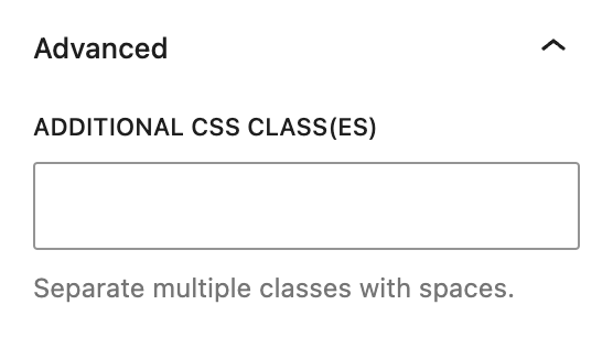
Font Awesome ShortcodesAdvanced Settings
These settings are only accessible to Pro users (with the exception of HTML anchors), and also only accessible to site admins.
Additional CSS Class(es)
This allows you to enter a unique Class identifier, to facilitate custom CSS targeting within the theme for custom development.
It also enables the use of Refoundry utility classes.
More about
Theme Customizations