What is a Row Block?
The Row Block is the secondary base layer for all section layouts, following the Bootstrap Grid System like this: Container > Row > Column.
How it Works
The Row Block governs the vertical and horizontal alignment of any contained Column Blocks, and the column gutters. That is its one purpose.
The Row Block can ONLY be placed inside a Container Block. Attempting to add the Row Block to anything other than a Container Block will result in an error and no change.
Think of a filing cabinet drawer with rails. You can hang file folders from the rails, and even add dividers to create further distinction between groups of folders. But you can’t hang folders in the drawers that don’t have rails – the folders will just tip over and make a mess. The rails provide a framework. At the same time, you wouldn’t tack filing cabinet rails onto other office furniture and expect them to perform other functions. Their one purpose is to hang file folders within a filing cabinet drawer.
Block Settings
You can customize the Container Block using Style, Layout, and Settings options, giving you great flexibility in how you tailor elements to your design.

Layout Tab
Gutter Settings
Gutters are the padding between your columns. Think of it as the space between the hanging folders – are they packed tightly together in the drawer, or spread out? Gutters responsively space and align content.

Enable Gutter
This on/off toggle controls whether the gutter padding around the Row Block and between any contained Column Blocks will be displayed or not.
More about
GuttersFlex Settings
Flex settings allow items to grow and shrink in proportion to one another to support responsive design, ie. how elements change when viewed on different screen sizes.
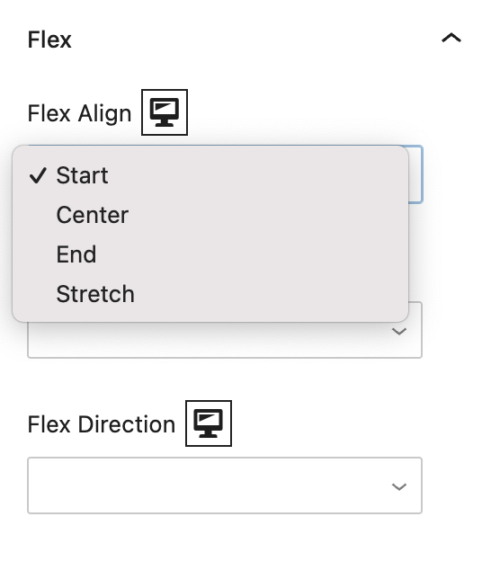
Flex Align
This governs the vertical spacing of any Column Blocks within the Row Block, using Start (top), Center, End (bottom), or Stretch alignment.
More about
Display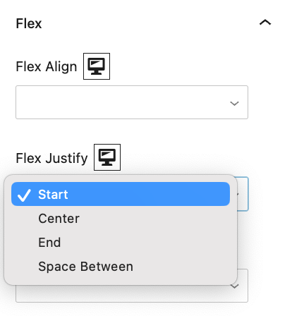
Flex Justify
This governs the horizontal spacing of any Column Blocks within the Row Block, using Start (left), Center, End (right), or Space Between alignment.
More about
Display
Flex Direction
This governs the direction in which flexible elements within a Row Block responsively move, depending on the size and type of the screen viewing the containing page’s content. The options are Row, Column, Row Reverse, and Column Reverse.
More about
Display
Settings Tab
Advanced Settings
These settings are only accessible to Pro users (with the exception of HTML anchors), and also only accessible to site admins.
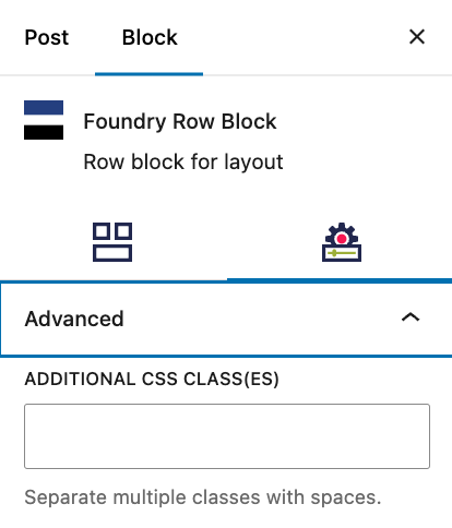
Additional CSS class(es)
This allows you to enter a unique Class identifier, to facilitate custom CSS targeting within the theme for custom development.
It also enables the use of Refoundry utility classes.
More about
Theme Customizations